Download
1 / 18
190 likes | 473 Vues
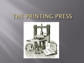
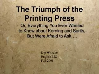
The Triumph of the Printing Press. Or, Everything You Ever Wanted to Know about Kerning and Serifs, But Were Afraid to Ask…. Kip Wheeler English 328 Fall 2008. Printing is not a new idea.

E N D
The Triumph of the Printing Press Or, Everything You Ever Wanted to Know about Kerning and Serifs, But Were Afraid to Ask…. Kip Wheeler English 328 Fall 2008
Printing is not a new idea We give all the credit to Johannes Gutenberg, but he wasn’t the first Printer--just the first in Europe to make the innovation practical.
The Phaistos Disk Discovered in Crete, 1908. If it isn’t a fake, it dates to 1850 BCE.
Woodblock Printing Used as early as 200 A.D. in China,(but economically not feasible without paper and without a phonetically based alphabet)
Movable type first appears using wooden blocks (and then later ceramic fired letters) in 1020 CE under the direction of Bi Shang in China. It becomes a standard competitor of calligraphy a good 400 years before the technology permeates Europe. It quickly spread to Korea and Tibet. Here are the directions for a Zaju play from the Yuan Dynasty of China, printed via wood block printing. The play is entitled Zhuye Zhou.
Tibetan Monks using rubbing technique to create a Woodblock Print in Sera Monastery, Tibet
Metal movable type first appears 20 years later (1040 CE) in Arabic Egypt, sixty-some years before the Crusades. The technology doesn’t become known in Europe until about 1450. European crusaders are far too busy slaughtering Muslims (and vice-versa) to trade printing technologies. Here, we see a metal type-letter (a “sort”) and the image it stamps on a page.
A typesetter would align hundreds of these “sorts” in rows, lock them in place, and reverse-stamp them to print an entire page at once.
Metal sorts wouldn’t crack under pressure the way ceramic sorts would. • Metal sorts would not absorb and hold excess ink the way pores in wood, much less messy. • While each wood block had to be carved by hand, it was easy to reproduce metal type. Gutenberg (originally a goldsmith) was familiar with using a matrix to stamp a negative impression into a hand mould made of lead, tin, and antimony. This left a hollow impression of the desired stamped image. This hollow mould could be filled with liquid metal, cooled, and the the sort snapped out after excess casting stuck on the end and edges (“tang”) were trimmed away. Advantages?
Gutenberg’s Debt to Olive Oil and Wine? He figured out the same mechanism used in winepresses to crush grapes and in oil presses to crush olives could be used to press ink against sheets of paper in rapid succession.
Renaissance Winepress c. 1450
Its daughter, Technologically Speaking-- The Printing Press (example From 1598)
Its great-grand daughter: The Koenig Platen Printing Press of 1823….
Reproduction of medieval manuscripts • Hybrid forms! • Vignettes! • Ligatures! • Majuscule becomes “Upper case”! • Miniscule becomes “lower case” (originally applied to the drawers in standard workshop design that held each letter! • Kerning! • Catchphrase! The Rise of Typeset!
Sans Serif Font Serifs! Serif Font Serif Font with serifs painted red. Traditionally, American printers use serif fonts for long passages or “body text,” and they use sans serif fonts for titles or short phrases. This rule is the opposite of most European publications.
Geneva Helvetica New York Times Arial Baskerville Bauhaus Braggadoccio Chicago Cooper Black The Rise of Fonts!
Finis! Citations: Under Construction! Serif and Sans Serif. Wikimedia Commons. “Wine Press.” The Clutterbug Photography. 7 October 2008. <http://www.theclutterbug.com/Photos/index_photos.html>.