Introduction to Human-Computer Interaction
Introduction to Human-Computer Interaction. Lecture Design for Navigation and Action. Navigation and Action. U sers must be able to recognize where they should go in the application to complete the task. T hey must be able to go through the required steps to complete the task.

Introduction to Human-Computer Interaction
E N D
Presentation Transcript
Introduction to Human-Computer Interaction Lecture Design for Navigation and Action
Navigation and Action • Users must be able to recognize where they should go in the application to complete the task. • They must be able to go through the required steps to complete the task. • Good design of navigation and action components of the interface is the foundation for this. Gokturk
Controlling Dialogue • One of the first interface components that will be designed is the controlling dialogue. • The controlling dialogue is the part of the interface that allows users to move through the application and complete their tasks • The controlling dialogue consists of: • Menus and Tabs • Toolbars • Command/Action Buttons The selection and organization of the components of the controlling dialogueshould come from the user and task analysis completed as part of the software engineering process. Gokturk
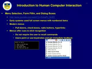
Menus • Interfaces in most software applications today consist of a pull-down menu at the top of the application along with other navigational aids (buttons, toolbars, etc.). • The pull-down menu should reflect the user’s view of the functionality of the software application. • A number of guidelines for the design of pull-down menus have been developed. Gokturk
Menu Choices • When planning the pull-down menu structure for an application, you must decide on the • horizontal menu along the top of the menu • vertical choices under each of these major categories. • The arrangement of these entries must be based on the user’s view of the logical structure of the application. Gokturk
Guideline – Horizontal Menu • H.M. should show the “visual structure” of the application. • From what is shown, the user should be able to: • ascertain how the application is laid out • what the main functions of the system are • how to navigate to an appropriate place for completing the task. Gokturk
Menu Depth • Number of cascading levels of menus that appear under horizontal (top level) menu items. Gokturk
Guideline – Menu Depth • Offer as many choices at the top level as needed to display structure. Restrict menu depth to three levels or less. Group vertical entries (maximum four or five within a group) using separators. Gokturk
Ordering Entries in the Menu • The order of entries in both the horizontal and vertical menu structure should be based on a method that is appropriate for the type of software application being designed. Gokturk
Guideline Base the order of entries on one or more of the following: • Frequency of use:How often this part of the application is accessed (e.g., a more frequently used entry should appear towards the top and left in the menu structure). • Sequence within task:The natural order for completing task (e.g., when using a word processor, we have to create the document before we can print it, or save it so New should be placed before Save or Print in the menu structure). • Standard order used in Windows:If standard Windows menu options (File, Edit, View, etc.) are used in this application, the standard order used in Windows should be maintained. • Chronological:If time is relevant. • Alphabetic:If no other ordering applies. Gokturk
Menu Wording • The wording in menu entries should be based on jargon that the user is familiar with • not necessarily terminology that the designer recognizes • The wording should be consistent throughout the application. Gokturk
Guidelines – Menu Wording • Horizontal menu entries should contain one-word options. • Vertical menu entries should take advantage of the titles used at the horizontal level • if the horizontal menu item is “Student,” one of the vertical entries under this might be “Save Record” à the user puts these two together in his or her interpretation • Vertical menu entries should use standard symbols for the option types. • If the menu choice leads to another menu, use 4. • If the menu choice leads to a secondary dialogue, use… (See previous figure). • If you need to show that an item has been selected, use check mark. • Abbreviations of menu entries should not be used unless you are sure that all users understand their meanings. Gokturk
Alternate Methods of Selection • Most applications are used by a diverse community of users • you should provide a variety of methods of selection • FN, CTRL, ALT, OPTION, WINKEY etc.. Gokturk
Guidelines • Use standard access keys • e.g. underline F so that Alt F provides same selection as clicking on File from the menu. • Use standard shortcut keys • e.g., Ctrl + S to Save, F1 for Help • but restrict these to the most commonly known. (Think about what you learned about Working and Long Term memory.) • Provide feedback when a selection is made Gokturk
Tabs • Tab controls are used to present a low-level visual menu. • They usually are associated with activities that require more than one screen for completion of data-entry tasks or with tasks that can naturally be grouped. Gokturk
Guidelines • Label tabs on the tab control with meaningful descriptors of the function of the tab. • Order tabs using one of the methods for menus. Gokturk
Toolbars • An alternative method for selecting functions within a software application • They usually consist of • a row of buttons containing icons, located at the top of the window below the menu • or a vertical row of buttons on the left or right side Gokturk
Guidelines • Consult the user concerning the functions that should be placed in the toolbar. • Divide the functions in the toolbar into logical groups based on functionality. • Use icons and make sure that these icons are field tested with actual users. • Use application-specific icons that the user would recognize. • Use supporting text in a tool tip (“mouse over” help). Gokturk
Example Gokturk
Command / Action Buttons • Save, OK, Cancel ..... • These buttons are referred to as “disposition” buttons because they often are used to complete (dispose of) a task within a conversational window • They sometimes open dialogue boxes which have their own command/action buttons.(PROPERTIES) Gokturk
Command / Action Buttons Gokturk
Guidelines • Use unambiguous labels for identification. Use standard names and meanings for generic Windows buttons like Close, Clear, Exit, Help, Cancel. • Use appropriate feedback when button is clicked. • Use appropriate Access keys (make sure there are no duplications). • Disable (gray out) buttons that do not apply at any stage in the completion of the task. Gokturk
Feedback • Transition diagram technique can be used. • Transitions from one state to another are caused by events. • In the case of HCI, events are triggered by the user. • For example, a user clicks the mouse on a button and the interface changes to another state (a window opens and becomes active). A user selects an option from a menu and this triggers a transition to a new state (a submenu cascades). • In an interface, the menu, toolbar and command/action button transitions all can be modeled showing the initial state with arrows leading to each of the other states that could be triggered by the event. Gokturk
Transition diagrams • Example: • Starting of the menu structure would be the horizontal menu entries. • When the user clicks on any of these entries, a submenu or a conversational window might appear. • When the user clicks on any of the action buttons, a secondary dialogue or a completion message or an error message might appear. • When the user clicks on an icon in the toolbar, a secondary dialogue might appear. • The can be very big for complex applications Gokturk
UAN – User Action Notation • To handle direct manipulation interfaces that involve pointing, dragging, and clicking on specific areas of the screen • It uses a number of symbols to represent • movement ( ~ ) • clicking (Mv for mouse down, M^ for mouse up). • symbol (!) is used to indicate the system response. • For example, UAN would show selecting an icon as follows: User Action ~ [icon] Mv Interface Feedback icon! User Action M^ Gokturk
Designing meaningful feedback • After the transitions are modeled, the designer must create visual and verbal feedback to support these changes. • Messages are used to communicate to the user what is happening in the system. • They can either be placed in the Message/Status area at the bottom of the form or in a secondary dialogue box that pops up when activated by an event. Gokturk
Status/Information Messages • These messages are used to indicate both progress towards a goal and the accomplishment of that goal. • This type of message may also be used to indicate what is happening when an action has been requested. Printing continuing... Gokturk
Alert/Warning Messages • Alert/warning messages are used to convey information and ask for a response. • These include messages used to alert the user to a possibly destructive process or irreversible action and allow the user to continue or back out. • Sometimes other options can be given (revert, delete,cancel etc) Gokturk
Error messages • slip is an error made due to incorrect typing. • The assumption when responding to this type of error is that the user knows how to proceed but has created an error through misentry or mis-clicking–this type of error is syntactic. • mistake is an error made due to misunderstanding how to proceed–this type of error is semantic and usually caused because the user’s mental model of how the application functionality is structured does not match the way the application has been designed. Gokturk
Error Messages • In both cases, the message should combine error and help processing. • The response should include a brief message telling what is wrong and how to correct it (if possible) and then offer more in-depth help. Gokturk
Guidelines • Write messages in a goal/action format. • (if the user has forgotten to select something that is required for printing, the message should indicate what the goal is (to print a document) and then the action (select a printer).) • Include a meaningful title in the message box. • Word messages in the jargon of the user. Base the wording on the user’s mental model. • Use examples in messages. Such as when the user has entered an incorrect format for a date, show an example (12-Feb-1999) in the message. • Present messages at the appropriate time. • Use selection controls rather than entry controls for difficult-to-remember items. • Never erase what the user has entered on the screen. Instead, highlight the error and allow the user to correct it. Gokturk
Questions? • Assignment is given • Due • Midterm date? Gokturk