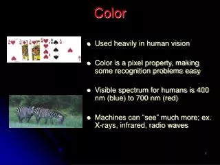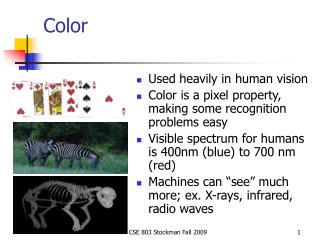
Color
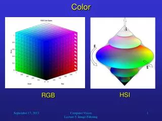
Color. COM 365 Newspaper Layout & Design. Reproducing color. Reflection and absorption Light rays reflected from surface of an object create color A red shirt absorbs all light rays except red It reflects red and appears red. Light. Color. RGB colors Red, green, blue

Color
E N D
Presentation Transcript
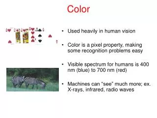
Color COM 365 Newspaper Layout & Design
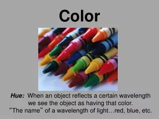
Reproducing color • Reflection and absorption • Light rays reflected from surface of an object create color • A red shirt absorbs all light rays except red • It reflects red and appears red Light Color
RGB colors • Red, green, blue • Primary colors for light (TV) • Also called additive primary colors • When combine all get white • CMYK colors • For printing • Cyan, magenta, yellow and black • Also known as subtractive primaries • Add all together get black
To get 4-color on printing press need four plates, one with each process color Magenta Yellow Cyan Black
Yellow plate Add magenta plate
Yellow, magenta and cyan (added in this step Black plate added for depth, shadow
Color terms • Hue: the color an object is • Identified by the name of the color -- red, green, blue, etc. • Saturation (chroma) • Intensity of a color • Less saturated color means less of color is there
Blue • Shade • Add black to color creates shade • Tint • Adding white to a color creates a tint
Warm/cool colors • Warm colors (red, yellow, orange) • Stimulating, excitement, etc. • Can be somewhat overpowering • Cool colors (blue, violet, green) • Calming, relaxing • Tend to recede
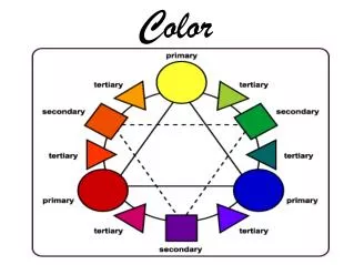
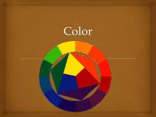
The color wheel Red Violet Orange Blue Yellow Green
Complementary Colors • Colors opposite each other on the color wheel are known as complementary colors • These colors are said to contrast because they don’t share any common color
By placing brilliant orange flowers against a bright blue background, van Gogh's painting has a lot of visual energy • Red of the flowers contrasts with the green of the leaves
In Wheatfields with Ravens, Vincent van Gogh used high contrast colors to make the yellow wheat fields stand out against the dark blue sky.
Analogous colors • Analogous colors are those colors that you'll find fairly close to one another on the color wheel. • Always going to be harmonious • Much less intense than complementary colors
Pantone Colors • Color matching system composed of samples showing various colors as they will appear in print Pantone 641 Pantone 611
Color guidelines • If color doesn’t serve function leave it out • Rules, screen backgrounds, type • If use color, should go with rest of page • If you use a color screen or background, use light, pastel color
The color tint on the informational graphic at right is too distracting and competes with other color on the page.
Here the color tint works much better because it’s an earthtone and blends in with the rest of the art on the page.
Just using color with art and photos works well here because just those elements (photos) stand out.
The same goes for this page. The only added color is for the teaser labels. Notice that color is not a bright red, it’s more a dull burgundy so it stands out some, but doesn’t compete.
Other ways to use color • Spot color • Add just one additional color besides black • Duotones • Addition of one color to b/w photo • End up with are 2 halftone screens • One for black, the other in color
Typically ads use spot color, either one of the primary colors (CMYK) or a Pantone color.
Halftone (black only) Duotone (black plus one color)
The duotone above right was created with Black and Pantone 471, the burnt orange color seen to the right.
Lack of spacing with color tints and boxes Typography is the balance between design and designer as it bridges the gap between image and concept. It implies much more than is visible. Design with the copy, and they will read it. Typography is the balance between design and designer as it bridges the gap between image and concept. It implies much more than is visible. Design with the copy, and they will read it.
Rules should not butt up against type • Leave 1 pica of white space 1 pica space Typography is the balance between design and designer as it bridges the gap between image and concept. It implies much more than is visible. Design with the copy, and they will read it. Typography is the balance between design and designer as it bridges the gap between image and concept. It implies much more than is visible. Design with the copy, and they will read it. Earth tone screen tint