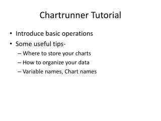
Chartrunner Tutorial
This tutorial provides a detailed introduction to performing basic operations in Chartrunner, focusing on chart creation and data organization. Learn useful tips for storing and managing your charts, as well as how to format your data, including column headers and data types. The guide also explains the steps to create various types of control charts, such as Individuals, X-bar, P-charts, and C-charts, using data from Excel files. Understand the criteria for special causes and how to set control limits for effective data analysis.

Chartrunner Tutorial
E N D
Presentation Transcript
Chartrunner Tutorial • Introduce basic operations • Some useful tips- • Where to store your charts • How to organize your data • Variable names, Chart names
Decide on type of data Continuous (Variables) Data Discrete (Attributes) Data Can both occurrences & non-occurrences be counted? Yes More than one observation per subgroup? No No Yes < 10 observations per subgroup? Are there equal area of opportunity? Are the subgroup sizes equal? Yes No Yes No No Yes –R –s XmR c-chart u-chart p-chart np-chart
Look at a sample chart • Open the program and select the chart that says: “Measurement control chart (01) health, Individuals, Average days positive mammogram”
What did their data look like to get that chart? • In Text file or Excel, data needs to be in columns with Time and Measurement headings • Now, go to the main menu and let’s see if we can re-create this chart • Make a new chart by clicking on the green + symbol, +
Step 1: Chart Name/Data Type • Name: “Example 1” • Description: optional • Chart Categories: Measurement Control Chart • Chart Type: Individuals
Step 2: Data Source • Select: Microsoft Excel from drop down menu • Database or filename: Browse: Day 1.xls
Step 3: Data Definition • Table: select Example 1 • How to treat the columns by: • Avg Delay: select “Measurement” • Week: select: “Unique Identifier” • Click “OK”
Is this the same chart? • Is the process stable? • How many criteria for special cause does this meet? • What’s different compared to the sample chart?
Setting Control Limits • Left click to draw a box around all the points up to and including 20 • Right click and scroll down to “compute limits” • Select , name “baseline”, then click compute and OK • Now, do the same for the reset of the data, points 21-36. Call this set “Post” • How dose this look now? Is it in control?
Make an Individuals chart of the number of patients seen per day • Use Day 1.xls • Select the I Chart sheet • Pick the care team you wish to measure (Bear, Orca, Eagle, Raven or Wolf) column for the measurement, Month is the identifier
Make an X-bar/range chart of the average daily blood sugar • Use Day 1.xls • Select the X-Bar sheet • Use the AM column and the PM column for the measurement, Date is the identifier (n=2: AM & PM)
Make a P-chart of the percent of patients each month with HGA1C < 7 • Use Day 1.xls • Select the P Chart sheet • Use the Total column for the “number inspected” (aka denominator) and the Under 7 column for the count (numerator), Date is the identifier • Ignore “percent”
Make a C-chart of the prescriptions each month for diabetes medications • Use Day 1.xls • Select the C Chart sheet • Use the Prescriptions column for the measure, Date is the identifier