Download
1 / 22
220 likes | 390 Vues
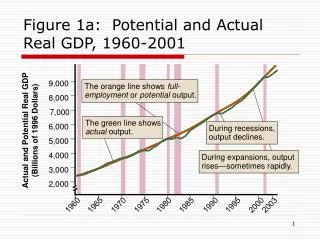
9,000. The orange line shows full-employment or potential output. 8,000. 7,000. Actual and Potential Real GDP (Billions of 1996 Dollars). 6,000. The green line shows actual output. During recessions, output declines. 5,000. 4,000. During expansions, output rises—sometimes rapidly.

E N D
9,000 The orange line shows full-employment or potentialoutput. 8,000 7,000 Actual and Potential Real GDP (Billions of 1996 Dollars) 6,000 The green line showsactualoutput. During recessions, output declines. 5,000 4,000 During expansions, output rises—sometimes rapidly. 3,000 2,000 1960 1965 1970 1975 1980 1985 1990 1995 2000 2003 Figure 1a: Potential and Actual Real GDP, 1960-2001
Aggregate Demand Curve Price Real Level GDP Aggregate Supply Curve Figure 1: The Two-Way Relationship Between Output and the Price Level
Interest Rate As the price level rises, money demand increases and interest rate rises. 9% 6% Money ($ Billions) Figure 2a: Deriving the Aggregate Demand Curve (a) Ms H E 500
On the AD curve, a higher price level is associated with a lower real GDP. The rise in the interest rate causes real GDP to fall. Figure 2b/c: Deriving the Aggregate Demand Curve (c) (b) Price Level AEr = 6% H AEr= 9% 140 E Aggregate Expenditure ($ Trillions) E 100 H AD Real GDP ($ Trillions) Real GDP ($ Trillions) 6 10 6 10
Since real GDP is higher at the given price level, the AD curve shifts rightward. At any given price level, an increase in government purchases shifts the AE line upward, raising real GDP. Figure 3: A Spending Shock Shifts the AD Curve (a) (b) Price Level AE2 AE1 H Real Aggregate Expenditure ($ Trillions) 100 H E E AD1 AD2 Real GDP ($ Trillions) Real GDP ($ Trillions) 10 13.5 10 13.5
Price level ↑moves us leftward along the AD curve Price level ↓moves us rightward along the AD curve Figure 4a: Effects of Key Changes on the Aggregate Demand Curve (a) Price Level P3 P1 P2 AD Real GDP Q3 Q1 Q2
Entire AD curve shifts rightward if: • a, IP, G, orNXincreases • Net taxes decrease • The money supply increases Figure 4b: Effects of Key Changes on the Aggregate Demand Curve (b) Price Level AD2 AD1 Real GDP
Entire AD curve shifts leftward if: • a, IP, G, orNXdecreases • Net taxes increase • The money supply decreases Figure 4c: Effects of Key Changes on the Aggregate Demand Curve (c) Price Level decreases AD1 AD2 Real GDP
Starting at point A, an increase in output raises unit costs. Firms raise prices, and the overall price level rises. Starting at point A, a decrease in output lowers unit costs. Firms cut prices, and the overall price levelfalls. Figure 5: The Aggregate Supply Curve Price Level AS 130 B 100 A 80 C Real GDP ($ Trillions) 6 10 13.5
Movements Along the AS Curve • When a change in output causes price level to change, we move along economy’s AS curve • What happens in economy as we make such a move? • As we move upward along AS curve, we can represent what happens as follows
When unit costs rise at any given real GDP, the AS curve shifts upward–e.g., an increase in world oil prices or bad weather for farm production. Figure 6: Shifts of the Aggregate Supply Curve AS2 Price Level AS1 L 140 100 A Real GDP ($ Trillions) 10
Real GDP ↑ moves us rightward along the AS curve Real GDP ↓ moves us leftward along the AS curve Figure 7a: Effects of Key Changes on the Aggregate Supply Curve (a) Price Level AS P3 P1 P2 Real GDP Q2 Q1 Q3
Entire AS curve shifts upward if unit costs ↑for any reason besides an increase in real GDP Figure 7b: Effects of Key Changes on the Aggregate Supply Curve (b) AS2 Price Level AS1 Real GDP
Entire AS curve shifts downward if unit costs ↓for any reason besides an decrease in real GDP Figure 7c: Effects of Key Changes on the Aggregate Supply Curve (c) Price Level AS1 AS2 Real GDP
Figure 8: Short-Run Macroeconomic Equilibrium AS Price Level B 140 E 100 F AD Real GDP ($ Trillions) 6 10 14
Figure 9: The Effect of a Demand Shock AS Price Level 130 H 115 J 100 E AD2 AD1 Real GDP($ Trillions) 10 13.5 12.5
An Increase in Government Purchases • Can summarize impact of price-level changes • When government purchases increase, horizontal shift of AD curve measures how much real GDP would increase if price level remained constant • But because price level rises, real GDP rises by less than horizontal shift in AD curve
An Increase in the Money Supply • Although monetary policy stimulates economy through a different channel than fiscal policy • Once we arrive at AD and AS diagram, two look very much alike • Can represent situation as follows
Figure 10: The Long-Run Adjustment Process Price Level AS2 AS1 P4 K J P3 P2 H P1 E AD2 AD1 YFE Y3 Y2 Real GDP
Demand Shocks: Adjusting to the Long Run • For a positive demand shock that shifts AD curve rightward, self-correcting mechanism works like this
Figure 11: Long-Run Adjustment After A Negative Demand Shock Price Level AS1 AS2 P1 E P2 N P3 M AD1 AD2 Real GDP Y2 YFE