Download
1 / 36
380 likes | 592 Vues
Analysis of Time Series Data. For AS90641 Part 1 Basics for Beginners. Contents. This resource is designed to suggest some ways students could meet the requirements of AS 90641. It shows some common practices in New Zealand schools and suggests other simplified statistical methods.

E N D
Analysis of Time Series Data For AS90641 Part 1 Basics for Beginners Created by Polly Stuart
Contents • This resource is designed to suggest some ways students could meet the requirements of AS 90641. • It shows some common practices in New Zealand schools and suggests other simplified statistical methods. • The suggested methods do not necessarily reflect practices of Statistics New Zealand.
Aims • This presentation takes you through the process of analysing the data in an Excel spreadsheet, drawing the graphs and identifying the trend. It also shows you how to do a forecast. • You will need to open the spreadsheet: Example sales.xls • Choose the worksheet labelled Hardware.
Time series data • Shows what happens as time passes. • Each data point is made up of 3 components: • Trend • Seasonal • Irregular. For an additive series: Data value = Trend + Seasonal + Irregular
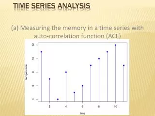
Beginnings • It is important to look at the series you are analysing before you start. • Draw a graph. • Look for the different components. • Think about what might be the best way of analysing it.
0 Look at: the trend the seasonal component the irregular
Table Use this to separate out all the components of the series.
Step 1 is to identify the trend: • Use a moving average to estimate a trend. • Because it is quarterly data, use an order of 4 initially. • Then centre the value by doing a moving average order 2. • In Excel you can do both columns in one go (see the next slide).
Click into the column next to the third data value (C9) Click the button to open the function box Choose AVERAGE or MEDIAN. Fill in the boxes by highlighting cells on your spreadsheet.
Fill down the column. Rounding: Rounded to 3sf (why?). Excel will use all the decimals in its calculations so rounding error is not a problem here.
Delete the last 2 trend values. You don’t have enough information for those moving averages. Colouring the cells helps to remind you not to use them.
Step 2 is to estimate the seasonal component: • Subtract out the trend to leave the estimated seasonal and irregular components. • Use a moving average to estimate the seasonal component value.
Calculate the seasonal and irregular values by subtracting the trend estimate from the raw data values, as shown below. You are removing the trend leaving these two components. This is called detrending! Fill down the column.
Other methods for finding seasonal components • For short time series an average across all the values for a season may be used to find the seasonal effect. • The moving average method is better for longer series where the seasonal pattern may be changing over the time. • That is why we will use this method for this data
[click on the first then hold down Ctrl to choose the others] Calculate a moving average over 3 values of the seasonal and irregular column for the quarter you want. (September in this case as it is the first quarter with a value in.)
Fill down, then copy and paste (values only) the nearest 4 values into the spaces. We are using the closest values as the best estimate of the missing ones. Do the same for the bottom 4 values.
Calculate the seasonally adjusted values. The seasonally adjusted column gives the values of the trend and irregular without the seasons. It is useful to compare the current value with values from previous seasons
Step 3 is to find a linear model for the trend: • Be aware that the linear trend line gives a simplified estimation of the trend. • Fitting a straight line to the whole length of your moving average trend gives you a model to estimate its slope. • We look at other possible models in the PowerPoint Extra for Experts.
Insert a new column at the start and put a count in it. Fill down past the end of your table
Highlight the next 3 columns and click on the graph icon to draw the line graph .
0 You can adjust it to look better if you want.
Estimating trend • This can be done in two ways • By looking at the moving average line at various points • By fitting a regression line. • The first way gives a more accurate estimate of the most recent trend.
0 Method 1 Notice that from September 1998 the moving average rises steadily. From the spreadsheet you can see that it rose $42 million over the 4 years to September 2002. So from September 1998 hardware sales rose by approximately $10.5 million per year.
Method 2 • Get excel to put a linear regression line on the data • This should be based on the moving average line. • This will give an estimate for the whole period of the series. • It may not be very accurate for the most recent values
On the graph, right click on a trend estimate data value and select Add trendline. Make sure that Trend Estimate is highlighted in the lower box. Click on options. Choose the option to display the equation.
0 Is the line a good model for forecasting terms in the series? How could you do a better one? The formula can be moved to be easier to see
0 Identify the trend in context The linear model for the trend line shows an increase in hardware sales of $1.01 million per quarter. This is approximately $4 million per year.
Step 4 is to calculate your forecast: • Use the formula from your model of the trend line. • This gives an estimate of the trend component. • Add back the seasonal component. • We will do an estimate for March 2004.
To forecast for March 2004 Make sure the count goes down to the quarter you want to forecast for.
Use the formula from your trend line to calculate the estimated trend value for March.
Add back the seasonal effects for March using the most recent March value.
Forecast In March 2004 the forecasted value for Retail Hardware sales using this model is $219 million (3s.f). This is calculated by substituting the number of periods since March 1991 into the formula for the trend. Then the seasonal adjustment for March is added back in. Forecast = 1.0125 x 53 + 167.51 -2.47 BUT: you need to be aware that your line did not follow the trend estimates very closely at the end. The next presentation looks at some ways of making better models.
A worked example of the report you could produce for Sales of Retail Hardware is available for you to check your results.
The End But see Extra for Experts!