Download
1 / 24
240 likes | 549 Vues
Website usability is about creating your website in such a manner that your website visitors can find what they're looking for quickly and easily. A usable website can bring in huge benefits on to your website and your business.

E N D
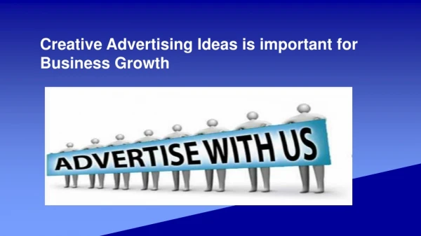
Website Usability Ideas for Business Growth - By CBIL360
Contents • Introduction about Usability • Definition of Usability • Navigation • Custom Error Pages • Image Map • Structure • Page Structure • Site Structure • Writing Content • Simplicity • Accessibility • Color Blindness • Consistency • Graphics • New Technology • Frames • Other Issues
Introduction about Usability • Usability is the key factor of web design. • If there is all very well having good looking dynamic web site, but if browsing time is too long or there are some difficulties in navigation then users will leave from your web page and visits other sites. • Users always want to find information for what they are looking for if they don’t find it quickly then they look it elsewhere.
Definition of Usability • Usability is a quality attribute for construction products and systems easier to use, and matching them more closely to user needs and requirements.
Usability is mentioned by 5 these quality parameters: • Learnability How much easy is it to learn for basic tasks for the first time for that they are encounter the web design? • Efficiency After all a user is learned web design, how easily they can accomplish their tasks. • Memorability When the users come back to design after a long period of time, how quickly they can achieve their proficiency in web design. • Errors How many errors are made by users, how critical are these errors, and how easily can they recover from these errors? • Satisfaction How cool and effective are these designs to use?
Navigation • Navigation is the key factor of an any website. It guides users to find their path, and tells them where they are and where they can go within the website. It shows a visual means for demonstrating the hierarchy of pages to be found. Good navigation often considered as good website structure. • Usually found in the following forms: • Navigation Panel • Location Indicator Device(Breadcrumbs) • Home button • Links • HTML Title • Sitemap • Search Facility • The 404 (and other error pages) • Graphics as navigation and/or links
Custom Error Pages Do you know, why custom error pages will be created? • Visitors get errors for different mistakes done by them while typing url. • It reflects your website branding. • It is a very useful navigation tools, helps visitors to stay on your website. • If the visitors do not get proper guidance from your site then they leave immediately from your website. Some of the custom error pages with error code and label are listed below : Error Code Label • 400 Bad Request • 401 Authorization Required • 403 Access Forbidden • 404 File Not Found • 500 Internal Server Error
Image Map • Image mappings are single graphics which possesses hotspot areas on them which have links which correspond to different web pages in the website. • Always try to provide textual links in addition to the image map • It helps to them who with graphics switched offin their browsers can view the links, and visually disabled people can use a speech synthesizer to follow the links properly.
Structure • In a website structure mainly consists of having good website structure, i.e, having a clean & logical structure to the website and good webpage structure, for which visitors realized the importance of different sorts of information on the web page.
Page Structure • There are many various type of page structure, probably depends upon the actual content within the web page. As with many factors of website design, the best effects come after experimentation. Use the Internet as a resource - copy your ideas you like most. But remember to consider usability. • Home page • It should be ideally designed different from sub pages. • Do not provide home button. • Clearly viewable company logo at the top left side of corner or other suitable place. • Provide proper navigation to sub pages. • Avoid vertical scrolling.
to be continued… • Top of the page navigation • It should have company logo or name of the site. • Should have links to the small version of site map which takes to the visitors to the previous page of the website. • Provide link to the home web page. • Navigation panel • Provides links to the other areas of website. • Use colored table cells which reinforces branding of a website. • Allow convenient space for content without affecting any part of a website.
to be continued… • Content area The text content area of a basic website page should be as in the following way: Page Title Sub Title(if necessary) paragraph, paragraph, paragraph, paragraph, paragraph, paragraph, paragraph, paragraph Next Important Heading paragraph, paragraph, paragraph, paragraph, paragraph, paragraph, paragraph, paragraph Subsequent Heading Should be smaller • Bullet points should be used for shorter lists • Bullet points should be used for shorter lists • Bullet points should be used for shorter lists
Site Structure • Simplicity and logically designed and structured are key aspects in site construction. • It enables easy navigation within the site links. • It should be hierarchical and will guide the user to get to more detailed information through the navigation. • Finally, the user should be able to reach all sub web pages of the site through any page.
Writing Content • As time is of the essence to most people using the Internet, so users don't waste time to read reams of text on-line. Research has proved that people tend to scan text on web page. • Keep it as little as possible. • Highlight important keywords or phrases. • Use listed points whenever possible. • Avoid so much vertical scrolling. • Avoid non-descriptive phrases like “click here”, provide proper meaning phrases to the links. • Avoid using <hr>, the horizontal tag to separate bodies of texts, instead use plenty of headings, sub headings, and white spaces. • Avoid centering texts as it is hard to read. • Don’t use all capitals, it’s harder to read.
Simplicity • It is the key aspect of usability. • Use headings and sub-headings properly to distinguish sections of texts. • Use white space properly make sure that there may be no more than 12 words per line. • Write effective short description – not as like an essay. • Highlight important keywords or phrases. • Use a pale and dark background with proper dark and light text. • Do not use colors with clash. • Specifically combinations which are difficult for color-blind people to read.
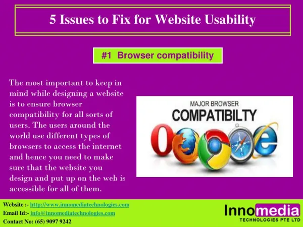
Accessibility • Accessibility to anyone, regardless of browser, platform, operating system, plug-ins is basically the most important aspect to consider when designing a site. Having proper accessible site, makes using your web site that much easier for visitor. Finally ease of use is equal to return visitors. • Confirm that your site is usable on main browser flavors and versions. • Make it usable without download plug-in for it. • Test your site at developing stage to checks it is properly working on various operating systems. • Use proper style sheets to divide style and text. • Use proper html tags to describe your text. • Confirm the colors you are using are not harmful for those who has color blindness.
Color Blindness • Around one in twelve internet surfer may be unable to use your site smoothly due to some form of color blindness. Basically, your web site will not look to a color blind people as designed it, perhaps, this shows that text is not-readable, navigation not-usable and texts are invisible. • Almost all color blind person unable to differentiate between shades of red and green • Such shades of colors view lighter to color blind people • Type of common forms in which color blindness are: • Protanopia – not able to accept red, and • Deuteranopia – not able to accept green • A rare form is found in: • Tritanopia – not able to accept blue
Consistency • Confirm that you surely placed navigation & design elements at consistent location. • Always try to place consistent with other site to helps your visitors. • Always try to place font style same throughout the site, keep this by using style sheet. • Links must be underlined and consistent colors for visited and unvisited. • Suggest an idea for that a link is within a site, or it redirect a user on different site or it is a mailto link.
Graphics • Utilize sparingly for that they add it to download time. • Always try to keep as small as in file and physical size as possible as you can. • Do not use navigation graphics if there are using several languages – it requires high maintenance. • Always try to provide width & height specification in the img source tag. • You must keep border=”0” in the img source tag because some of the browsers will display a blue border around the your provided image if it is a link. • You must have to provide descriptive alt text to the img source tag.
New Technology • Don’t try to use technology which has been introduced within two years. • Don’t try to develop a site where for which users have to download software to view it. • If you are trying to develop new technology enabled site identify usability issues regarding all kinds of website. • Find out your website statistics to confirm that how many of your users have familiar with most recent plug in previous to designing your website.
Frames • Always try to keep away from frames. • They are hard to maintain. • Unable to bookmark each web pages. • Do not co-operate to search engine to spider your site.
Other Issues • Check your website on different types of browser and on also window sizes. • Set your web pages through an HTML validation such as – http://www.validator.w3.org/ • Avoid using underlined text as users consider it as link. • Avoid using punctuation marks (like comma etc) in hyperlink – it looks unprofessional. • Avoid providing new browser window (<a href target=_blank" ...>) to users it don’t provide back button facility in their browser, finally visitors throw away from your site.