Download
1 / 25
300 likes | 548 Vues
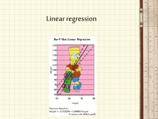
Linear Regression In Excel. Linear Regression. In this presentation you will learn the following: How to make a scatter plot in Excel (Click Here ) How to add the line of best fit (or trend line) to your scatter plot (Click Here )

E N D
Linear Regression • In this presentation you will learn the following: • How to make a scatter plot in Excel (Click Here) • How to add the line of best fit (or trend line) to your scatter plot (Click Here) • How to put multiple best fit lines on the same graph (Click Here)
Linear Regression • Open an Excel file and type the data on page 41 of your workbook
Linear Regression • Click Insert, then Chart
Linear Regression Click Next
Linear Regression Click Next
Linear Regression Click
Linear Regression • And the results . . .
Linear Regression • Left-click on a data point. You’ll see that several of the data points are highlighted.
Linear Regression • Once you selected your data points, right-click, choose “Add Trendline”
Linear Regression • We want a linear trendline since the plotted data appears be linear Click Click
Linear Regression Click Click
Linear Regression • And the results . . .
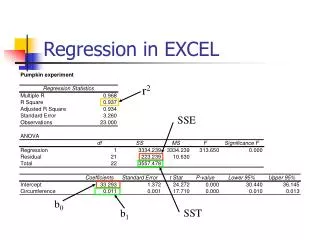
Linear Regression • A word about the correlation coefficient (R): • Excel can only display the square the correlation coefficient • To find the correlation coefficient value you need to take the square root • Then, depending on whether the slope of of your trendline is positive or negative you’ll be able say whether R is positive or negative
Linear Regression • What if we wanted to add multiple trendlines to the same graph? • The U of A Factbook contains interesting information about the demographics of the university
Linear Regression • An excerpt of data is shown below:
Linear Regression • Let’s suppose we wanted to compare the trends of resident and non-resident tuition and fees from 1995 to 2004 • Go ahead and type in the data in a blank Excel worksheet
Linear Regression • Your data should look something like:
Linear Regression • Making the scatter plots Highlight the cells where the resident values are stored Click Click
Linear Regression Since we’re going to plot two sets of data we’ll want to title our plot of the residents Highlight cells where the years are stored Click add to so we can do the same thing for the non-residents
Linear Regression Title this plot of the non-residents Highlight the cells where the year values are stored Highlight Non-Resident Tuition & Fee values Click
Linear Regression • Title your plots as shown below: Click
Linear Regression • And the results . . .
Linear Regression • Now as before, click on the data points for each plot and add a trendline • The results of this are displayed on the next slide
Linear Regression • And the results . . .