Download
1 / 17
170 likes | 457 Vues
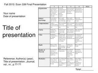
Fall 2013: Econ 339 Final Presentation. Your name Date of presentation. Title of presentation. Reference: Author(s) (year), Title of presentation, Journal , vol., nr., p.??-??. Total:_________. Requirements.

E N D
Fall 2013: Econ 339 Final Presentation Your name Date of presentation Title of presentation Reference: Author(s) (year), Title of presentation, Journal, vol., nr., p.??-?? Total:_________
Requirements • Copy the first page of this PowerPoint file into your presentation, so that it starts with the grading rubric!! • You have 7 minutes to present followed by 3 minutes for discussion. • The maximum number of slides you’ll be able to cover is around 7 to 8. • I recommend you don’t have more than 7 slides, otherwise you won’t be able to finish • You will have to hand in the slide presentation to get full credits
Tips • Check the grading rubric on the first page • Don’t read off the slides! Use note cards if necessary • Speak loud and clearly and not too fast • Take it serious • Be careful making jokes. It is very easy to come across as insincere etc. if your presentation is “too funny”. You want to avoid that in a professional setting where you do not know the audience (most of the times)
More tips • What follows are some tips/suggestions about how to make “good” slides
This is too much – it looks crowded • Use of contemporary data is problematic because many factors are correlated with housing segregation along with distance to medical facilities • It is better to examine a historical “natural experiment” • Racial integration of hospitals in the American South in the 1960s • Integration was mandated by the federal government as a condition of accepting Medicare funding • Chay, Almond and Greenstone (2007) show that hospital integration lowered the black-white infant mortality gap in Mississippi
This is better • Eligibility expansions have not achieved universal coverage for low-income teens • Individual mandate could potentially make a large difference • But, many low-income teens would be exempt from mandates • Other policy options: • outreach efforts targeting schools; • engage community partners who work with teens;
Figures and Graphs • Here are some examples of good and bad graphs
Use Figures and Graphs when possible. This one looks a bit boring though
This is a good graph as well 1959-61 Vehicle Mortality 1968-70 Vehicle Mortality
1963 1966 1967 1971 White: Cool graph!! Black
Tables • Here are some examples of good and bad tables
Have a conclusion - example • Mississippi: In 1960s a black motorist seeking medical attention after a car accident might have to travel 50-60 miles to get to a hospital • Racial integration substantially lowered distance to the nearest hospital for black motorists • Distance mattered: motor vehicle fatalities were lower if a hospital was close by