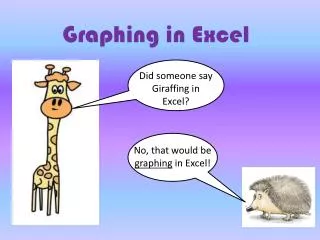
Graphing in Excel
Did someone say Giraffing in Excel?. Graphing in Excel. No, that would be graphing in Excel!. Well, that sounds fun too. Oh, yes. It’s quite rewarding . Let’s begin. First you need some data to graph. Since this is your first time, we will supply you with some data.

Graphing in Excel
E N D
Presentation Transcript
Did someone say Giraffing in Excel? Graphing in Excel No, that would be graphing in Excel!
Well, that sounds fun too. Oh, yes. It’s quite rewarding.
Let’s begin. First you need some data to graph. Since this is your first time, we will supply you with some data. This is real data from the giraffe population of Niger. Now you’re talking!!
Giraffe Population in Niger over Time There used to be thousands of giraffes in Niger. In 1996, there were only 50 left . Many people have worked hard to help save these giraffes from extinction.
Since this data shows how the population changed over time, we are going to make a line graph. I’m cool with that. Okay..
Open up the Excel Program. It will look like this:
Entering data into a spread sheet. • Data should be entered vertically. 2. The independent variable should go in the first column. 3. The dependent variable should go in the second column. In this study, which is the independent variable? If you said the date, you are correct. The population of giraffe depends on what year it is because it changed over time. The number of giraffes was determined by measuring (counting them!)
Okay, let’s do it! • In the top left box, ‘1A,’ write the word year. Like this! year
2. In the box directly to the right of that, type the word ‘giraffes.’ Like this! giraffes year
3. Now enter each value for year and the corresponding number of giraffe. Make sure they are lined up correctly. Fun, right? 1996 50 2000 87 142 2006 2009 200 2010 310
Now we’re going to make the graph. Move your mouse over the columns of data starting at the upper left until you have highlighted all the data. (Don’t include the headings, just the numbers!) They meant me, silly! Did someone say Mouse?!
On the tabs on top, click on “Insert.” After you click, you will see a colorful collection of charts.
Tada! It makes a graph for you: But we’re not done yet!
It should have changed to look like this: You must always give your graph a title and label both axes. This is the ‘’y” axis. This is the ‘’x” axis.
Just click on them one by one and type in this title and these labels: And click on this and delete it.
Your graph should look like this: You can change the color if you want.
Do you think the giraffe conservation efforts in Niger are succeeding? I always look up to you! We have a way to go, but things are looking up!
The End! Giraffe population data from Association for the Safeguard of Giraffes of Niger (ASGN).