How to Create Interactive Data Visualization Story?
The power and importance of storytelling applies to visualization of data. More than often, charts, spreadsheets and other visualization are not appropriate; but the story is.

How to Create Interactive Data Visualization Story?
E N D
Presentation Transcript
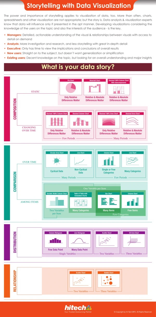
Storytelling with Data Visualization The power and importance of storytelling applies to visualization of data, too. More than often, charts, spreadsheets and other visualization are not appropriate; but the story is. Data analysts & visualization experts know that data will influence only if presented in the apt manner. Developing visualizations considering the knowledge of the users on the topic and also the interests of the audience - is the key. • Managers: Detailed, actionable understanding of the visual & relationships between visuals with access to detail on demand • Analysts: More investigation and research, and less storytelling with great in-depth detail • Executive: Only has time to view the implications and conclusions of overall results • New users: Straight on to the subject, but doesn’t want generalization or simplification • Existing users: Decent knowledge on the topic, but looking for an overall understanding and major insights What is your data story? Pie Chart Waterfall Chart Stacked 100% Column Chart With Subcomponents STATIC Only Relative Differences Matter Relative & Absolute Differences Matter Relative & Absolute Differences Matter COMPOSITION Stacked 100% Column Chart Stacked Column Chart Stacked 100% Area Chart Stacked Area Chart CHANGING OVER TIME Only Relative Differences Matter Relative & Absolute Differences Matter Only Relative Differences Matter Relative & Absolute Differences Matter Few Periods Many Periods Circular Area Chart Line Chart Column Chart Line Chart OVER TIME Non-Cyclical Data Single or Few Categories Cyclical Data Many Categories COMPARISON Many Periods Few Periods One Variable per Item Variable Width Column Chart Table of Table with Embedded Charts Bar Chart Column Chart AMONG ITEMS Many Categories Many Items Few Items Two Variables per Item Few Categories DISTRIBUTION Column Histogram Line Histogram Scatter Chart 3D Area Chart Few Data Point Many Data Point Three Variables Single Variables Two Variables RELATIONSHIP Scatter Chart Bubble Chart Two Variables Three Variables © Copyright by Hi-Tech BPO. All Rights Reserved. Your Trusted Outsourcing Partner