Download
1 / 31
310 likes | 337 Vues
This lecture covers the principles of simplicity and contrast in graphic design for user interfaces, including techniques for reduction, regularity, and double-duty. It also explores the concepts of chunking, visual variables, and gestalt principles of grouping.

E N D
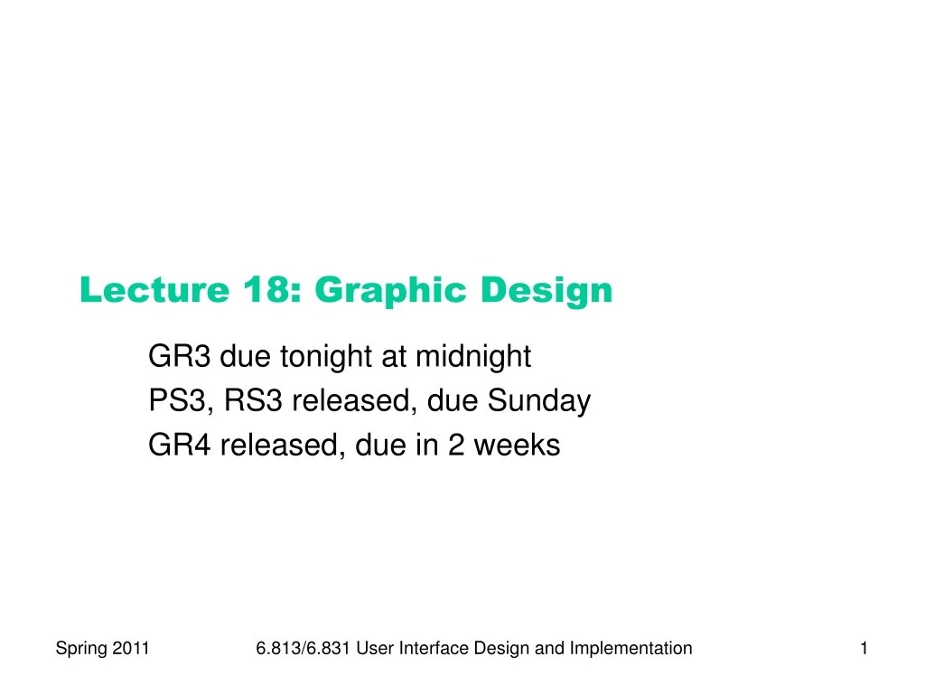
Lecture 18: Graphic Design GR3 due tonight at midnight PS3, RS3 released, due Sunday GR4 released, due in 2 weeks 6.813/6.831 User Interface Design and Implementation
UI Hall of Fame or Shame? 6.813/6.831 User Interface Design and Implementation
Nanoquiz closed book, closed notes submit before time is up (paper or web) we’ll show a timer for the last 20 seconds 6.813/6.831 User Interface Design and Implementation
10 12 13 14 15 11 17 18 19 20 16 1 3 4 5 6 2 8 9 0 7 A good prototyping technique for evaluating efficiency is: (choose one best answer) A. task analysis B. scenario C. computer prototype D. paper prototype E. Wizard of Oz Which of the following are advantages of paper as a prototyping technique? (choose all good answers) A. It’s cheaper than coding B. A paper prototype can’t be shipped as the final product C. Users may act more deliberately when using a paper prototype D. Hand-sketching encourages different kinds of feedback from users Suppose you’re designing a new tab bar for Internet Explorer, and you build a paper prototype of the tab bar. Which of the following areas will have the best fidelity in this prototype? (choose one best answer) A. look B. feel C. breadth D. depth 6.813/6.831 User Interface Design and Implementation
Today’s Topics • Human perception • Chunking • Visual variables • Gestalt principles of grouping • Graphic design guidelines • Simplicity • Contrast • White space • Balance • Alignment 6.813/6.831 User Interface Design and Implementation
Simplicity • “Perfection is achieved not when there is nothing more to add, but when there is nothing left to take away.” • Antoine de St-Exupery • “Simplicity does not mean the absence of any decor… It only means that the decor should belong intimately to the design proper, and that anything foreign to it should be taken away.” • Paul Jacques Grillo • “Keep it simple, stupid.” (KISS) • “Less is more.” • “When in doubt, leave it out.” 6.813/6.831 User Interface Design and Implementation
Techniques for Simplicity: Reduction • Remove inessential elements 6.813/6.831 User Interface Design and Implementation
Techniques for Simplicity: Regularity • Use a regular pattern • Limit inessential variation among elements 6.813/6.831 User Interface Design and Implementation
Techniques for Simplicity: Double-Duty • Combine elements for leverage • Find a way for one element to play multiple roles title bar scrollbar thumb help prompt selection handles 6.813/6.831 User Interface Design and Implementation
Chunking • “Chunk”: unit of perception or memory • Chunking depends on: • What you already know • How the information is presented Hard: M W B C R A L O A B I M B F I Easier: MWB CRA LOA BIM BFI Easiest: BMW RCA AOL IBM FBI • 3-4-character chunking is good for presenting unrelated digits or letters 6.813/6.831 User Interface Design and Implementation
value hue shape orientation Contrast & Visual Variables • Contrast encodes information along visual dimensions texture position size 6.813/6.831 User Interface Design and Implementation
Characteristics of Visual Variables • Scale = kinds of comparisons possible • Nominal (=) • All variables • Ordered (<, >) • Ordered: position, size, value, texture granularity • Not ordered: orientation, hue, shape • Quantitative (amount of difference) • Quantitative: position, size • Not quantitative: value, texture, orientation, hue, shape • Length = number of distinguishable levels • Shape is very long (infinite variety) • Position is long and fine-grained • Orientation is very short (~ 4 levels) • Other variables are in between (~ 10 levels) 6.813/6.831 User Interface Design and Implementation
Selectivity • Selective perception: can attention be focused on one value of the variable, excluding other variables and values? • Selective: position, size, orientation, hue, value, texture • Not selective: shape 6.813/6.831 User Interface Design and Implementation
N N Z M Z M K N M K K Z N N K M M Z M K K Z N K Z N M Z M M N K M N K Z N K K Z N M 6.813/6.831 User Interface Design and Implementation
Associativity • Associative perception: can variable be ignored when looking at other variables? • Associative: position, hue, value, texture, shape, orientation • Not associative: size, value • Small size and low value interfere with ability to perceive hue, value, texture, and shape 6.813/6.831 User Interface Design and Implementation
Techniques for Contrast • Choose appropriate visual variables • Use as much length as possible • Sharpen distinctions for easier perception • Multiplicative scaling, not additive • Redundant coding where needed • Cartoonish exaggeration where needed • Use the “squint test” 6.813/6.831 User Interface Design and Implementation
Choosing Visual Variables for a Display 6.813/6.831 User Interface Design and Implementation
Designing Information Displays 6.813/6.831 User Interface Design and Implementation
Contrast in Publication Styles Title Heading This is body text. It’s smaller than the heading, lighter in weight, and longer in line length. We’ve also changed its shape to a serif font, because serifs make small text easier to read. Redundant encoding produces an effective contrast that makes it easy to scan the headings and distinguish headings from body text.1 1This is a footnote. It’s even smaller, and positioned at the bottom of the page. Figure 1. This is a caption, which issmaller than body text, and set off by position, centering, and line length. 6.813/6.831 User Interface Design and Implementation
Simplicity vs. Contrast max 75% 50% 25% min Tukey Tufte #1 Tufte #2 6.813/6.831 User Interface Design and Implementation
Contrast Problems Source: Interface Hall of Shame 6.813/6.831 User Interface Design and Implementation
White Space • Use white space for grouping, instead of lines • Use margins to draw eye around design • Integrate figure and ground • Object should be scaled proportionally to its background • Don’t crowd controls together • Crowding creates spatial tension and inhibits scanning 6.813/6.831 User Interface Design and Implementation
Crowded Dialog Source: Mullet & Sano, p. 110 6.813/6.831 User Interface Design and Implementation
Using White Space to Set Off Labels (b) (a) Source: Mullet & Sano, p. 96 6.813/6.831 User Interface Design and Implementation
The Gestalt Principles of Grouping • Gestalt principles explain how eye creates a whole (gestalt) from parts proximity similarity continuity closure area symmetry 6.813/6.831 User Interface Design and Implementation
White Space Avoids Visual Noise 6.813/6.831 User Interface Design and Implementation
Balance & Symmetry • Choose an axis (usually vertical) • Distribute elements equally around the axis • Equalize both mass and extent 6.813/6.831 User Interface Design and Implementation
Symmetry Example 6.813/6.831 User Interface Design and Implementation
Alignment • Align labels on left or right • Align controls on left and right • Expand as needed • Align text baselines 6.813/6.831 User Interface Design and Implementation
Grids Are Effective Source: Mullet & Sano, p. 165 6.813/6.831 User Interface Design and Implementation
Summary • Use contrast to emphasize important distinctions • Choose appropriate visual variables • Squint test • Simplify unimportant distinctions • Remember Gestalt grouping • Alignment, balance, symmetry 6.813/6.831 User Interface Design and Implementation