Download
1 / 3
30 likes | 180 Vues
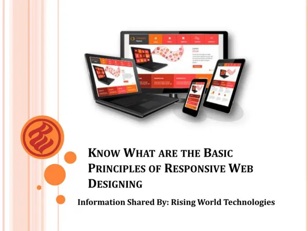
Responsive web design is a great way to develop websites that work on multiple screens.

E N D
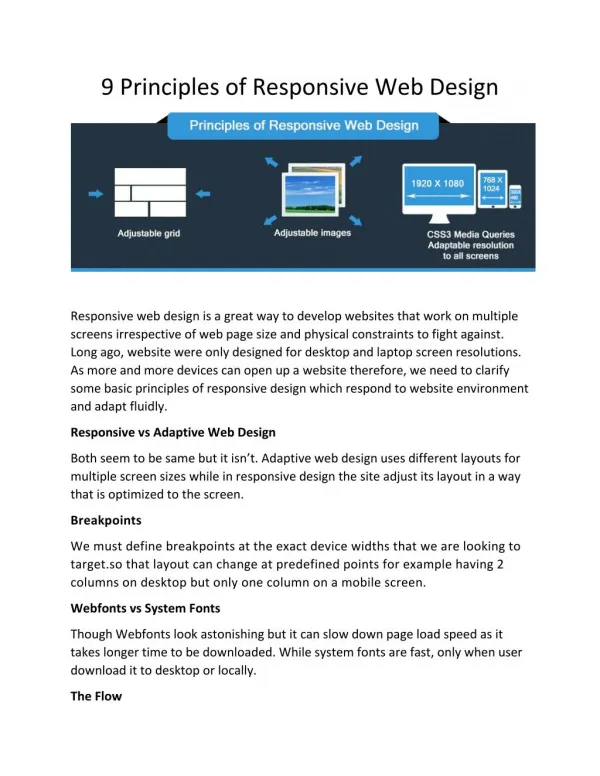
9 Principles of Responsive Web Design Responsive web design is a great way to develop websites that work on multiple screens irrespective of web page size and physical constraints to fight against. Long ago, website were only designed for desktop and laptop screen resolutions. As more and more devices can open up a website therefore, we need to clarify some basic principles of responsive design which respond to website environment and adapt fluidly. Responsive vs Adaptive Web Design Both seem to be same but it isn’t. Adaptive web design uses different layouts for multiple screen sizes while in responsive design the site adjust its layout in a way that is optimized to the screen. Breakpoints We must define breakpoints at the exact device widths that we are looking to target.so that layout can change at predefined points for example having 2 columns on desktop but only one column on a mobile screen. Webfonts vs System Fonts Though Webfonts look astonishing but it can slow down page load speed as it takes longer time to be downloaded. While system fonts are fast, only when user download it to desktop or locally. The Flow
As your screen gets smaller, you site content must start to take up more vertical space or anything below will be pushed down. Relative Units Previously, websites have been designed in terms of pixels and are called static units that are seen the size no matter what the size of the resolution. For a responsive site, we need units that are flexible or can work on any screen type. That is those that auto adjust to fit the screen of the user depending on the used resolution. These units are called relative units. Nested Objects Wrapping up elements in a container makes your design become more understandable, clean and tidy. Max and Min Values Must take Min/Max values help, because having a width 100% means same content will stretch to the whole width of your TV screen but looks less effective as on a mobile device ,on the other , using max width of 100px, means content would fill the screen but don’t go over 100px. Mobile or Desktop First Technically, you can start your project either with desktop first or mobile first. Or some designers start from both ends but it doesn’t matter. Choose what really works for you best. Bitmap images Vs Vectors Use bitmaps if your site contains icons with lot of details and fancy effects otherwise go to vector image. But some old browsers won’t support it so choose wisely according to the needs of your project. Read more here Responsive web design tools. Feel free to add your comments below.