Mastering PowerPoint: Avoiding Presentation Pitfalls for Effective Communication
Discover common mistakes to avoid when using PowerPoint in presentations. Learn how to effectively use slide animations and text to engage your audience. Explore the importance of minimalism in text and visuals, ensuring your message is clear and impactful. Understand how to use bullet points as speaking cues while refraining from reading slides verbatim. Gain insight on appropriate use of graphics and backgrounds, and discover strategies to keep your audience focused and attentive throughout your presentation.

Mastering PowerPoint: Avoiding Presentation Pitfalls for Effective Communication
E N D
Presentation Transcript
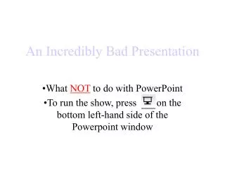
An Incredibly Bad Presentation What NOT to do with PowerPoint To run the show, press on the bottom left-hand side of the Powerpoint window
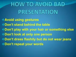
Slide Animations • Watch the sound effects! (Less is more) • Text animations that take too long don’t help either! • Keep text to a minimum. If you try to give them everything on one screen, they’ll spend more time reading the slide and less time LISTENING TO YOU!
Slide Text • Use bullets as speaking points • Try to avoid reading your slides (it “dumbs down” the presentation) • Thoose red lynes that apear beloh text wen you ar writing yur slide are tellling yu somting. (Embarrassing, isn’t it?) • Know your text, have a copy of your slide in front of you. • It’s very hard (and poor form) to have more than six bullets per slide • More than six will cause you to have to break the text size rule of no less than 32 points for clarity(yeah right, like you can read this from 100 feet away!) • Usecolorforemphasis, notstyle, in text. • Vary Serif and Sans Serif in papers, not in slides (it is too distracting).
Graphics • Be sure graphics are appropriate to your topic. If you have to explain I, don’t use it! • Use small (file size ) graphics for best results • Backgrounds should be chosen carefully!
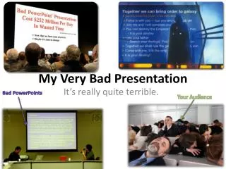
Thank you very much!If you want people to ignore you after your presentation, be sure to put a lot of text on the last slide, like contact information. You can almost guarantee a fast exit this way.(Use a plain black slide instead)