Learning Intention: To interpret pie charts
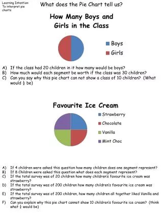
Learning Intention: To interpret pie charts. What does the Pie Chart tell us?. If the class had 20 children in it how many would be boys? How much would each segment be worth if the class was 30 children? Can you say why this pie chart can not show a class of 10 children? (What would ½ be).

Learning Intention: To interpret pie charts
E N D
Presentation Transcript
Learning Intention: To interpret pie charts What does the Pie Chart tell us? • If the class had 20 children in it how many would be boys? • How much would each segment be worth if the class was 30 children? • Can you say why this pie chart can not show a class of 10 children? (What would ½ be) • If 4 children were asked this question how many children does one segment represent? • If 8 Children were asked this question what does each segment represent? • If the total survey was of 20 children how many children’s favourite ice cream was strawberry? • If the total survey was of 200 children how many children’s favourite ice cream was strawberry? • If the total survey was of 200 children, how many children all together liked Vanilla and strawberry? • Can you explain why this pie chart cannot show 10 children’s favourite ice cream? (think what ¼ would be)
What does the Pie Chart tell us? Learning Intention: To interpret pie charts • This pie chart shows how 20 children got to school. • How many children walk to school? • B) How many children catch the bus to school? • C) How many children get a lift to school? • This pie chart shows how 80 children got to school. • How many children prefer xbox? • B) How many children prefer Playstation 3? • C) How many children prefer DS?
Learning Intention: To interpret pie charts What does the Pie Chart tell us? • This pie chart shows 40 children’s favourite lessons. • How many children ‘s favourite lesson is UCT? • How many children ‘s favourite lesson is Games? • How many children ‘s favourite lesson is Literacy? • How many more children like ICT than Literacy? • What fraction of the children prefer Maths? • This pie chart shows 120 children’s favourite sport. • How many children ‘s favourite sport is Football? • How many children ‘s favourite sport is basketball? • If there were twice as many children in the survey how many children ‘s favourite sport would be swimming? • What fraction of the children liked badminton the most?
Learning Intention: To interpret pie charts Here is a pie chart. Make up your own story to explain what the pie chart shows. Set 5 questions for your partner to answer about the chart, you must be able to answer the questions your self.