Spot Misleading Graphs in Data Display
150 likes | 245 Vues
Master the skill of identifying and analyzing misleading graphs to interpret information accurately. Learn how data distortion can influence perceptions and how to prevent misinterpretations. Find solutions to redraw graphs to ensure clarity and honesty in visual data representation. Enhance your graph analysis skills and avoid falling victim to misleading visual presentations.

Spot Misleading Graphs in Data Display
E N D
Presentation Transcript
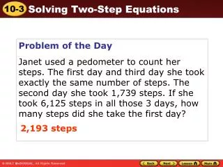
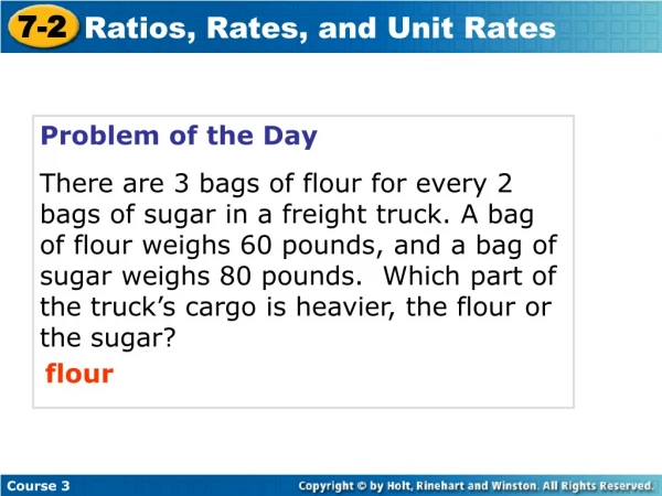
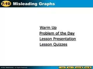
Warm Up Problem of the Day Problem of the Day Lesson Presentation Lesson Quizzes
Warm Up Use the graph for Questions 1-3. 1. What network had the most viewers? 2. What network had the fewest viewers? 3. What network(s) had about the same viewer ship? ABC FOX CBS, NBC
Problem of the Day A bar graph has vertical axis intervals of 6. How would the graph look if the intervals were twice as large? It would be half as tall.
A data display that distorts information in order to persuade can be misleading. An axis in a graph can be “broken” to make the graph easier to read. However, a broken axis can also be misleading. In the graph at right, the cost per minute for service with Company B looks like it is twice as much as the cost for service with Company A. In fact, the difference is only $0.10 per minute.
Additional Example 1 Both line graphs show the high temperature Monday through Friday. Which graph could be misleading? Why? The graph at right could be misleading. It gives the impression of greater temperature change because the vertical axis does not begin at zero.
Which graph could be misleading? Why? Average Restaurant Meal Price Graph A Graph B 20 15 10 5 0 25 20 15 10 5 Price per meal Price per meal Gino’s Gino’s Village Grill Pasta City City Diner Village Grill Pasta City City Diner Check It Out: Example 1 Graph B could be misleading. The vertical axis does not begin at zero, so differences in scales appear greater.
Additional Example 2A: Analyzing Misleading Graphs Explain how you could redraw the graph so it would not be misleading. Draw the entire vertical scale on the graph.
Additional Example 2B: Analyzing Misleading Graphs Explain how you could redraw the graph so it would not be misleading. Draw the vertical scale with equal spacing between marks so that the distance between 0 and 18,000 equals the distance between 18,000 and 36,000.
Taxicab Fares 13 12 11 10 Fare ($) Mon Tue Wed Thu Fri Check It Out: Example 2A Explain how you could redraw the graph so it would not be misleading. Draw the entire vertical scale on the graph. The vertical axis is broken, so differences in fare appear greater.
Water Consumed 48 40 32 24 16 Ounces of Water Mark Frank Mila Yvonne Check It Out: Example 2B Explain how you could redraw the graph so it would not be misleading. Draw the entire vertical scale on the graph. The vertical axis does not start at zero so differences in water consumed seem greater.
Lesson Quizzes Standard Lesson Quiz Lesson Quiz for Student Response Systems
Lesson Quiz Explain why each graph could be misleading and why. 1. 2. The scale does not start at 0, so it looks like fewer people like each type of animal. The vertical scale on the graph is not small enough to show the changes.
Lesson Quiz for Student Response Systems 1. Explain why the graph could be misleading. A. The vertical axis is broken, so it looks like fewer people like each type of drink. B.The vertical scale is not small enough to see differences. C. The intervals are not equal to compare the frequencies. D. The vertical axis does not begin with zero.
Lesson Quiz for Student Response Systems 2. Explain why the graph could be misleading. A. The vertical axis is broken, so difference in the number of birds appears smaller. B.The scale of the graph is not divided into equal intervals, so differences in the number of birds appear less than the actual. C. The vertical scale is not small enough to show the actual differences.