Guidelines for Visual Aids and Presentations Suggestions for Presenters
190 likes | 376 Vues
Guidelines for Visual Aids and Presentations Suggestions for Presenters. Society of Quality Assurance 2004 Annual Meeting Guidance. M. Rosenberg/L. Kvasnicka June 1998 Revised: R. Fuller/C. Kryzanauskas March 1999 Revised: M. Lander April 2003.

Guidelines for Visual Aids and Presentations Suggestions for Presenters
E N D
Presentation Transcript
Guidelines for Visual Aidsand PresentationsSuggestions for Presenters Society of Quality Assurance 2004 Annual Meeting Guidance M. Rosenberg/L. Kvasnicka June 1998 Revised: R. Fuller/C. Kryzanauskas March 1999 Revised: M. Lander April 2003
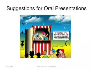
We’d Like Your Presentation to Go As Smoothly As Possible So We Hope You Don’t Mind a Few Suggestions...
General Tips • In general, • Use several bullet points that target the topic • Do not use a lot of text/verbiage • Simple is better • Mix text and figures • Get to the point within the first two minutes • Address the topic to the relevancy of the audience
Visual Aid Formatting • PowerPoint presentations are preferred over overheads or 35mm slides • Slides must be visible and legible at the back of the room -- a distance of 150 ft. • View your presentation as a slide show. Use an audience if possible. If slides are visible on the monitor, they should be visible in the room.
Visual Aid Formatting • Use several simple slides instead of one complicated slide • Limit wording to either 15 to 30 words or six to seven items per slide • Use the horizontal (landscape) mode. • Leave a space -- at least the height of a capital letter -- between lines.
Visual Aid Formatting • Use large, easy-to-read fonts and sizes • Use clip art, sparingly, to add interest • For data, graphs usually show better than tabular data • Use graphs to convey trends, comparisons, and relationships • Use tables when precise numbers must be presented. Keep tables to a minimum and follow rules of size
Remember the Audience • Slides are meant to be read • Not everyone is in front (base visibility needs for a room ~ 150 feet in length) • Rooms can be very large • Lighting can vary
Fonts • SIZE DOES MATTER • you are not writing a manuscript... • But bigger doesn’t always mean better • Font style is as important as size • Sans serif fonts (such as Arial) are easier to read
Use Style • Some fonts can be difficult to read • Even when you increase the size • Test before you commit! • “Trimmings” can also blur your message • Instead of changing fonts, change bullets • DO NOT USE “ALL CAPS”
Bulleting Items • Vary the size, shape, and color of the bullets • 125% larger than text, complimentary color • 150% larger than text, complimentary color • variation on a theme! • Bullets can make your slides personal • Choose bullets that fit your topic
Tables are best when precise numbers are needed Use a maximum of six lines or columns Use abbreviations Column titles should be horizontal Encase the table in a box Only have one number per cell Use percentages instead of a number or count, unless % is misleading (such as small sample size) Tabular Formats
CAUTION! • Do not use busy backgrounds • Color becomes more critical • Be sure to test before you commit • You can be creative and still be clear • Experiment!!!
PowerPoint looks best with: medium colored backgrounds light (not white) text Overheads look best with: Light background Dark text Consider the fact of COLORBLINDNESS Use blue, orange or yellow Do not use red and green together Color Suggestions Endo Pharmaceuticals Inc. Confidential
Spacing Comparison Keep the elements of the slides closer to each other than to the border of the slide. “White space” surrounding the elements will draw attention to them. Keep the elements of the slides closer to each other than to the border of the slide. “White space” surrounding the elements will draw attention to them.
Organization • The larger and more concentrated the central elements of your slide are, the more attention they will get. • Conversely, smaller and more dispersed elements will not get noticed.
General Presentation Hints • Do not apologize for your presentation; do not mention errors unless they are misleading • Don’t be distracted by your slides during the presentation: • Use the laser pointer sparingly • Don’t talk to the screen • Don’t keep one slide up too long • Use transitions to keep the presentation flowing • Use a mouse to run slides and keep facing the audience
Ready, Set, Go! • Send your presentation electronically to your session chair ahead of the meeting. This will ensure the presentation is ready when you are. • Bring overheads and the file on disk in the event of an equipment failure. • There will be a “speaker ready room” available for you to preview and arrange your presentation.
Ready, Set, Go! • Present yourself to the session chair at least 15 minutes prior to the session start. • Meet with the session volunteer in the meeting room to discuss your presentation needs. • Please stay on schedule. We must adhere to the time frame to be fair to all speakers. • Relax, have fun, enjoy the audience!
Thank you for your participation! • If you have questions on this guidance, please contact: Your Session Chair