Download
1 / 23
230 likes | 369 Vues
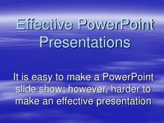
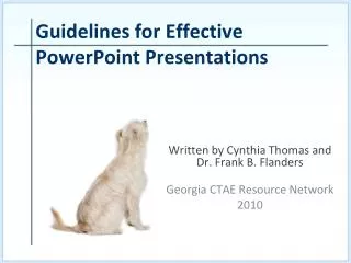
Written by Cynthia Thomas and Dr. Frank B. Flanders Georgia CTAE Resource Network 2010. Guidelines for Effective PowerPoint Presentations. Objective. Students will be able to explain 10 guidelines for preparing effective PowerPoint presentations. Is this how you want the audience to look?.

E N D
Written by Cynthia Thomas and Dr. Frank B. Flanders Georgia CTAE Resource Network 2010 Guidelines for Effective PowerPoint Presentations
Objective Students will be able to explain 10 guidelines for preparing effective PowerPoint presentations.
Is this how you want the audience to look? Of course not! Follow the guidelines (Rules of Thumb) to help prepare informative and interesting presentations.
Whatis a Rule of Thumb? A guide that is not intended to be strictly accurate or reliable for every situation. Note: “Rule of Thumb” originated with carpenters who used their thumb to estimate measurement.
Rule of Thumb #1 • Organize! • Presentations should be well organized.
Rule of Thumb #1 Continued… Your presentation should generally consist of Title Slide Objectives: state what you want your audience to learn Body:the content of your message Summary: a shortened version of the message
Rule of Thumb #2 FONT SIZE Can you read this well? (11pt) How about this? (16pt) And now? (24pt) And now? (36pt) • Use large legible fonts. • Generally 24+ for text & 32+ for Headers
Rule of Thumb #2 Continued… • Some audience members may be sitting several yards away from the screen. Don’t make them squint! • Arial, Tahoma, Times New Roman, &Verdana are easy to read and compatible with most computers.
RuleofThumb #4 • Minimize text on slides. • Generally, only 7 lines with 7 wordsper line for each slide Don’t just read to your audience!
Rule of Thumb #4 Continued • Keep your audience alert!!! • Do not put everything you plan to say in your presentation or your audience may just hear…“blah, blah, blah…”
Rule of Thumb #4 Continued… The slides should summarize main points. If you need detailed notes for your presentation, use the “speaker notes” section at the bottom of each PowerPoint slide.
Rule of Thumb #5 Use appropriate designs and complementary colors. Generally no more than three colors on one slide. Be careful with photo backgrounds as often text can become illegible as the colors change.
Rule of Thumb #6 Use animations and sounds sparingly and with care. Animated pictures may seem cool but can distract your audience and detract from the presentation’s professionalism.
Rule of Thumb #6 Continued… Pretty Cool, Huh! Not distracting at all! Do you even know what the presenter just said?
Rule of Thumb #7 Use images to add interest. Make sure that images are appropriate, and that they help convey the message.
Rule of Thumb #7 Continued… • This slide is to show that English Bulldogs can be intimidating to strangers and are great guard dogs. • Is this image representative of the message?
Rule of Thumb #8 Check and then double check for grammatical and spelling errors.
Rule of Thumb #8 Continued • You slide presentaion is finishd! The colors look great, the slide design is profesional and appropriat for your topic.. You have some colorfull, pictures that add just the right amount of pizaz!!! • Now it is time to go present it! It is gonna be incredble!!!! The audeience is going to be blone away! Did you see the mistakes? They are revealed on the next slide.
Rule of Thumb #8 Continued • Your slide presentaion is finishd! The colors look great, the slide design is profesional and appropriat for your topic.. You have some colorfull, pictures that add just the right amount of pizaz!!! • Now it is time to go present it! It is gonna be incredble!!!! The audeience is going to be blone away!
Rule of Thumb #9 Use charts and graphs as visuals for data. Charts and graphs can be great tools to organize data. Make sure they are accurate and easy for the audience to read. Excel is a great tool for creating charts and graphs!
Charts & graphs should show information in an easy to understand and representative manner. Rule of Thumb #9 Continued… Are these easy to understand?Which is more useful for understanding the data?
Rule of Thumb #10 Keep it simple. Your presentation should not be a display of every feature of PowerPoint.
Summary Remember, your presentation is about your topic, not the slide show! Your audience should remember the things you said, not “how cool” your slide show was!