Student 5: Low Achieved
Low. Achieved. Late night. Creative are a design company from North Carolina in the USA. They specialize in creating unique and effective logos for businesses to help them stand out in today's over-communicated world. The company fosters open collaboration with clients to ensure that the design process is rewarding and aligns with the clients' demands, resulting in impactful solutions. Their diverse range of clients benefit from innovative design strategies aimed at capturing market attention and leaving a lasting impression. Explore a selection of their client identities and be inspired by their attention to detail and creativity.

Student 5: Low Achieved
E N D
Presentation Transcript
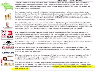
Student 5: Low Achieved Late night Creative are a Design company based out of North Carolina in the USA fuelled by round the clock thinking. These logos are some of their client identity works. Their main objective is to help businesses stand out in an over communicated world. They have a large range of clients, and help them grow new markets, launch new products and services, expand their brand messages. They encourage our clients to actively participate in the design process, as open collaboration insures that creative development will be an effective and rewarding process and that the design is acceptable to the clients demands. This process starts with drawn concepts and moves on into the developed digital versions which are then refined and finalised.They aim to create solutions that will rise above the clutter to capture the attention of the clients market and will leave an indelible impression on the clients customer base. • The masthead for peace at work shows a simple combination of text and image to create an effective masthead. The simplicity of colours keeps the design from getting too complicated and also emphasises the ‘at’ of the text because the colour draws you eye. Techniques I can take from this masthead such as the combination of text an image to show what my company is about. Visual and text link because it helps the customer visualise what the logo is about. • The 3TEX logo has been made in a very orderly fashion with the whole design in an enclosed box. Once again the colour range is reasonably limited but in this masthead, black and white have been used in conjunction with red. I like that this design has used the image to imitate what the text says with ‘3D inside’ being inside the box. This technique is very useful and clarifies the idea of the masthead which is useful in communicating the company’s idea. • This masthead is again using a boxed format to create an interesting composition. The simple combination of text and numbers with more emphasis on the numbers rather than another number Three. • This masthead, even though it is in black and white it is still very effective. You can still see the main idea of the masthead which is imitating a frog. Although this is a good masthead I don’t really understand what I can take from it other than using black and white colour. • This masthead has combined text and the logo very well. Again limited colour has been used to stop the confusion of the rainbow effect. I like how the logo part have used the first letter and geometric shapes, I might use this in my mastheads as it could be quite effective to show my company • This masthead though very simple has made itself unique and noticeable by cutting out small parts of the text and making the ‘A’ look different. Once again not much colour has been used to avoid the rainbow effect. I like how all the letters are the same size and the edges are clean and crisp. This gives a sleek up market looking masthead which I think looks very attractive.
Gardner design is a company based in Kansas in the USA. The Gardner process for crafting world-class identities — At Gardner Design they pride themselves in thinking about things that others don't. They believe the difference between good identity and a great one lies in the details. They go to great lengths to ensure that no stone is ever left unturned and the client’s specifications are fulfilled. They begin each project by immersing themselves in exhaustive research, looking to uncover the brand attributes and reference points that will arm their team with the information needed to find the absolute best expression of the brand. And with a team of artists working on a project – each with their own individual style and influences – they view every identity through countless visual combinations and multiple perspectives. As well, they created the logo lounge trend report produced and published internationally each spring The work represented is just a sampling of the type can only come through a creative process that's driven by an intense attention to detail. MARLEN - This masthead has used limited colour which is common in most of the mastheads on this page. This is because the designer doesn’t want to detract from the actual design of the masthead. Marlen is an international food processing manufacturer. The ‘M’ symbolises organic elements in the curving lines, and the processing (conveyor belt) aspect in the ribbon effect which flows up and down the m strokes. The clean sans serif letters underneath are very open honest strong and reliable in terms of the font selection, colour, and kerning. TRADITIONS – This logo is for a furniture and home fittings company. The black and white, traditional serif font, colonial style building, and est1984 all contribute to the effect of a ‘old school’ traditional values store. The customer instantly knows that the products in this shop will be early twentieth century ‘farmhouse colonial’ style. The traditional focus implies high quality, heirloom furniture. The mansion building subtly implies this is for successful, wealthy discerning customers.
Fernandez design is a company based out of Houston Texas in the USA his designs start with drawn concepts and then they get converted to the digital stage. Good solutions start with good ideas. That’s why our approach begins with a pencil and paper before it comes to life on the computer. It’s a process that involves the client each step of the way. We know you have a story to tell it is our job to carry that message into a solution. Fernandez design is a specialised graphic design studio with a focus on logo design iconography and illustration. Established by Carlos Fernandez in 2000 the studio has been retained by nationally recognised advertising agencies design firms and direct clients for a wide variety of projects. The ‘Briar Chapel’ design uses font selection, placement and simple graphic images to communicate a lot of information about the business. The FONT has serifs which imply a traditional aspect while the curving arc is both traditional and a little halo like or could be the sun passing overhead. This all means trustworthiness. The very simple cottagey type drawing is friendly and looks charming and old world. This give the impression that the chapel is a nice, no fuss place to go – specially for a simple happy wedding.
My three designers Fernandez design, Late night Creative, and Gardner Design. All these three artist models are design companies focused on creating identities and logos for clients from a wide variety of backgrounds. The first company, Fernandez Design, is a company based out of Houston Texas in the USA. Established by Carlos Fernandez in 2000 the studio has been retained by nationally recognised advertising agencies design firms and direct clients for a wide variety of projects. Fernandez Design s pride themselves in starting the design process with a pencil and paper. They find that this is still the easiest way to generated ideas with their clients before digitalising them and finalizing the design concepts. This is an interesting discovery because the digital age has moved a lot of designers and artists have moved the whole design process to the computer skipping out the concept hand drawn stage. In terms of social aspects, Fernandez design has a good relationship with their clientele. They still involve them in the design process and have regular meetings with clients creating a strong understanding of what the client wants out of the design. The second company, Gardner Design, is a company based in Kansas in the USA. They begin each project by immersing themselves in exhaustive research, then moving on to hand drawn stage and finally digitalising the ideas. They also pride themselves in starting with the hand drawn designs and then moving to the digital finals keeping the handmade element alive. The unique thing about Gardner design is they have several different artists working together; they view every identity through countless visual combinations and multiple perspectives. This dynamic created by having multiple perspectives creates a large variety of design solutions for the client to choose from. Another interesting fact about Gardner designs is that they run the website LogoLounge.com. This is useful for expanding their social market and attracts new clients. The third company, Late night Creative are a Design company based out of North Carolina in the USA. They encourage their clients to actively participate in the design process, as open collaboration insures that creative development will be an effective and rewarding process and that the design is acceptable to the clients demands. This process starts with drawn concepts and moves on into the developed digital versions which are then refined and finalised. This process involves the client as much as possible and make sure they understand the client’s needs as well as possible. These three artist models share a lot of the same designing traits. It is interesting to find that although the digital age is taking over all three of these companies start the design process with drawn concepts.