
Mastering GUI Components with Python Megawidgets
Explore Python Megawidgets (Pmw) toolkit to create advanced GUI components in Python. Learn to implement ScrolledListbox and ScrolledText components for user-friendly interfaces.

Mastering GUI Components with Python Megawidgets
E N D
Presentation Transcript
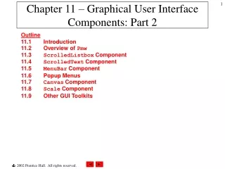
Chapter 11 – Graphical User Interface Components: Part 2 Outline11.1 Introduction11.2 Overview of Pmw11.3 ScrolledListbox Component 11.4 ScrolledText Component 11.5 MenuBar Component 11.6 Popup Menus 11.7 Canvas Component 11.8 Scale Component 11.9 Other GUI Toolkits
11.1 Introduction • More advanced components and more complex GUIs • Python megawidgets (Pmw) toolkit provides high-level GUI components developed from smaller Tkinter components • Introduce more Tkinter classes
11.2 Overview of Pmw • Each Pmw component combines Tkinter components to create a useful, more complex component • Each subcomponent can be configured independently • Pmw option names have the form subcomponent_option • Method configure alters Pmw options
11.3 ScrolledListbox Component • List box • Sometimes called a drop-down list • Provides a list of items from which a user can select • Implemented by Tkinter class Listbox • Scrolling through a list can be accomplished with a TkinterScrollbar • PmwScrolledListbox megawidget combines Tkinter classes Listbox and Scrollbar
Import Pmw module Initialize Pmw Create ScrolledListBox component Assign list to option items Default number of list items to display Scrollbar always present Set callback for list selection event 1 # Fig. 11.1: fig11_01.py 2 # ScrolledListBox used to select image. 3 4 from Tkinter import * 5import Pmw 6 7 class ImageSelection( Frame ): 8 """List of available images and an area to display them""" 9 10 def __init__( self, images ): 11 """Create list of PhotoImages and Label to display them""" 12 13 Frame.__init__( self ) 14 Pmw.initialise() 15 self.pack( expand = YES, fill = BOTH ) 16 self.master.title( "Select an image" ) 17 18 self.photos = [] 19 20 # add PhotoImage objects to list photos 21 for item in images: 22 self.photos.append( PhotoImage( file = item ) ) 23 24 # create scrolled list box with vertical scrollbar 25 self.listBox = Pmw.ScrolledListBox( self, items = images, 26 listbox_height = 3, vscrollmode = "static", 27 selectioncommand = self.switchImage ) 28 self.listBox.pack( side = LEFT, expand = YES, fill = BOTH, 29 padx = 5, pady = 5 ) 30 31 self.display = Label( self, image = self.photos[ 0 ] ) 32 self.display.pack( padx = 5, pady = 5 ) 33 34 def switchImage( self ): 35 """Change image in Label to current selection""" fig11_01.py
Return tuple containing index of selected item 36 37 # get tuple containing index of selected list item 38 chosenPicture = self.listBox.curselection() 39 40 # configure label to display selected image 41 if chosenPicture: 42 choice = int( chosenPicture[ 0 ] ) 43 self.display.config( image = self.photos[ choice ] ) 44 45 def main(): 46 images = [ "bug1.gif", "bug2.gif", 47 "travelbug.gif", "buganim.gif" ] 48 ImageSelection( images ).mainloop() 49 50 if __name__ == "__main__": 51 main() fig11_01.py
11.4 ScrolledText Component • PmwScrolledText component combines TkinterText and Scrollbar components • Sometimes an external event (i.e., an event generated by a different GUI component) indicates when to process the text in a ScrolledText component
Create PmwScrolledText component Enable word wrap Set number of columns Set number of rows Vertical scrollbar always present Horizontal scrollbar always present Create uneditable ScrolledText component 1 # Fig. 11.2: fig11_02.py 2 # Copying selected text from one text area to another. 3 4 from Tkinter import * 5 import Pmw 6 7 class CopyTextWindow( Frame ): 8 """Demonstrate ScrolledTexts""" 9 10 def __init__( self ): 11 """Create two ScrolledTexts and a Button""" 12 13 Frame.__init__( self ) 14 Pmw.initialise() 15 self.pack( expand = YES, fill = BOTH ) 16 self.master.title( "ScrolledText Demo" ) 17 18 # create scrolled text box with word wrap enabled 19 self.text1 = Pmw.ScrolledText( self, 20 text_width = 25, text_height = 12, text_wrap = WORD, 21 hscrollmode = "static", vscrollmode = "static" ) 22 self.text1.pack( side = LEFT, expand = YES, fill = BOTH, 23 padx = 5, pady = 5 ) 24 25 self.copyButton = Button( self, text = "Copy >>>", 26 command = self.copyText ) 27 self.copyButton.pack( side = LEFT, padx = 5, pady = 5 ) 28 29 # create uneditable scrolled text box 30 self.text2 = Pmw.ScrolledText( self, text_state = DISABLED, 31 text_width = 25, text_height = 12, text_wrap = WORD, 32 hscrollmode = "static", vscrollmode = "static" ) 33 self.text2.pack( side = LEFT, expand = YES, fill = BOTH, 34 padx = 5, pady = 5 ) 35 fig11_02.py
Retrieve text from ScrolledText component text1 Arguments specify range of text to retrieve Display text1’s selected text in ScrolledText component text2 36 def copyText( self ): 37 """Set the text in the second ScrolledText""" 38 39 self.text2.settext( self.text1.get( SEL_FIRST, SEL_LAST ) ) 40 41 def main(): 42 CopyTextWindow().mainloop() 43 44 if __name__ == "__main__": 45 main() fig11_02.py
11.5 MenuBar Component • Menus • Contain lists of actions • Simply the appearance of GUIs • PmwMenuBar contains methods necessary to manage a menu bar, a container for menus • Menu item – GUI component inside a menu that performs an action when selected by a user • command menu item – initiates an action • checkbutton menu item – toggled on or off • radiobutton menu item – a group presents mutually exclusive options
11.5 Menubar Component • separator menu item – horizontal line groups related menu items • cascade menu item – submenu (or cascade menu) provides more menu items from which users can select • Balloons (also called tool-tips) display descriptions of menus and menu items
Create a PmwBalloon component Create PmwMenuBar component Specify Balloon component attached to MenuBar Second argument specifies text of balloon Add menu File to PmwMenuBarchoices Add command menu item to File menu Associate menu item with event handler Set name of menu item Add submenu Color to menu Format Add separator menu item to menu Format 1 # Fig. 11.3: fig11_03.py 2 # MenuBars with Balloons demonstration. 3 4 from Tkinter import * 5 import Pmw 6 import sys 7 8 class MenuBarDemo( Frame ): 9 """Create window with a MenuBar""" 10 11 def __init__( self ): 12 """Create a MenuBar with items and a Canvas with text""" 13 14 Frame.__init__( self ) 15 Pmw.initialise() 16 self.pack( expand = YES, fill = BOTH ) 17 self.master.title( "MenuBar Demo" ) 18 self.master.geometry( "500x200" ) 19 20 self.myBalloon = Pmw.Balloon( self ) 21 self.choices = Pmw.MenuBar( self, 22 balloon = self.myBalloon ) 23 self.choices.pack( fill = X ) 24 25 # create File menu and items 26 self.choices.addmenu( "File", "Exit" ) 27 self.choices.addmenuitem( "File", "command", 28 command = self.closeDemo, label = "Exit" ) 29 30 # create Format menu and items 31 self.choices.addmenu( "Format", "Change font/color" ) 32 self.choices.addcascademenu( "Format", "Color" ) 33 self.choices.addmenuitem( "Format", "separator" ) 34 self.choices.addcascademenu( "Format", "Font" ) 35 fig11_03.py
Create radiobutton menu items Associate grouped radiobutton menu items with same callback Associate grouped radiobutton menu items with same variable Create checkbutton menu item 36 # add items to Format/Color menu 37 colors = [ "Black", "Blue", "Red", "Green" ] 38 self.selectedColor = StringVar() 39 self.selectedColor.set( colors[ 0 ] ) 40 41 for item in colors: 42 self.choices.addmenuitem( "Color", "radiobutton", 43 label = item, command = self.changeColor, 44 variable = self.selectedColor ) 45 46 # add items to Format/Font menu 47 fonts = [ "Times", "Courier", "Helvetica" ] 48 self.selectedFont = StringVar() 49 self.selectedFont.set( fonts [ 0 ] ) 50 51 for item in fonts: 52 self.choices.addmenuitem( "Font", "radiobutton", 53 label = item, command = self.changeFont, 54 variable = self.selectedFont ) 55 56 # add a horizontal separator in Font menu 57 self.choices.addmenuitem( "Font", "separator" ) 58 59 # associate checkbutton menu item with BooleanVar object 60 self.boldOn = BooleanVar() 61 self.choices.addmenuitem( "Font", "checkbutton", 62 label = "Bold", command = self.changeFont, 63 variable = self.boldOn ) 64 65 # associate checkbutton menu item with BooleanVar object 66 self.italicOn = BooleanVar() 67 self.choices.addmenuitem( "Font", "checkbutton", 68 label = "Italic", command = self.changeFont, 69 variable = self.italicOn ) 70 fig11_03.py
Create a TkinterCanvas component with a white background Display Canvas text item Method itemconfig configures Canvas items Set fill color of Canvas item Terminate the program 71 # create Canvas with text 72 self.display = Canvas( self, bg = "white" ) 73 self.display.pack( expand = YES, fill = BOTH ) 74 75 self.sampleText = self.display.create_text( 250, 100, 76 text = "Sample Text", font = "Times 48" ) 77 78 def changeColor( self ): 79 """Change the color of the text on the Canvas""" 80 81 self.display.itemconfig( self.sampleText, 82 fill = self.selectedColor.get() ) 83 84 def changeFont( self ): 85 """Change the font of the text on the Canvas""" 86 87 # get selected font and attach size 88 newFont = self.selectedFont.get() + " 48" 89 90 # determine which checkbutton menu items selected 91 if self.boldOn.get(): 92 newFont += " bold" 93 94 if self.italicOn.get(): 95 newFont += " italic" 96 97 # configure sample text to be displayed in selected style 98 self.display.itemconfig( self.sampleText, font = newFont ) 99 100 def closeDemo( self ): 101 """Exit the program""" 102 103 sys.exit() 104 fig11_03.py
105 def main(): 106 MenuBarDemo().mainloop() 107 108 if __name__ == "__main__": 109 main() fig11_03.py
11.6 Popup Menus • Context-sensitive popup menus created with Tkinter class Menu • Provide options specific to the component for which generated the popup trigger event
Create TkinterMenu component Remove default first entry, a dashed separator item Add radiobutton menu item to TkinterMenu component Associate right-mouse click event with callback popupMenu 1 # Fig. 11.4: fig11_04.py 2 # Popup menu demonstration. 3 4 from Tkinter import * 5 6 class PopupMenuDemo( Frame ): 7 """Demonstrate popup menus""" 8 9 def __init__( self ): 10 """Create a Menu but do not add it to the Frame""" 11 12 Frame.__init__( self ) 13 self.pack( expand = YES, fill = BOTH ) 14 self.master.title( "Popup Menu Demo" ) 15 self.master.geometry( "300x200" ) 16 17 # create and pack frame with initial white background 18 self.frame1 = Frame( self, bg = "white" ) 19 self.frame1.pack( expand = YES, fill = BOTH ) 20 21 # create menu without packing it 22 self.menu = Menu( self.frame1, tearoff = 0 ) 23 24 colors = [ "White", "Blue", "Yellow", "Red" ] 25 self.selectedColor = StringVar() 26 self.selectedColor.set( colors[ 0 ] ) 27 28 for item in colors: 29 self.menu.add_radiobutton( label = item, 30 variable = self.selectedColor, 31 command = self.changeBackgroundColor ) 32 33 # popup menu on right-mouse click 34 self.frame1.bind( "<Button-3>", self.popUpMenu ) 35 fig11_04.py
Display Menu component at given coordinates Set Frame component’s background color 36 def popUpMenu( self, event ): 37 """Add the Menu to the Frame""" 38 39 self.menu.post( event.x_root, event.y_root ) 40 41 def changeBackgroundColor( self ): 42 """Change the Frame background color""" 43 44 self.frame1.config( bg = self.selectedColor.get() ) 45 46 def main(): 47 PopupMenuDemo().mainloop() 48 49 if __name__ == "__main__": 50 main() fig11_04.py
11.7 Canvas Component • Tkinter component Canvas displays text, images, lines and shapes • Blank by default • Program creates canvas items to display items on a Canvas • New items drawn on existing items unless otherwise specified
Create TkinterCanvas component Bind mouse dragging event to Canvas component Retrieve x- and y- coordinates of mouse position Create oval Canvas item 1 # Fig. 11.5: fig11_05.py 2 # Canvas paint program. 3 4 from Tkinter import * 5 6 class PaintBox( Frame ): 7 """Demonstrate drawing on a Canvas""" 8 9 def __init__( self ): 10 """Create Canvas and bind paint method to mouse dragging""" 11 12 Frame.__init__( self ) 13 self.pack( expand = YES, fill = BOTH ) 14 self.master.title( "A simple paint program" ) 15 self.master.geometry( "300x150" ) 16 17 self.message = Label( self, 18 text = "Drag the mouse to draw" ) 19 self.message.pack( side = BOTTOM ) 20 21 # create Canvas component 22 self.myCanvas = Canvas( self ) 23 self.myCanvas.pack( expand = YES, fill = BOTH ) 24 25 # bind mouse dragging event to Canvas 26 self.myCanvas.bind( "<B1-Motion>", self.paint ) 27 28 def paint( self, event ): 29 """Create an oval of radius 4 around the mouse position""" 30 31 x1, y1 = ( event.x - 4 ), ( event.y - 4 ) 32 x2, y2 = ( event.x + 4 ), ( event.y + 4 ) 33 self.myCanvas.create_oval( x1, y1, x2, y2, fill = "black" ) 34 fig11_05.py
35 def main(): 36 PaintBox().mainloop() 37 38 if __name__ == "__main__": 39 main() fig11_05.py
11.8 Scale Component • Tkinter component Scale enables user to select from a range of integer values • Has numeric values and a slider • Horizontal orientation: minimum value at extreme left and maximum value at extreme right • Vertical orientation: minimum value at extreme top and maximum value at extreme bottom
11.8 Scale Component Numeric value slider
Specify Scale’s maximum value Create TkinterScale component Specify Scale’s minimum value Set initial Scale value Delete previously drawn Canvas item Create oval Canvas item Option tags sets Canvas item’s name 1 # Fig. 11.7: fig11_07.py 2 # Scale used to control the size of a circle. 3 4 from Tkinter import * 5 6 class ScaleDemo( Frame ): 7 """Demonstrate Canvas and Scale""" 8 9 def __init__( self ): 10 """Create Canvas with a circle controlled by a Scale""" 11 12 Frame.__init__( self ) 13 self.pack( expand = YES, fill = BOTH ) 14 self.master.title( "Scale Demo" ) 15 self.master.geometry( "220x270" ) 16 17 # create Scale 18 self.control = Scale( self, from_ = 0, to = 200, 19 orient = HORIZONTAL, command = self.updateCircle ) 20 self.control.pack( side = BOTTOM, fill = X ) 21 self.control.set( 10 ) 22 23 # create Canvas and draw circle 24 self.display = Canvas( self, bg = "white" ) 25 self.display.pack( expand = YES, fill = BOTH ) 26 27 def updateCircle( self, scaleValue ): 28 """Delete the circle, determine new size, draw again""" 29 30 end = int( scaleValue ) + 10 31 self.display.delete( "circle" ) 32 self.display.create_oval( 10, 10, end, end, 33 fill = "red", tags = "circle" ) 34 35 def main(): fig11_07.py
36 ScaleDemo().mainloop() 37 38 if __name__ == "__main__": 39 main() fig11_07.py
11.9 Other GUI Toolkits • PyGTK provides object-oriented interface for the Gimp Toolkit component set • wxPython extension module enables access to wxWindows, a GUI C++ library • PyOpenGL interface to OpenGL

