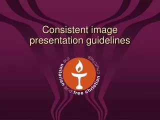

Unitarian Church Branding Guidelines
E N D
Presentation Transcript
Overview • Introduction • The flaming chalice symbol • Logo variations and formats • Colour palette • Fonts (typefaces)
Introduction • A clear and consistently presented image is important because it can: • communicate a concise message about the church’s character and purpose • reassure and inspire existing members as well as attract new ones • become one of the church’s strongest assets at both local and national levels
Introduction • These guidelines are for the benefit of all church people, both employed staff and those involved in a voluntary capacity, as well as for many affiliated organisations • The way in which we apply the image can help shape how we will be perceived in our local community
Introduction • We have developed a broad and flexible set of ‘tools’ to reflect our broad perspectives and welcoming nature • These tools include a wide range of logos and colours • While flexibility is important, consistent application is essential if the branding is to be effective • We have also supplied a range of publication types in MS Word format to help you to get started
Why the flaming chalice symbol? • It is the internationally recognised symbol of the Unitarian movement • The lighting of a chalice is increasingly becoming a feature of communal worship in Unitarian congregations • This symbol is a central feature of our visual identity in all published material, whether in printed matter, electronic publications, or in signage, displays and exhibitions
Old versus new? • The new logo is the same, just a little softer • The chalice is more three dimensional, infusing a sense of movement • It is designed to symbolise the open and welcoming nature of Unitarian and Free Christian Churches as we move ahead Old New
Logo variations • The symbol is available in two basic designs and nine different colour formats • Additionally, it is available in different electronic formats e.g. for print, internet, screen • The chalice symbol can be used on its own for internal communication and events • In almost all other cases, especially when communicating with the wider public, you should use a logo with wording which can be applied according to your local situation and preferences
Logo variationsBasic Design 1: horizontal strapline Please note: the logo can be presented in any of the colours from the primary colour palette
Logo variationsBasic Design 2 – disc Please note: the disc logo can be presented in any of the colours from the primary colour palette and the wording around the logo can be varied as necessary
Logo position and proportions • The logo should always be shown in a consistent position and at relative proportions within a document • The same positioning and proportions apply for most types of communication e.g. letters, newsletters and pamphlets • An exception to this is for display boards, banners etc. where the focus is on the logo • For full details of positioning and sizing, please see the website
Standard pantone colours 50% tint Colour palettePrimary colours • Consistent use of colour is also very important • The primary palette contains colours you should use in most cases • Its theme is natural colours, emphasising a warm ‘flame’ or ‘sunset’ range
Colour paletteSecondary and tertiary colours • The secondary and tertiary palettes use earthy colours that have been chosen to reflect the colours of a flame • Only use these colours if necessary and in moderation • You will need appropriate software • You will need to follow the methods described in the full branding guidelines
Fonts (typefaces) • This is the primary font • It is a standard font, widely available on PCs • Use it for: • Leaflets • Posters • Displays • Magazines Helvetica Legacy • This is the secondary font • Use it for academic, theological and narrative documents e.g. • Books • Reports • Longer news items
Fonts (typefaces) • Both fonts, Helvetica and Legacy, can be used alongside each other in many publications • For more information, please refer to the guidelines document which you have been given
Any questions? • If you have any questions please refer to the website or contact us at the Information Department at Essex Hall
Thank you • We hope you find these guidelines useful • We look forward to all working together to ensure the new image develops in a strong and effective way