Introduction to Accessibility
330 likes | 360 Vues
Understand the importance and benefits of accessibility, compliance, and user-friendly structures for people with disabilities. Learn about disabilities, readability, structuring documents, colors, alt text for images, and more. Enhance your digital content for inclusivity and effective communication.

Introduction to Accessibility
E N D
Presentation Transcript
Introduction to Accessibility TSO training: 6/20/2018 support.cc.gatech.edu
WHY ACCESSIBILITY? • Legal: We are required to follow 508 & WCAG 2.0 AA. AMAC overview slides & GT Accessibility Policy (slides). • Communication: is more effective across different channels (including mobile) and different abilities. • Marketing: often improves SEO (search engine optimization). • Ethical: everybody deserves our good, good content. *FYI: Slides available to download after this training.
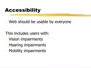
Types of Disabilities Examples? • Auditory • Motor & Mobile • Cognitive • Seizure • Visual
STRUCTURE AND Readability • Making something easier to read is similar on websites and in documents. • No one reads: http://uxmyths.com/post/647473628/myth-people-read-on-the-web • A key way to make these documents readable is by using the correct structural and hidden pieces. Video explanation of comprehension/language: https://www.w3.org/WAI/perspectives/understandable.html Video explanation of layout: https://www.w3.org/WAI/perspectives/layout.html
Structure: Clear vs. Blurry 1 • What visual clues do you get just from scanning this document?
Structure:Links • Screenreaders often navigate a page by listing all the links. • Links, generally, should: • Make sense out of context • Describe where they go • Be unique • Links should not: • Use the URL text • Use the words “Click here”, “Learn more”, “Read more”, “Email me”, etc
Structure: Clear vs. Blurry 2 • What visual clues do you get just from scanning this document?
Structure: HEADINGS AND LISTS • Headings give an overview of the page, but are not the same as visual changes in font size or color. Likewise, lists are more than just circular images at the start of a line. • Screenreaders often navigate a page by listing all the Headings. • Also incredibly helpful for those with cognitive disabilities (such as ADHD), or busy people who don’t read, but just quickly scan the page. • Use heading levels sequentially. For our Drupal/Mercury sites, start with h3 (because we already use h1 & h2). You can use h3 multiple times, if content is at the same “level”.
DOCUMENTS and PDFS • A lot of the same rules apply as do to webpages. Learn how to use headings, reading sequence, and etc. in Microsoft Word or Adobe Acrobat Pro. • Resources: • https://www.hhs.gov/web/section-508/making-files-accessible/index.html • http://www.amacusg.org/wag/images/1/16/Slides_81-156_AccessibleDocs.pdf • http://www.amacusg.org/wag/images/c/ca/KarenMcCallAccessibleWordToPDFJun2017.pdf
Structure: READING Order • Reading order or sequence is especially important for tables and for PDFs.
Images AND COlorS • Images can enhance comprehension, and are especially helpful for people with dyslexia, ADHD, and other cognitive or neurological challenges. • Poor use of images or color can be distracting and even prevent some people from understanding your content.
COLORS: HIGH CONTRAST • Use a high contrast color scheme. • This is especially important so that text and background do not blend together. • Tool 1: https://webaim.org/resources/contrastchecker/ • Tool 2: https://developer.paciellogroup.com/resources/contrastanalyser/ • Video explanation: https://www.w3.org/WAI/perspectives/contrast.html
COLORS: Alternative I.D. Needed • Provide alternatives for color coding, especially essential for those with color-blindness.
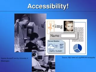
IMAGES: Alternative text basics • Software cannot translate images into words for those having documents and webpages read aloud to them. • We must translate those images, by providing “alternative text” or “alt tags” that describes them. • Tip: Do not use the words Image, Picture, Photo, etc. in your alternative text. • Tip: Inspect element for image in your web browser.
IMAGES: CONTEXT COMPARISON • Website content = “Acorns” • Horticulture class = “Acorns of Quercusgeorgiana M.A. Curtis” • Image is a link = “International Oak Society” • Image is decoration = “”
IMAGES: CONTEXT AND PURPOSES • Provide text alternatives (less than 120 characters) based on the purpose of the image: • Embedded text = avoid • Informative = essential information presented • Decorative = leave blank • Functional = describe functionality (e.g. print page or what it links to) • Complex = provide full-text equivalent (e.g. diagrams) • Explanation of image types and their alternative text: https://webaim.org/techniques/alttext/
IMAGES: EMBEDDED TEXT and SIZE • In general, do not embed text inside an image, as software cannot read it and it will often be unreadable when scaled for mobile. • If you do embed text, you must copy the same words as the Alternative Text.
IMAGES: Banner Alternative TexT • If I hadn’t taken this course I would never have figured out that I had a passion for this, says Nylah Julmice, standing in front of sound waves and code samples. (111-162 characters)
IMAGES: ALTERNATIVE TEXT POP QUIZ • What alternative text could you provide for this image?
IMAGES: ALTERNATIVE TEXT POP QUIZ • What alternative text could you provide for this image? And could you read it on a mobile device?
IMAGES: ALTERNATIVE TEXT POP QUIZ • What alternative text could you provide for this image? And how would you navigate it without a mouse?
TABLES: KEEP IT SIMPLE • Tables are for data: do not use them for layout. • Avoid nested tables, as they are not read well by software. • Leave width blank or use a percentage (e.g. 95%), for scaling on mobile. • Web Accessibility Tutorial on Tables from W3C
TABLES: RELATIONSHIPS • Screenreaders do not have the visual cues that communicate relationships, so special code must be added to give those cues.
Tables: READING ORDER Should make sense when read from top to bottom and left to right.
TABLES: HEADERS • Must have at least 1 row or 1 column designated as a header. • The text editor adds the <th> code when you set the Headers option under Table Properties.
TABLES: CAPTION vs. SUMMARY • Always provide a visible Caption, either a title or brief description of the content of the table. • The Summary invisibly describes the structure of a table and may not be needed.
VIDEOs: CAPTIONS AND TRANSCRIPTS • Who do captions help? People who: • Have no or little hearing • Are non-native speakers • Have ADHD • Are in a very loud or very quiet place • Video explanation of caption importance: https://www.w3.org/WAI/perspectives/captions.html • Tips: • Livestreaming (synchronous video) is almost impossible to make accessible, without specialized software and paid live caption experts. • Automatic captions are often wrong. • If no captions, upload both a transcript and a video description.
VIDEOS: Caption Costs and Guides • Captions are not expensive. Likely will only be a few dollars per minute of video from these vendors: • https://webmasters.gatech.edu/handbook/amac-campus-accessibility-organization • http://www.3playmedia.com/customers/case-studies/georgia-tech/ • You can also add your own captions to hosted videos: • Add captions to YouTube videos • Add captions to Kaltura videos
VIDEOs: CAPTION EXAMPLE 1 • Automatic captions can be embarrassingly inaccurate.
VIDEOs: CAPTION EXAMPLE2 • Automatic captions lack punctuation.
VIDEOs: CAPTION EXAMPLE 3 • Manual captions are more accurate, easier to read, and better represent us to the world.
ADDITIONAL RESOURCES • https://www.w3.org/WAI/tutorials/ • http://www.amacusg.org/wag/Main_Page • http://wave.webaim.org/ • https://fae.disability.illinois.edu/abouts/ • https://webaim.org/standards/508/checklist • https://webaim.org/articles/cognitive/ • https://www.adobe.com/accessibility/products/indesign.html • http://diagramcenter.org/table-of-contents-2.html#contents • http://www.amacusg.org • https://www.webpagefx.com/tools/read-able • https://webmasters.gatech.edu/kb/writing-web-guide • https://www.youtube.com/watch?v=EpyhtQYJqD4 • http://www.espn.com/core/toolkit/page/webAccessibilityGuide • https://help.twitter.com/en/using-twitter/picture-descriptions • https://www.nngroup.com/articles/how-users-read-on-the-web/
Q & A • Do you have questions? • Content Questions (Comm): • cocweb@cc.gatech.edu • Training Requests (TSO):tsoweb@cc.gatech.edu