Download
1 / 63
630 likes | 789 Vues
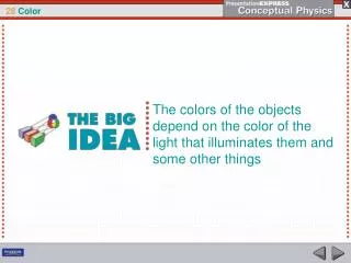
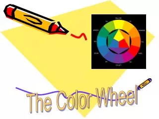
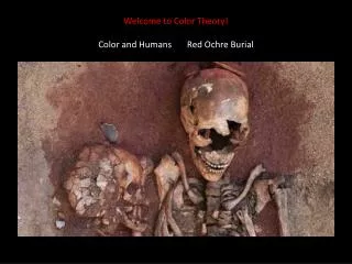
Welcome to Color Theory! Color and Humans Red Ochre Burial. Joseph Kosuth. Indian Festival. Franz Marc 1880-1916. Katsushika Hokusai 1760-1849. Clarice Cliff Art Deco (early 1930s) designer. Some Pioneers of Color Theory: Sir Isaac Newton (1642-1727).

E N D
Johann Wolfgang Von Goethe, author of Faust and important theories of color Johann Wolfgang Von Goethe was a German polymath (he did many things well) who lived from 1749-1832. He wrote novels and poems, studied plants, and, in 1810, wrote Theories of Color. While some of his color theories did not hold up to scientific testing, he was one of the first color theorists to look at the psychology of color. In addition, his view that darkness, as well as light, affected color also influenced numerous Painters including J.M.W. Turner
Michel Eugene Chevereul (1786-1889)French Chemist, Colorist, supervisor of dye production carpet plant.Book: The Principles of Harmony and Contrast of Colors 1839
Chevreul was also influential in the world of art. After being named director of the dye works at the Gobelins Manufactory in Paris, he received many complaints about the dyes being used there. In particular, the blacks appeared different when used next to blues. He determined that the yarn's perceived color was influenced by other surrounding yarns. This led to a concept known as simultaneous contrast. His writings subsequently had a great influence on advanced art in Europe, particularly Impressionism, Post-Impressionism and Orphism.
The Development of the Idea of Simultaneous Contrast • Simultaneous Contrast: the way in which two different colors affect each other, how one color can change how we perceive the tone and hue of another when placed side by side. The colors themselves don't change, but we see them as altered.
Georges Seurat Sunday Afternoon on the Island of La Grande Jatte
On the left, an example of Orphism: Kathedrala by Frantisek Kupka (1912-3). On the right,Post-Impressionism: Paul Serusier, The Talisman, 1888
Chevreul is also linked to what is sometimes called Chevreul's illusion, the bright edges that seem to exist between adjacent strips of identical colors having different intensities. See Chevreul'sThe Laws of Contrast of Colour for more information.[2]
Johannes Ittenhttp://aqua-velvet.com/2012/12/itten-the-elements-of-color-1970/
Itten and Froebel – Romantic Color Theory • Itten started the Bauhaus foundations course with its emphasis on unusual uses of common materials. Students were presented with discarded materials (wire mesh, cardboard, newspapers, matchboxes, phonograph needles and razor blades) and instructed to basteln; to improvise something. Other assignments involved the study of materials. Wood, feathers, mosses, hides had to be looked at, touched and drawn until they were known by heart and could be from memory. The idea was to transcend realistic reproduction to achieve an interpretative design instead of a mere imitation. • It is said that this method was influenced by Friedrich Froebel's pedagogy of "education through play". Itten represented the central person of the early Bauhaus years. He influenced the first era of it. The foundations course established by him came out to be decisive for the teaching program of the school. • Itten developed a general theory of contrast, the main theme of which was the "clair / obscure contrast", as the basis for this course. This was treated in various assignments: first in the form of checker-board patterns, then in abstract and finally in realistic works. Classical pictures were also analysed with the same aim in mind. By dividing it up into squares, the student was induced to work through the entire area of the picture with awareness, and to make a new decision each time regarding the respective grey value. • Itten initiated mandatory form and color education for Bauhaus students. He taught there until 1923, essentially on the concept of creation, focusing on form and color and in the process developing his theories on color and the color circle. In March 1923, Itten left the Bauhaus because Gropius no longer approved of his teaching methods - in particular of the preparatory meditation exercises and the Far-Eastern mysticism which this presupposed. Itten's departure was the first symptom of a general re-orientation of the school. The "romantic" or as others have called it, the universalistic era, came to an end.
Vocabulary • HueName of a particular color zone, defined by different wavelengths of light. Examples of hue: blue, green, yellow and red. Hue can encompass a range of colors within the wavelength area. • Tip: think of hue as a color zone rather than a color. Hue is bigger than individual color • In painting,hue is often used in conjunction with terms such as: tint, shadeand tone. • A tint is created when a color is mixed with white. • A shade is created when a color is mixed with black. • A tone is created when a color is mixed with gray.
New VocabularyThree easily confused properties:ValueSaturationChroma
Value Value is what we know as the degree of Light or Dark. Value is present in black and white but also in color. Buttercup yellow has a lower (whiter) value than navy blue. This value scale may help you with your achromatic and monochromatic reproductions.
Saturation Saturation is not really a matter of light and dark, but rather how pale or strong a color appears. The term refers to the dominance of pure hue.Thesaturation of a color is not constant, but it varies depending on the surroundings and what light the color is seen in. Highly saturated colors appear as pure hues. Colors with low saturation appear washed out or weak. Great painting exercises. Wait for a sunny day and paint a brightly colored ball in the early morning, noontime and evening. Or paint the color of a wall lit by candlelight, lit with a normal light fixture and then with the light fixture and full sun (open the curtains). Observe different degrees of saturation.
Chroma • **Chroma is the Greek word for color. Sometimes it is used to mean the same thing as color, but it is also used to describe the combination of saturation and brightness. A highly saturated lemon yellow is much brighter than a highly saturated blue-green. You can say that the yellow has higher chroma than the blue-green. Many digital applications allow you to adjust both brightness and saturation, creating varieties of chroma.
Achromatic Reproduction • Achromatic Reproduction of a masterwork • Why? • What is the power of a limited palette? • What do you gain? Lose? Learn • How does color translate into value? • An appreciation of black and white: Citizen Kane. • http://www.youtube.com/watch?v=-r0b_XeRkG4
More Appreciation: Gerard RichterRAF Series – BaaderMeinhoff