Download
1 / 43
460 likes | 563 Vues
Explore the significance of color attributes like hue, saturation, and brightness, as well as the color wheel, color basics, and combinations. Discover how warm and cool colors influence emotions and learn about various color schemes that can create harmony in design.

E N D
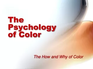
The Psychology of Color The How and Why of Color
Color Attributes • There are literally millions of colors, but they can be divided into just a few color families. • And every color can be described in terms of having three main attributes: hue, saturation and brightness.
Hue • Any pure color is referred to as a hue. • Hue is identified as the color family or color name (such as red, green, purple). • Hue is directly linked to the color's wavelength.
Saturation • Saturation, also called “chroma,” is a measure of the purity of a color or how sharp or dull the color appears. • Saturation is the relative brilliance or vibrancy of a color. The more saturated a color, the less black it contains.
Brightness • Brightness, also called “luminance” or “value,” is the shade (darkness) ortint(lightness) of a color. • Areas of an evenly colored object in direct light have higher brightness than areas in shadow.
Tint vs. Shade • A hue is a specific color; red, green, blue. • A tint of a color is made by adding white. • A shade is made by adding black.
Color Wheel • Invented by Sir Isaac Newton. • A tool for understanding color relationships and creating harmonious color schemes. • The color wheel is divided into three categories: primary, secondary, and tertiary.
Color Wheel • Primary colors are those that cannot be created by mixing other colors together. • Secondary colors are those that are created by mixing two primary colors. • Tertiary colors are those that are created by mixing a primary and secondary color together. For this reason they have two-word names.Example: blue-green, yellow-orange, etc.
Color Basics • Sir Isaac Newton discovered that white light breaks into a rainbow of colors in 1666 by passing a beam of light through a prism. • He found an infinite number of colors in this spectrum.
Newton wanted to show that there were just seven main colors (red, orange, yellow, green, blue, indigo and violet). • Monochromatic colors in the spectrum (composed of a single, unique wavelength, which can't be further separated into other colors).
Color Combinations • Newton's experiments showed that light can be combined to form different colors. • For example: blue and yellow light produces green light that appears identical to the green found in a prism spectrum. (Modern techniques show these to be different colors.) • Such color pairs are called metamers (they appear to be identical, but they have different wavelengths.)
Color Combinations • Newton found some color combinations produce pure white instead of colored light. • They complete each other when mixed. These pairs of colors are called complements. • In this example you see that purple and yellow lights combine to form white.
Color of Light: Additive Color • Additive color is how light is mixed to create color. • This method is called the RGB (red-green-blue) process because those are the primary colors used to mix visible light. • This is the color system used by televisions, computers, color CRTs, LCDs, plasma screens, stadium mega-screens, and stage lighting.
Additive Color: Color Monitors • Projection systems used televisions, computers, and plasma screens (among others) use a dot pattern to produce the colors seen by the eye. • This is similar to POINTILLISM, a painting technique use in the 19th century. • Pointillism is a form of painting in which tiny dots of primary-colors are used to generate secondary colors.
Additive Color: Color Monitors • If you view a painting created with Pointillism up close, you will see that the image is made from pure “dots” of color that the eye mixes. • A computer monitor or TV screenuses RED, GREEN and BLUE dotsin a similar fashion to produce the secondary colors you see on the screen.
Warm vs. Cool Colors Warm colors appear larger than cool colors.
Cool colors • Cool colors range from blue to violet, the half of the color wheel with shorter wavelengths. • Have a calming effect. • Frequently used for backgrounds to set off smaller areas of warm colors. • Used together, cool colors can look clean and crisp, implying status and calm. • Bright cool colors generates more excitement than light, medium or dark cool colors.
Warm Colors • Warm colors range from red to yellow. • On the half of the color wheel corresponding to the longer wavelengths. • Warm colors are active, attention-grabbing and aggressive. • They stimulate emotions, motivate and seem to come forward off the screen or page.
Color Schemes • Selecting color combinations may be based on several traditional color schemes. These are: • Complimentary • Monochromatic • Neutral • Analogous • Low Intensity • Split Compliments • Double Compliments
Complementary Colors • Any two colors whose light together produces white are called complementary colors. • Complementary colors in an image are pleasing to the eye. The colors seem to belong together. • The most effective use of complements is to let one of them dominate by giving it a bigger area or a fuller saturation, while using the other as an accent.
Complementary Colors • Complementary colors lie opposite each other on the color wheel. They complete or enhance each other. • When a pair of high intensity complementsare placed side by side, they seem to vibrate and draw attention to the element. • If the hues are of low-intensity, the contrast is not too harsh.
Complementary Colors • Intensity can only be altered by mixing a color with its complement, which has the effect of visually neutralizing the color. • Changing the values of thehues, adding black or white,will soften the effect.
Monochromatic Schemes • A monochromatic color scheme uses only one hue (color) and all values (shades or tints) of it for a unifying and harmonious effect. • You can change the value of a color by adding black (shade), or white (tint), or gray (tone). • As white is added to a color it becomes “higher” in value (lighter). • As black is added it becomes “lower” in value (darker).
Monochromatic Schemes • Valueis therelationship of light to dark. • Values that are close together give the design a calm appearance. • Values of pure hues as well as those of tints and shades create movement. • Value contrasts show textureand provide an effective means of directing viewer attention in a composition.
Neutral colors • Contains equal parts of three primary colors - black, white, gray, and sometimes brown. • When neutrals are added to a color, only the value changes. • If you try to make acolor darker by adding a darker color to it, the color (hue) changes. • Black and white are thought of as neutrals because they do not change color.
Analogous Colors • Colors that contain a common hue and are found next to each other on the color wheel. • Adjoining colors on the wheel are similar and tend to blend together. • They are effective at showing depth.
Analogous Colors • Analogous color can be used to create subtle differences in an image or design by creating a peaceful and more harmonious feeling.
Split-Analogous • A color scheme that includes a main color and the two colors one space away from it on each side of the color wheel. • An example is red, blue, and violet or red, yellow and violet.
Intensity • Intensity is the Brightness or dullness of a color. • A pure hue is a high-intensity color. • A dulled hue, a color mixed with its complement, is called a low-intensity color.
Triads • A color triad is composed of three colors spaced an equal distance apart on the color wheel. • The contrast between triad colors is not as strong as that between complements.
Triad - Primary Colors • Primary Color are rarely seen as a trio except in children’s products. • Red and yellow, are popular in the USA for everything from fast foodto gas stations. • Blue and red are also common, but are attractive only when separated by space.
Triad - Secondary • Colorscreated by mixing two primary colors to create a secondary color. • Red + yellow =orange • Yellow + blue = green • Blue + red = purple (violet)
Intermediate Triads • Colors are created by mixing a primary and a secondary • Examples: red-orange yellow-orange yellow-green blue-green blue-purple red-purple
Split Complements • The combination ofone hue, plus the hues on each side of its complement. • Easier to work with than a straight complementary scheme because it offers more variety. Example: red-orange, blue, and green.
Double Complements • Two hues and their opposites. • Four colors arranged into two complementary color pairs. • Scheme is hard to harmonize. • If all four colors are used in equal amounts, the scheme may look unbalanced. • Choose a color to be dominant or subdue the colors.
Compositional Effects of Color:Spatial effects • Hues that are lighter at maximum saturation (yellows, oranges) appear larger than those that are darker at maximum saturation (e.g., blues and purples). • Warm colors appear closer and cool colors fall back.
Compositional Effects of Color • A large shape or form appears to be heavier than a small shape. Several small shapes or forms can balance one large one. • An object with a complicated contour is more interesting and appears to be heavier, than one with a simple contour. A small complex object can balance a large, simple object.
Compositional Effects of Color • Use highly saturated or high-intensity colors (a pure hue with no other colors mixed in) or busily detailed areastodraw attention. • Highly saturated colors give the appearance of carrying more weight than less saturated, low-intensity or visually simpler areas.
How Colors Effect Each Other • Placing colors next to each other effect how we see colors and is a complex part of color theory. • Red appears more brilliant against black. • Red is somewhat duller against the white. • Next orange, red appears lifeless. • In contrast with blue-green, red exhibits brilliance. • The red square appears largeron black than on other background colors.
How Colors Effect Each Other • The color of the surrounding color can affect how the color looks. • The block in the center of the examples below are the same, only the background color has changed. • Color is partially defined in our brain by the colors surrounding it.
Sources of Information • Write Design on-line http://www.writedesignonline.com/resources/design/rules/color.html