Download
1 / 22
250 likes | 982 Vues
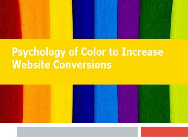
The Psychology of Color Which Color, graphics and font for what sites and why? By Teann Nghiem Topics Why do we need to study colors? What are some color terminology? Psychological effects of color What does each color represent? Different cultural interpretations of color

E N D
The Psychology of Color Which Color, graphics and font for what sites and why? By Teann Nghiem
Topics • Why do we need to study colors? • What are some color terminology? • Psychological effects of color • What does each color represent? • Different cultural interpretations of color • How does fonts and graphics play a role? • Case studies
Important Role That Color Plays • Color influences our mood • Affects how we view certain things • The Ancient Egyptians, Chinese and Indians believed in chromo therapy. • Today it influences the market and plays an important role in marketing items and how we view certain web sites.
Color Terminologies • Spectrum: All possible color space • Hues: Defines a specific location on the color wheel or spectrum • Value: Describes the range from light to dark • Muted: Colors that have very little saturation. • Tint: The process of adding white to a color • Tone: the process of adding black to a color.
More Terminologies • Color Wheel • Primary Colors: RED, BLUE, YELLOW • Secondary Colors: GREEN, ORANGE AND PURPLE • Tertiary Colors: Other shades of color that are produced when mixing secondary colors
Color Harmony • Analogous Colors are the three colors that are side by side on a color wheel • Complimentary Colors are colors that are opposite of each other on the color wheel. - NY Mets uniform are complimentary Blue and Orange
Psychological effects of color • The human eye can see at least 7 million colors. The colors we see can affect our perceptions of the world. • Colors can affect our reactions to emotions to even our appetite. The color Blue
Our eyes can play tricks on us. • High contrast between colors creates muscular activity which fatigues the eye. The greater the contrast between two colors the more difficult it is to look at.
When we reduce the Contrast • The two sets of pictures are now easier to see when we lower the contrast.
Cultural Differences • In every culture colors are viewed differently • In the Europe, U.S and Japan brides traditionally wear white, while in China, India and Pakistan it is traditional to wear red.
On The WEB • Colors play and important role on a web page. • Unsuccessful color choices make it difficult to view the web. Here is an example of a bad site. • Brower-Safe Colors -Cookwood Site -Prime Shop Example of the difference: http://www.lynda.com/products/books/dwg/flatdither.html
Four Formula For Success • Convert images to the correct file format • Select the most appropriate colors by analyzing the store’s products or services and the target market. • Use color to create a functional user-interface • Use color harmony principles • In depth coverage at this site: Color Matters
Fonts • “There are no good and bad typefaces, there are appropriate and inappropriate typefaces. Think about your reader and the feeling you want to convey, then choose a typeface that fits.” - Daniel Will-Harris (http://www.will-harris.com/use-type.htm)
Fonts • Fonts types are also important and should be taken into consideration. • Just because you like the font doesn’t mean you should use it. • Serif, San-serif, Monospace • Type is on the page to serve the text. It should make the words easy to read and provide a suitable background. Type should not overpower the text. • Another alternative = embedded fonts
Graphics • Graphics enhances a web site • Some different types of graph formats : jpg and gifs • http://www.lynda.com/products/books/dwg/dithering.html • Anti – Aliasing vs. Aliasing
www.hothothot.com • Hot Hot Hot!!! • Are they using the right colors? • Analyzing the predominate colors: RED ORANGE YELLOW
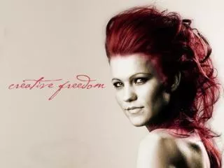
Revlon • Revlon • Re establishes it brand color: RED • Colors used: Red, Burgundy and Pink shades
Conclusion • Colors combinations can effect the way we feel about things therefore it is crucial that we learn how to use that to our benefit to market or site or product.
Works Cited • http://colormatters.com/des_ecom.html • http://library.thinkquest.org/50065/psych/effects.html?tqskip=1 • http://www.insteam.com/LauraFunderburk/ • http://webdesign.about.com/compute/webdesign/gi/dynamic/offsite.htm?site=http://www.bhg.com/default.sph/bhgcontent.class%3FFNC=next%5F%5FAstory%5Fhtml%5F%5F%5F1%5F%5F%5F56%5F%5F%5F432%5F%5F%5F2181%5F%5F%5F2%5F%5F%5F2 • http://www.hothothot.com/ • http://www.will-harris.com/use-type.htm • http://www.victoriassecret.com/ • http://www.lynda.com/hex.html • http://www.cigars-of-cuba.com/secure/index.html • http://www.revlon.com/index.asp • Chijiiwa, Hideaki. Color Harmony. Rockport Publishing, China, 1987 • Weinman, Lynda. Designing Web Graphics.3 New Riders, Indiana, 1999