Graphs
Graphs. V. Martinez. Essential Question. In what ways do we use graphs to solve problems in our daily lives?. Line Plot –organizes data. Ages of People in an apartment building. Bar Graph. A bar graph is used to compare amounts. Pictograph.

Graphs
E N D
Presentation Transcript
Graphs V. Martinez
Essential Question • In what ways do we use graphs to solve problems in our daily lives?
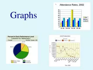
Bar Graph • A bar graph is used to compare amounts.
Pictograph • A pictograph uses pictures or symbols to represent an assigned amount of data. • A pictograph takes the form of a bar graph.
Advantages of a pictograph • A pictograph is easy to read. • 2. They show trends in data clearly. • 3. They are fun to use.
Disadvantages of a pictographs • It may be difficult to find a symbol or picture to represent the data. • 2. The key can be confusing to read. 3. A pictograph can be difficult to make.
Line Graph • A line graph is used to show change over time. • You can use a line graph to look for trends and to make predictions.
Click here to see more about line graphs • http://www.mathgoodies.com/lessons/graphs/line.html
Line Graph - a graph that shows changes over time. Each year the average rainfall was measured in inches. Use the data in the table to make a Line Graph.
Draw the “L” Box2. Put the title. • Average Yearly Rainfall • l • l • l • l • l • L________________________
3. Label the x and y axis • Average Yearly Rainfall • 10l • 8 l • 6 l • 4 l • 2 l • 0 L________________________ • 1995 1996 1997 1998 1999 • Average Rainfall
Add the data by placing dots. • Average Yearly Rainfall • 10l x • 8 l x • 6 l x • 4 l • 2 l x • 0 L_______________________x_ • 1995 1996 1997 1998 1999 • Average Rainfall
Connect the dots. TITLE E LEGEND LABELS
Draw a line graph. • Temperatures In NY City • Day 1 43° F • Day 2 53° F • Day 3 35° F • Day 4 57° F • Day 5 59° F • Day 6 67° F
Use the data to make a line graph. • Sam's Weight • Month Weight in Kg • January 49 • February 54 • March 61 • April 69 • May 73
The graph is easier to read than the table.What do you notice about Sam’s weight?

