Color PowerPoint
Often used for autumn and Halloween designs. Tints or shades of orange (such as peach or ... Cheery and sunny. Combines well in a design but if used alone can ...

Color PowerPoint
E N D
Presentation Transcript
1. Color
2. Why study color? It is the most important element of a design
It is one of the few visual design elements that people notice
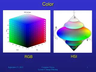
3. Properties of Color Hue: property that gives a color a name (ex: red)
Value: measurement of the amount of light reflected from an object
Intensity: brightness or concentration of a color
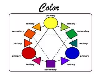
4. The Color Wheel Contains three categories of colors
Primary Colors: red, yellow, and blue; all other colors can be mixed from the primary colors
Secondary Colors: orange, green, violet; mixture of equal amounts of two primary colors
Tertiary (Intermediate) colors: made by mixing a primary color with the adjacent secondary color (ex: red-orange). When naming, the primary color is always named first.
5. Changing the Value of a Color Value can be changed by adding black or white to a color
Adding black produces a shade
Adding white produces a tint
6. Changing the Intensity of a Color Colors can be dulled or neutralized to produce a tone
Adding gray to a color will create a tone
Mixing a color with its complement will also create a tone
Placing complementary colors next to each other will increase intensity
7. Psychological Effects of Color Warm Colors: red, orange, yellow
associated with sun, heat, and fire
evoke warm and happy feelings
warm colors will dominate when in an arrangement
Cool Colors: blue, green, violet
associated with grass, water, ice
create restful, soothing feelings
fade into background of a design
8. Psychology of Individual Colors
9. White Blends easily with other colors
Adds brightness and contrast
Portrays elegance and sophistication
10. Red Embodies strength and dominance
Can often become overpowering if used too much
11. Pink Combines well with other colors
Light pink portrays romance and femininity
Bright and deep colored pinks draw more attention than pastel tints
12. Orange Radiant color
Often used for autumn and Halloween designs
Tints or shades of orange (such as peach or rust) blend well with other colors
13. Yellow Vibrant and highly visible color
Cheery and sunny
Combines well in a design but if used alone can become monotonous
14. Green Serves as a natural background color
Green containers don�t attract attention and are very common
Natural color for foliage plants in a design
15. Blue Peaceful, quiet, and cool
Recedes into the background of a design
Large quantities of dark blue can be depressing
16. Purple (Violet) Color of royalty
Can be seen as either a warm or cool color depending on the accompanying colors
when mixed with reds, the blueness of purple is evident and it becomes cool
when mixed with blues, the redness of purple is evident and it becomes warm
17. How can color be used to create design principles?
18. Balance Dark colors are heavier than light colors
Putting darker colors at the base of a design will add balance
19. Depth Using a combination of warm and cool colors will maximize depth
This combination causes warm colors to advance forward and cool colors to recede into the background
20. Focal Point Bright colors immediately attract attention
Focal points can be created by simply using contrasting colors
21. Rhythm Using similar colors throughout a bouquet or design creates rhythm
If the same or corresponding colors are used as a focal point and again throughout an arrangement, eye movement is increased
22. Harmony & Unity Achieved by the repetition of colors throughout a design
Using similar colors pulls the design together
23. What are common types of color schemes?
24. Monochromatic Uses variations of a single hue
To avoid boredom, make sure to include various tints, tones, and shades of the hue
25. Analogous Color scheme incorporating three or more colors that are next to each other on the color wheel
Can include the hue as well as tints and tones of the hue
26. Complementary Two hues that are directly opposite of each other on the color wheel
Complementary colors intensify each other
27. Split-Complementary Composed of a hue and the two colors adjacent to its complement
Ex: yellow paired with blue-violet and red-violet
28. Triadic Use of three colors equidistant on the color wheel
Can often be difficult to use in a design
Ex: red, blue, and yellow
29. Double-Complement Uses a total of four colors (two pairs of complements)
This scheme can offer a variety of visual effects
30. Alternate Complement Use of a triad plus the complement of one of the colors in the triad
Ex: yellow, red, blue, and violet
31. Tetrad 4 colors equidistant on the color wheel
Ex: yellow, violet, blue-green, and red-orange
32. What influences color selection? Seasons or holidays
Special Occasions (ex: weddings)
Symbolism
Favorite Colors
Existing Colors