Data Analysis Unit Interpreting Data in Various Forms
Learn how to interpret data using various representations like histograms and box-and-whisker plots. Practice ordering data, creating intervals, calculating frequencies, and plotting graphs to analyze information effectively. Gain insight into understanding mean, median, mode, and range from different data representations.

Data Analysis Unit Interpreting Data in Various Forms
E N D
Presentation Transcript
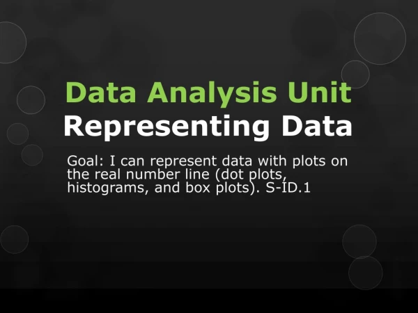
Data Analysis UnitInterpreting Data in Various Forms Standard/Objective: I can interpret data shown in various data representations (dot plots, histograms, and box plots). (S-ID.1)
Histogram Steps Order the data from least to greatest. Determine the intervals by find the range of the data set, dividing the range by the number of intervals (5) and round to the nearest whole number. Determine the frequencies in each interval by counting the numbers in the data set that lie within each interval. Label x-axis with intervals and y – axis with frequency. Draw bars in each interval corresponding to the number of frequency for each interval. Give the histogram a title.
Example #1 The ages of the Board of Directors of an insurance company are given below. Use the data to make a histogram. Board of Directors Step 1: 50, 52, 54, 56, 57, 57, 60, 61, 61, 63, 64, 67, 69 Frequency Step 2: Create Intervals 69-50= 19 19 /5 = 3.8 Intervals = 4 equal intervals starting at 50. Step 3: Determine the frequency Step 4: Label x and y -axis Step 5: Draw bars 50-54 55-59 60-64 65-69 Step 6: Title Ages
Error Analysis-Example #1 • The numbers of students in different classes at a community college: 25, 15, 28, 52, 22, 38, 42, 44, 24, 32, 19, 28, 29, 20, 31 What is wrong with the histograms below? A). B). • The intervals in Graph A are not even, 15 -19 then 20-29. • The bars in Graph B are not touching, there should be no gaps.
Error Analysis-Example #2 Marisa recorded the heights, in inches, of the 17 students in her homeroom. The data set she gathered was 66, 63, 60, 55, 73, 59, 59, 63, 71, 61, 65, 64, 64, 69, 65, 66, 64. She created a histogram to display the data. Which of the following are possible intervals she could use in her histogram? A). 60-64, 65-69, 70-74 B). 55-59, 60-66, 67-69, 70-74 C). 55-59, 60-64, 65-69, 70-74 D). 60-69, 70-79 All the data would fit in the intervals and the intervals are evenly spaced out.
Error Analysis-Example #4 • The numbers of students in different classes at a community college: 25, 15, 28, 52, 22, 38, 42, 44, 24, 32, 19, 28, 29, 20, 31 Which graph represents the data set best? A) B) • The bars in Graph B are not the same width.
Box-and-Whisker Plots A box encloses the middle half of the data and whiskers extend to the minimum and maximum data values. Steps Order the data from least to greatest. Find the minimum and maximum values. Find the median. Find the lower and upper quartiles (medians of the lower and upper half). Plot these five numbers below a number line. Draw the box, whiskers, and a line segment through the median.
0 5 10 15 20 25 35 40 45 50 30 Example 1 Given the data below, construct a box-and-whisker plot. • 36, 39, 40, 34, 33, 48, 25, 30, 37, 17, 42, 40, 24 Min: Q1: Median: Q3: Max: 17 17, 24, 25, 30, 33, 34, 36, 37, 39, 40, 40, 42, 48 27.5 36 40 48
50 55 60 65 70 75 85 90 95 100 80 Example 2 Given the data below, construct a box-and-whisker plot. • B) 92, 94, 87, 76, 69, 82, 62, 90, 76, 82, 85, 87, 64, 61, 95, 87 Min: Q1: Median: Q3: Max: 61 61, 62, 64, 69, 76, 76, 82, 82, 85, 87, 87, 87, 90, 92, 94, 95 72.5 83.6 88.5 95
What can be determined from different representations? The high temperatures in Concord, CA, for October 1–15, 2005, are given below. The data set is represented as a Histogram and Box Plot but each graph tells a different story.
Example #1- What can be determined from a histogram? The high temperatures in Concord, CA, for October 1–15, 2005, are given below. From the Histogram can the mean, median, mode and range be determined without the data set? No, can not determine the mean without the exactly values from data set. Mean: Median: Mode: Range: No, only the median interval by finding the middle value on the histogram. 13 12 4 No, can not determine the mode without the exactly values from data set. 3 11 8 10 2 7 15 9 14 1 5 6 No, can not determine the range without the exactly values from data set. Since there is 16 temperatures 8 is middle value, therefore 78-81 is the median interval.
Example #2- What can be determined from a Box Plot? The high temperatures in Concord, CA, for October 1–15, 2005, are given below. From the Box Plot can the mean, median, mode and range be determined without the data set? No, can not determine the mean without the exactly values from data set. Mean: Median: Mode: Range: Yes , it’s 81. No, can not determine the mode without the exactly values from data set. Yes , it’s 17 because 87(max)- 70 (min).
Example #3 Sara used box-and-whisker plots to show the points she scored in her basketball games this season. She used different plots for the home and away game data, and produced the graph below. Unfortunately, Sara cannot remember which plot represents the home game data and which represents the away game data. Which fact can she use to determine which set of data was used to create each box-and-whisker plot? A). Sara scored at least 5 points in every home game. B). The mode of the set of away game scores was 14. C). Sara scored 23 points in an away game last week. D). Sara played more home games than away games. Both Box Plots have a minimum value of 5.
Example #4 Jorge created the box-and-whisker plot below to display the number of points he scored during each basketball game this season. Can you find the number of scores used to create the box-and-whisker plot? Why or why not? Explain. No, can not determine the exact number of points scored without the exactly values from data set of each basketball game.
Example #5 Jorge created the box-and-whisker plot below to display the number of points he scored during each basketball game this season. Find the range of points used to create the box-and-whisker plot or explain why it's not possible to determine that from a box-and-whisker plot. Yes, the range of points scored can be determined, 14 - 4 = 10. The range of points scored is 10.
Example #6 Jorge created the box-and-whisker plot below to display the number of points he scored during each basketball game this season. Find the mode of the points used to create the box-and-whisker plot, or explain why it's not possible to determine that from a box-and-whisker plot. No, can not determine the mode points scored without exactly values from data set from each basketball game.
Example #7 The counseling department at Glendale Community College created the following histogram to display their class sizes. Explain how to determine, or why you cannot determine, the number of classes they used to create the histogram. Yes, by adding up the frequency of each bar to find the total amount of classes they used to create the histogram. 7 2+7+3+3= 15 classes were used to create the histogram. 3 3 2
Example #8 The counseling department at Glendale Community College created the following histogram to display their class sizes. Explain how to determine, or why you cannot determine, the range of the class sizes that they used to create the histogram. No, can not determine the range of class size without the exactly values from data set of each class size.
Example #9 The counseling department at Glendale Community College created the following histogram to display their class sizes. Can you determine the median of the class sizes? If so, what is it? If you cannot find the exact median, determine the narrowest interval within which you know the median must lie. Can determine the interval the median value would fall into by find the middle number of data value on histogram. 9 No, can not determine the exact median without the exactly values from data set of the class sizes. 8 7 6 5 12 15 The median class size would lie be between 20-29 students. 4 2 11 14 10 3 1 13
Relating Histograms to Box Plots • http://higheredbcs.wiley.com/legacy/college/mann/0470444665/applets/applet_01_v4.html
Summary • What information can you find from a box-and-whisker plot? • What information can you find from a histogram? • What information can you find from a dot plot?