Download
1 / 18
180 likes | 281 Vues
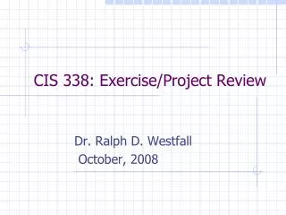
CIS 338: Exercise/Project Review. Dr. Ralph D. Westfall October, 2008. Submitting Exercises/Projects. Specifications. "You didn't say you wanted _____" specifications (specs) are always incomplete programmers/analysts get paid to solve problems incomplete specs is one of the problems

E N D
CIS 338: Exercise/Project Review Dr. Ralph D. Westfall October, 2008
Specifications • "You didn't say you wanted _____" • specifications (specs) are always incomplete • programmers/analysts get paid to solve problems • incomplete specs is one of the problems • avoid making unwarranted assumptions • when in doubt, research things you can find on your own, ask about other things
Quality of Solution • “right” vs. “better” solutions • calculations must be right • 2 + 2 = 4 is the right answer • 2 + 2 = 55 is a wrong answer • what is “right” when creating something that can't be verified logically? • art vs. science • try to make user interface "better"
Beware of "Tunnel Vision" • use all information available to you, e.g. • information in textbooks • programming information on web sites • online forms on the Internet • but don't keep bugging clients • don't ask for things you should be able to figure out on your own • but do post messages to Discussions
Timing • make a schedule • analysis, coding, testing and debugging, preparing materials to turn in • include some "slack" (extra time) in schedule • something always goes wrong
Reliability • your program HAS TO run on the client’s computer • you can’t say “It runs OK on my computer” • professors may get away with this but … • testing needs to include another computer • testing needs to include unexpected conditions • e.g., what happens if a web site gets 100,000 or 1 million visitors? (Britannica)
Help the User • 25 cents may be better than 0.25 • 2 keystrokes, not 4 • label to explain this so user doesn't get confused • use meaningful titles, align the labels, make textbox sizes proportional to inputs • labels can make subtle distinctions clearer • e.g., data is percent, not decimal • format output(s) in currency where necessary • keep buttons together, Exit on lower right
Other Issues • use Option Strict On • consistently use object naming conventions • btn[name], txt[name], frm[name] • use comments, but don't overdo it • comment "tricky" code, NOT obvious stuff • well-chosen variable names reduce need for comments
General Exercise/Project Issues • be sure zip file is submitted • extra/final step (button) after uploading • screen print(s), all code, etc. should be in one Word .doc file • penalty for every file imported for grading • make sure all files are included in zip • .doc, .vb, .sln, .suo, etc. • bin and obj directories also
Specific Exercise/Project Issues • Textbox size should relate to size of data • Decimal calculations, # of digits after decimal • Form1 caption not meaningful to user • Naming convention not used (frm, txt, btn) • Need to get rid of unused/"dead" code • Comments: don't overuse • Project 1: 9 out of 29 were late • Code must be edited to get project to run?
Example 1 • attractive layout • output textbox disabled • right aligned #s • not overly large • but textboxes are much wider than inputs
Example 2 • layout is good • good feature: output textbox is disabled • textboxes too big on this one also • numbers aligned left • right or centered better?
Example 3 • good feature: shows grade and grade points • Clear (reset) button • labels are too wide, for both textboxes and buttons • lot of unused space on form
Example 4 • nice color and layout • output textbox disabled, which is good • but make textboxes less wide, to fit data • get rid of unused space on upper left and bottom of form
Example 5 • centering is better than left aligned #s • TextBoxes have too much vertical height • frame around answer is helpful • too many decimals • but it's a common practice is to keep textboxes in one column
Example 6 • Form1 (.Text) is not meaningful to user • other comments?
Example 7 • buttons in between textboxes is not the standard or typical arrangement