Color
Color. ELEMENTS OF DESIGN Elements of design are “tools”. Just like the carpenter has a hammer and saw, the designer has the elements. There are 4 elements of design: Line, Form, COLOR, & Texture.

Color
E N D
Presentation Transcript
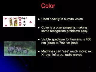
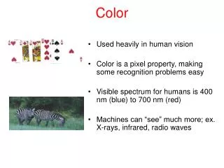
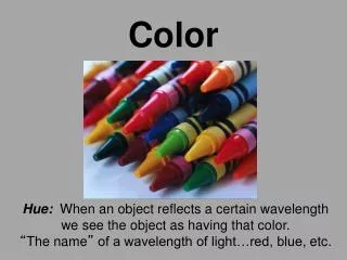
ELEMENTS OF DESIGN Elements of design are “tools”. Just like the carpenter has a hammer and saw, the designer has the elements. There are 4 elements of design: Line, Form, COLOR, & Texture. Color is a property of light. A color spectrum is produced by a beam of light as it passes through a prism. Although the number of colors is unlimited…more than 10 million have been identified, and several hundreds have been reproduced by scientists.
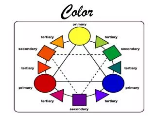
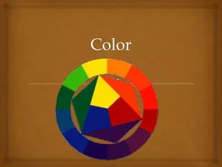
Color Wheel This color wheel system, based on three primary colors, is known as the Brewster System. It was developed by David Brewster. It is also called the Prang System. Each color on the color wheel is a true “hue”.
Primary Colors… Red, Blue, and Yellow Primary colors cannot be man-made by mixing other colors together. A pigment is color from a biological source, which when used in housing and design applications can be natural or synthetic (manmade).
Secondary Colors… Orange, Green, and Violet Remember, it’s “violet”, not purple. Secondary colors can be “made” by mixing two primary colors together. Blue and red make violet; red and yellow make orange; yellow and blue make green.
Tertiary Colors… Yellow-green, Blue-green, Blue-Violet, Red-Violet, Red-orange, Yellow-orange The tertiary colors are also referred to as the intermediate colors.Tertiary colors are made by mixing a primary with a secondary color… the primary color is always listed first. For example, when the primary color of yellow is mixed with the secondary color named green, the new tertiary color is called yellow-green. Tertiary colors can be expanded further, such as mixing blue and blue-green together. The result would be the color blue-blue-green. Perhaps we would name that color “teal” to be less confusing.
Neutral Colors… Neutral colors include black, white, and brown. They also include all the tints and shades of black, white, and brown… so include colors known as tan, beige, gray, cream, etc. Neutral colors can be made by mixing: black and white complementary colors all three primaries together (plus some black or white) Neutral colors blend well with all other colors. They enhance and strengthen the other colors around them. Stone such as slate, brick, marble, etc.; metallics such as brass, pewter, gold, chrome etc.; and glass fall into the neutral category. Black is the absence of “light”; white is the absence of “color”.
Complementary colors… Complementary colors are those located directly opposite each other on the color wheel.
“INTENSITY” OF COLORS Intensity is the brightness or dullness of a color. It is sometimes called “chroma”. The intensity changes by using the complementary color. The degree of brightness is referred to as “saturation”. Place a hue beside its complement to make it appear brighter. Add the complementary color to a hue to make the hue “dull”. When complementary colors are mixed, grays and browns can result. Saturated less saturated less saturated Saturated
“VALUE” OF COLORS In nature there are hundreds of different steps in value that are sometimes not easily distinguished by the human eye. Value is the lightness or darkness of a color. To combine a hue with black is called a SHADE. To combine a hue with white is called a TINT. To combine a hue with black and white is called a TONE. Remember… colors appear darker when placed on rough textures. Paint appears darker when it dries on the wall. Artificial incandescent and fluorescent lighting changes the appearance of some colors.
Color Schemes • There are certain groups of colors that work together very well in interiors…they might be referred to as Color Schemes or Color Harmonies. • A color scheme can include hues, any values (including tints, shades, tones), or intensities of that hue, and any neutrals. • Make sure when using color schemes to select colors that you or your client likes. • Color schemes of adjoining rooms may need to be coordinated. • Although some designers prescribe to the idea that “beauty is in the eyes of the beholder”, most prefer a “tasteful” approach. Taste is defined as a cultured appreciation for aesthetic quality or sensibility.
Monochromatic • A color scheme using one color, and tints, tones and shades of that color.
Analogous • A color scheme using 3 or more colors next to each other on the color wheel.
Complementary • A color scheme using colors opposite each other on the color wheel.
Double Complementary • A Color scheme using two sets of complementary colors.
Split Complementary • A color scheme using one color, and the colors on either side of it’s complement. This color scheme, along with the double complementary are more difficult to achieve in a tasteful fashion.
Triad • A color scheme using three colors equal distance from each other on the color wheel.
Neutral • A color scheme using whites, blacks, browns, grays and beiges, etc. This scheme is often “accented” with a small amount of another hue, and called the ACCENTED NEUTRAL.
Some designers base a room decor on a popular “theme” instead of a prescribed color scheme. It should only be used if it reflects the personality and preferences of the client. Fad The bedroom above is decorated around a nautical “theme”, disregarding any specific color harmony. This red, white, and blue color combination is only acceptable for those who prefer the patriotic “theme”.
What doesn’t count… As you put together or identify the background and furnishing samples that make up your color scheme, there are some items in the room that do not have to be considered: Books and magazines. The colors of a painting, although the predominant color, frame, and mat colors may be considered. Living things, such as pets, fresh flowers, and plants.
Warm Colors • Colors on the warm side of the spectrum…red, yellow, orange. They usually also include the neutral black and brown tones. Warm colors are especially good in rooms with northern exposures.
Cool Colors • Colors on the cool side of the spectrum…blue, violet, green. They usually include the neutral white and gray tones. Cool colors are especially good in rooms with southern exposures.
Light Colors “RECEDE” When rooms are painted pastel or light colors/neutrals, they seem bigger. The colors “recede” or appear to move away from you. Remember when selecting paint… the paint dries darker on the wall. Dark Colors “ADVANCE” When rooms are painted dark colors/neutrals, they seem smaller. The colors “advance” or appear to move in closer to you. Large prints or very “busy” prints may also make a room appear smaller.
Choosing Color Schemes… • Color schemes look best when one color dominates. • Your dominant color should cover about two-thirds of the room area. An equal split between dominant and subordinate colors is less pleasing. • Evaluate parts of the room that cannot be changed, then consider color choices that will complement existing furnishings. • Base your color scheme on the exposure of the room (choose warm colors for northern exposures and cool colors for southern exposures; choose lighter colors for small rooms and darker colors for large rooms; choose colors you like; choose colors that complement a particular fabric, wallpaper, work of art, etc. • Consider the psychological and physiological effects of color…
Physiological Effects of Individual ColorsColor creates powerful psychological and physiological effects. Psychological effects are sensed in the mind; physiological effects actually cause a change in the body. It is important to note that people may react differently to the same color, based on their previous experiences or learned behavior. Research studies have shown that: • Color affects eye's perception of weight and size. Dark and bright colors seem heavier than light and cool colors. (However, it is interesting that the opposite effect is true in fashion design. Dark colors tend to slim the figure, whereas light colors are usually thought to make one look heavier.) • Color affects a person's perception of temperature. Studies have indicated that body temperature actually fluctuates in response to various colors. For example, red, orange, and yellow can raise one's temperature; cool colors have the opposite reaction. • Color can cause feelings of boredom and calmness, or stimulation and liveliness. Colors may cause the nervous system to become agitated, and the body reacts in negative ways to this stimulus. • Colors can affect one's reaction to sounds, taste, odors, and time perception. • Colors can improve the rate of recovery of sick patients.
Psychological Associations with Color: Gray Elegance, humility, respect, reverence, stability, subtlety, timelessness, wisdom OR boredom, decay, decrepitude, dullness, dust, pollution, urban sprawl White Reverence, purity, snow, peace, innocence, cleanliness, simplicity, security, humility, marriage, sterility, winter OR coldness, sterility, surrender, cowardice, fearfulness, winter, unimaginative Black Modernity, power, sophistication, formality, elegance, wealth, mystery, style OR evil, death, fear, anonymity, anger, sadness, remorse, mourning, unhappiness, mystery Red Passion, strength, energy, fire, love, sex, excitement, speed, heat, leadership, masculinity, power OR danger, fire, gaudiness, blood, war, anger, revolution, radicalism, aggression, stop Blue Seas, skies, peace, unity, harmony, tranquility, calmness, coolness, confidence, water, ice, loyalty, conservatism, dependability, cleanliness, technology, winter OR depression, coldness, idealism, obscenity, ice, tackiness, winter Green Nature, spring, fertility, youth, environment, wealth, money (US), good luck, vigor, generosity, go, grass OR aggression, inexperience, envy, misfortune, jealousy, money, illness, greed Yellow Sunlight, joy, happiness, optimism, idealism, wealth (gold), summer, hope, air OR cowardice, illness (quarantine), hazards, dishonesty, avarice, sissification, weakness Violet Sensuality, spirituality, creativity, wealth, royalty, nobility, ceremony, mystery, wisdom, enlightenment OR arrogance, flamboyance, gaudiness, mourning, profanity, exaggeration Orange Buddhism, energy, balance, heat, fire, enthusiasm, flamboyance, playfulness OR Aggression, arrogance, flamboyance, gaudiness, over-emotion, warning, danger, fire Brown Calm, depth, natural organisms, nature, richness, rusticism, stability, tradition OR boorishness, dirt, dullness, filth, heaviness, poverty, roughness
Color The End
Color Projects You will be completing a total of 8 pages for these two projects. The first 6 pages will each be set up to illustrate a neutral, monochromatic, complementary, analogous, triad, and fad color scheme according to the sample given. Include the title, your name, and a color wheel that is suitably colored and labeled for each page. You must find your pictures in catalogs or magazines… not the internet. You may use a computer or your templates for printing. The 7th page will include a hand-painted value and intensity scale, using the tempera paint colors of your choice. On the 8th page, use colored pencils to color each picture in a manner that illustrates the psychological associations of color. Dull Hue Dull Complement Hue Brown Complement White 5 Tints True Hue 4 Shades Black Red Value Scale Intensity Scale
COLOR SCHEME: MONOCHROMATIC BY YOUR NAME This monochromatic color scheme is based on a single hue… red orange. By mixing a small amount of red-orange and white, a peachy tone is achieved.
Dull Hue Dull Complement Hue Brown Complement VALUE & INTENSITY OF COLOR By__________ Value scale for the color:______________ Intensity Scale for the color: ___________ White 5 Tints True Hue 4 Shades Black
Name: ____________________ The psychological associations of color… A rose for your sick relative in the hospital. A rose for your true love! The blanket of your favorite race horse. Teen boys car. A hat, perfect for the king’s coronation or the college graduate. The sofa in the dentist’s waiting room.