Download
1 / 18
210 likes | 592 Vues
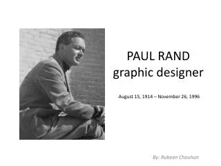
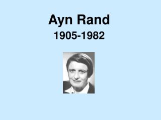
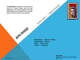
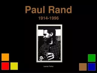
Paul Rand 1914-1996. Image here. Lauren Fisher. Early Life. Paul Rand was born Peretz Rosenblum in Brooklyn in 1914 Being born into a strict Orthodox Jewish family was an obstacle for him since the religion did not allow drawing or representations of the human form

E N D
Paul Rand1914-1996 Image here Lauren Fisher
Early Life • Paul Rand was born PeretzRosenblum in Brooklyn in 1914 • Being born into a strict Orthodox Jewish family was an obstacle for him since the religion did not allow drawing or representations of the human form • He took night classes at Pratt during high school against his parents’ will • He attended Parsons School of Design in 1932-33 as well as the Art Students League in 1933-34 • Peretz changed his name to Paul Rand in order to fit into the advertising world which was dominated by Protestants
Influences • Paul always felt he was a self taught designer • He credits Gebrausgraphik, a German advertising magazine, for early influences on his work • Modernists, like Picasso, Leger, DuChamp and Paul Klee • He drew on many European art movements: Cubism, Constructivism, and De Stijl to produce his own style
Graphic design career • Wrote several books on design • Wrote and illustrated several children’s books • Consulted for companies • Taught at Yale
First job at Apparel Arts Magazine setting the page layouts • Became known for “transforming mundane photographs into dynamic compositions”
A page from Apparel Arts Magazine • Influence of European Modernists • Engages viewer in the creative process
A cover he designed for Direction Magazine, an anti-fascist magazine of art & culture • Christmas issue 1940 • “presents the magazine as both a war torn gift and a crucifix”
Advertisement: Coronet Brandy ‘Man’ • photo, collage, print & drawing • bold graphics • whimsical humor
Advertisement for Dubonnet Company • cubism influence • prominent label (page 2 of logos)
Advertisement for El Producto Cigar Company • combines photo of cigar & label with whimsical line drawings • used this mascot over & over in ads for the company, close to 100 of them
1956 redesigned the IBM logo • they did not ask him to change the logo, he felt it needed to be updated • took the label from 3 solid capitals to the 3 striped capitals • he saw a problem with the sequencing of the letters going from narrow capital I to the wide capital M, stripping tied them together
A poster done in 1981 for an in house event for the company • initially officers at IBM did not like because took away from their official logo • known as one of his best works
Original Westinghouse logo was made with a “gothic” typeface “w” • Rand choose not to depart totally from the original, instead he changed the “w” to a circuit board “w” and kept the circle around it
UPS approached Rand in 1961 • he took their antiquated shield logo, and decided to make it more modern • he streamlined the shield, used lower case gothic lettering, and placed the outline of a package with a bow on top
1962 the American Broadcasting Company (ABC) approached Rand to redesign their logo • original logo was three capital letters in black: ABC • Rand decided to change them all to lower case gothic typeface and based his design on 3 equal circles of white on a black background • Rand loved the idea of minimalism
Rand collaborated with Steve Jobs for the NeXT computer in 1986 • Steve Jobs wanted to have a logo designed for his educational computer company, he went to IBM to seek special dispensation so that Rand could design a logo for him • The computer came in a black box/cube • “decided to frame the word itself within a cube to evoke the product itself” • changed “e” to lowercase because he felt all capitals would be misinterpreted as EXIT
“A logo cannot survive unless it is designed with the utmost simplicity and restraint”. - Paul Rand
Sources Heller, Steven, and Paul Rand. Paul Rand. London: Phaidon, 2000. Print.