Download
1 / 29
290 likes | 448 Vues
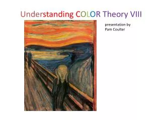
presentation by Pam Coulter. Under standing C O L O R Theory VIII. Review: Warm colors approach cool colors recede.

E N D
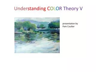
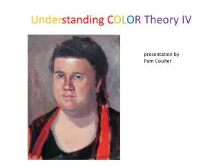
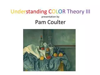
presentation byPam Coulter UnderstandingCOLOR Theory VIII
Review: Warm colors approach cool colors recede In depth perception, our human vision reads warm colors (red, orange, yellow, yellow-green) as closer to us and cool colors (blue, purple blue-green) as more distant. Notice that, if you stand looking out over distant fields, while you may still see a red roof in the distance, in general, farther objects will be "bluer" and nearer objects, brighter and warmer.
Flattening the plane • You can “flatten” space in a composition by mis-using cues. Doing a still life, for instance, where all the objects are bright and primary brings them into the same plane. (Not saying this is wrong. You can use this if you know what you’re doing.) Abstract by Mary Ellen Mogee
What’s wrong with this portrait? Doing a portrait where the background is brighter and more warm than the face makes the face recede. Mary Ellison by Mary Cassatt
Review: Warm colors approachCool colors recede Exercise: landscape or portrait – using background color properly and “improperly”
Review: Color proximity colors affect colors they are near. As an exercise to see this, we did a series of small simple figure-on-ground exercises using the same color on the figure and different colors on the ground (the background or area surrounding the figure.) Examples on following slides:
Review: Color ProximityUsing a colored ground Using a colored ground under your painting affects the painting, particularly if the paint is a bit transparent. Also, allowing a contrasting colored ground to show through parts of the painting gives an interesting contrast.
Review: Colored Ground If you are going to start with a dark ground, you will want to ensure that your paints are relatively opaque. The opacity or transparency of your paints affects the finished product.
Color opacity and transparency Color opacity and transparency, how it affects your painting in acrylics and oils. How to combat problems. Show examples of information on paint tubes. Have students demonstrate with their colors, using a black line from a sharpy. Optional exercise: do a chart of opacity / transparency as shown
color and composition: hard and soft edges Hard edges are those that don’t blend into adjacent forms. Soft edges allow a value or color to blend and blur into adjacent areas. Note: following compositional notes don’t just apply to color. But color can be important in making hard and soft edges. Use contrast or lack of contrast. Exercise: do a simple still life, finding the hard and soft edges. Can be monochromatic. See example next page.
color and composition: Broken color …and why it is used. Broken color: Two or more colors so placed in a painting as to produce the optical effect of another color, without being mixed on the palette.
Why the “Old Masters” used dark backgrounds in portraits Woman Holding a Balance, Vermeer Laughing Cavalier, Franz Halls Self Portrait, Rembrandt
“Picasso believed Art to be the son of Sadness and Suffering… that sadness lent itself to meditation and that suffering was fundamental to life… If we demand sincerity of an artist, we must remember that sincerity is not to be found outside the realm of grief.” Picasso’s “Blue Period” is further triggered by the fate of his closest friend, CarlesCasagemas, whose infatuation with a girl and her rejection led to his subsequent attempt to kill her and to his own suicide. Picasso explained later, “It was thinking about Casagemas that got me started painting in blue.” Mood and color Picasso, blue period, Old Guitarist
Mood and color Gradually, Picasso’s colors brighten, in what has somewhat misleadingly been termed the “Rose Period” (1904-1906). Not only soft pinks, but blues, reds and greens complement these images. The emaciated figures became fuller. The new color expresses warmth and life. Picasso, Rose Period
Mood and color Munch, The Scream In his diary in an entry headed, Nice 22.01.1892, Munch described his inspiration for the image: One evening I was walking along a path, the city was on one side and the fjord below. I felt tired and ill. I stopped and looked out over the fjord—the sun was setting, and the clouds turning blood red. I sensed a scream passing through nature; it seemed to me that I heard the scream. I painted this picture, painted the clouds as actual blood. The color shrieked. This became The Scream.
Mood and color This painting may communicate many different moods to different people. Vermeer has not left any written explanation. What do you think? Vermeer, Woman reading a letter
Mood and color JMW Turner’s painting at left evokes the deep and solemn calm of the funeral of Turner’s old friend and colleague, the painter Sir David Wilkie. Wilkie died on board ship while returning from the Middle East in 1841, and was buried at sea off Gibraltar. A strong focus is the silhouetted black sail, of which Turner declared, “I only wish I had any color to make them blacker.” The blackness of the sail challenges the tradi-tionallaws of aerial perspective, developed by both Northern and Venetian painters, accord-ing to which the sail should be less distinct. Turner’s departure from the traditional perspective was his device to emphasize and express grief. The sails are crisp and sharp, but the background of this painting, and many of his seascapes, is blurred and indistinct, creating atmosphere and a sense of motion.
High and low key High and low contrast These terms aren’t specific to the study of color, but you should understand them. Key refers to the dominant tone or value of a picture: high (light), medium or low (dark.) Contrast refers to the difference in high and low tone values used for emphasis in a picture. A painting can be high key and still have some point of high contrast, or low key and high contrast, low key (that is, mainly dark) and low or high contrast, low key and low contrast. If a painting doesn’t seem to be working, take a look at the key and contrast. Often, working on a painting, you may find it is all in the middle grey tones: little contrast, indifferent medium key values. One way to evaluate this is to take a photo or make a photocopy and see if the paintingall appears to be in the mid-tones. Then add some contrast.
Key and Contrast Low Key High Key Medium Key High Contrast Medium Contrast Low Contrast
Final Review We covered: 4 basic aspects of color in brief and in full: Hue Value Saturation Temperature The history of the color wheel Color gamuts Application of the color wheel in painting
Review We covered: How to mix neutrals (greys and browns) The three-color colorwheel The 6-color wheel and why it works The color value scale How to modify “home” value using analogous and complementary colors Tints and shades Warm and cool shadows
Review We covered: When the light is cool, the shadows are warm and vice versa. Atmospheric (aerial) perspective Warm colors approach; cool colors recede Color proximity: how color affect colors they are near. Using colored grounds
Final Review And today we covered: Color transparency and opacity: how it affects your painting in acrylics and oils and how to combat. Use of color in composition: Hard and soft edges broken color and why it is used Why the “old masters” used dark backgrounds in their portraits Color and mood High and low key High and low contrast
A final note “Art is a word that summarizes the quality of communication” quote from essay on art by L. Ron Hubbard Don’t sacrifice the message by working only to achieve technical perfection, but work to achieve competence adequate to convey the message. My advice, Pam Coulter Blehert
November afternoon, Hanover Avenue, Richmond VA by Pam Coulter (pamcoulterart.com)