Analyzing Sushi Preferences: Dependence in Choice Through Quantitative Survey Methods
This study investigates whether individual preferences in sushi roll choices demonstrate dependence rather than random selection. Using a dataset from a survey of 5,000 respondents who ranked their top ten sushi rolls, we explore how often pairs of rolls are chosen together, identifying popular and unpopular pairings. By applying simulation techniques to compare actual choice frequencies against expected frequencies, we aim to derive insights into consumer taste without being solely influenced by overall popularity. This research contributes to understanding taste dependency in food preferences.


Analyzing Sushi Preferences: Dependence in Choice Through Quantitative Survey Methods
E N D
Presentation Transcript
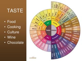
Quantifying Taste Testing for Dependence in Choice
Let’s say there’s a survey of the following format: Choose n out of these k objects For example: • Choose your three favorites out of these ten photographs • Of these fifty apps, which ten would you download to your phone? • Which two of these seven movies would you want to watch?
So if we had a survey like that… Could we prove that that there is dependence within each person’s choices? For example, do people have a certain “taste” in sushi rolls? Objectives: • We wanted to prove that each person does not choose randomly. Some items are chosen together more often than they would be otherwise. • In particular, we wanted to find which items are similar to one another. If a person chooses a given object, which other objects is he also more likely to choose?
Dataset • SUSHI Preference Data Set -- survey taken by 5000 people in which they were asked to rank ten different types of rolls from best to worst (http://www.kamishima.net/sushi/ ) • The ten rolls: shrimp (0), sea eel (1), tuna (2), squid (3), sea urchin (4), salmon (5), egg (6), fatty tuna (7), tuna roll (8), cucumber (9) • We just looked at each respondent’s first three choices and ignored the order in which they listed them. (This way, the data fit our “choose n out of k” format.)
Summary of the Data The following is a matrix of how often each pair of sushisappeared together in someone’s top three: Most popular pairs Least popular pair
End of the Story? Doesn’t this answer our questions? • The most popular pairings were (2,7) and (4,7). So those who like roll #7 were more likely to choose roll #2 or #7. • The least popular pairing was (5,9) – only 21 respondents listed them as two of their top three! They must be very dissimilar.
Taste or Popularity? That ignores the fact that some rolls were just more popular overall. It makes sense that (2,7) and (4,7) were chosen together so often since 2, 4, and 7 were popular overall. The reverse is true for 5 and 9. There’s no clear proof that these pairings tell us anything about people’s taste – they may just reflect each roll’s popularity.
How Should We Adjust For This? We needed to generate a matrix of how often each pair of rolls would be expected to appear together. We could then compare the actual results to the expected results. To generate this matrix, we decided to run a simulation.
How Should We Simulate It? • Each respondent needs to randomly choose three rolls • The rolls must be chosen without replacement – each respondent needs to choose three differentrolls • Each roll’s overall popularity must be held fixed
Simulation Technique #1 • Simply choose three rolls out of ten without replacement, using sample(0:9,3,replace=FALSE,prob=P1,P2,…)in R • Imagine that a number line between 0 and 3 is split up into 10 parts where the size of each part is proportional to the frequency of each subsequent roll. • A random number between 0 and 3 is then generated, corresponding to one of the rolls. For example, if 1.4 was generated, then roll #4 would be chosen.
Simulation Technique #1 con’t • A new number line is then drawn, leaving out whichever roll was chosen the first time, while proportionally increasing the size of each remaining part. For example, this would be the new number line if #4 were chosen: • Once again, a number between 0 and 3 would be chosen, corresponding to the second roll chosen. • This same process would be repeated to choose the third roll.
Problem with Technique #1 • We have to redraw the number line after the first choice. As a result, the probabilities for the second and third choices are not the same as the overall probabilities. • The overall distribution of choices from the simulation is not equal to the overall distribution of choices from the actual survey: How can we fix this? We somehow need to keep the overall probabilities constant for each choice, while still not allowing for repeats.
Simulation Technique #2 Hartley and Rao (1962) describe an approach to solve this problem: • Randomize the order of the rolls. This was accomplished by calling sample(0:9) in R. • Split up the number line between 0 and 3 into 10 parts where the size of each part was still proportional to the frequency of each subsequent roll, but using the new order. For example, when the new order of the roll is [3,7,5,9,1,2,4,0,8,6] we use the following number line:
Simulation Technique #2 con’t • A random number between 0 and 1, d, is chosen. • The three rolls selected are the ones corresponding to d, d+1, and d+2. In the following example d = .95, meaning that rolls 5, 2, and 6 – the rolls corresponding to .95, 1.95, and 2.95 – are chosen.
Simulation Technique #2 = Success! Our simulation shows that each roll is chosen with the same frequency using this technique as in the actual survey.
Expected Matrix Using this second method, we found our matrix of expected results. The fact that our expectations were so different from the actual data implies that people don’t make their choices independently.
Generating the Residual Matrix • We generated the residual matrix using the formula • The residuals serve as measurements of similarity. A large positive residual means that the two rolls are similar and were chosen together more often than would have been expected. • The opposite is true for a large negative residual.
Residual Matrix *Remember how 2 and 7 initially seemed to be the most similar pair? It still looks like they are similar, but there are many other pairings which are much more similar. For example, 6 and 9 were chosen together only 66 times yet has a larger residual!
Distance Matrix and Visualization • To convert the residual matrix into a distance matrix, we needed to make all the values positive. We did this by setting distance equal to . • To visualize this matrix, we ran multidimensional scaling (MDS). • MDS attempts to set a point for each roll such that the distance between any two points is proportional to the distance between the corresponding rolls. These points are then plotted on an (x,y) axis so the results can be seen more easily. • Essentially, the n objects are first plotted in (n-1)-dimensional space so that the distances between all points are perfect. This is then “scaled down” to two dimensions.
MDS Results 0 - shrimp 1 - sea eel 2 - tuna 3 - squid 4 - sea urchin 5 - salmon 6 - egg 7 - fatty tuna 8 - tuna roll 9 - cucumber
To further support these results, we re-ran the analysis by looking at each respondent’s top five choices. These were the results of the new multidimensional scaling: The fact that this plot is so similar to our prior one (see previous slide) proves that our results were not merely a result of the fact that we arbitrarily chose to look at the top three choices and that any value of k and n (where k<n) should work.
The MDS makes sense! The groupings made by the MDS make sense when we look back at what each type of roll was.
Why does it make sense? Look at the clusters it formed: • 6 and 9 Egg and Cucumber, the two non-fish choices • 2, 7, and 8 All three are different types of tuna rolls Since those clusters make sense on their own, and were confirmed by our statistical analysis, we could also trust the other clusters we formed: • 4 and 5 Sea Urchin and Salmon • 0, 1, and 3 Shrimp, Sea Eel, Squid
Conclusion • In our study, we looked at associations in choice data using simulations. • The simulation was done by sampling without replacement yet still proportional to size. • We showed that people did not make their choices randomly. • MDS and clustering based on the identified associations revealed the specifics of people’s taste. • This general approach can be readily applied to other choice data.