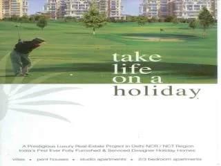
Discovering Dubai: A Cultural and Tourist Haven Featuring Beyoncé
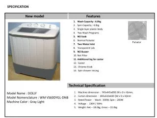
This magazine cover, designed by Awatif Kaissi, epitomizes tourism in Dubai while showcasing global icon Beyoncé on its cover. The use of both French and English makes it appealing in Morocco. The typography blends block and italic fonts with a variety of colors, emphasizing key information such as “WOW! Beyoncé African Queen.” Despite aesthetic challenges with a busy layout, the striking visuals and contrasting colors effectively draw in readers. This monthly issue offers insights into Dubai’s attractions, capturing the modern and cultural essence of the destination.

Discovering Dubai: A Cultural and Tourist Haven Featuring Beyoncé
E N D
Presentation Transcript
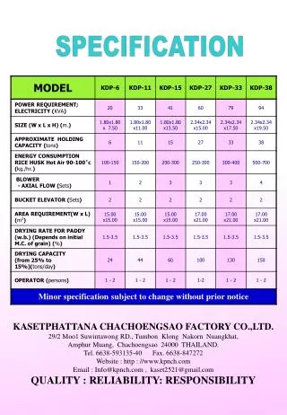
speCIFIcAtion By Awatif Kaissi
This graphic uses french as well as english which is notorious in Morocco. Also this magazine has advertised itself by celebrity endorsement using beyonce on their cover. They have changed their fonts from block to italics in places, as well as having different sized text located across various areas of the page making more important information stand out such as “WOW! Beyonceafrican Queen” Furthermore the background is white, contrasting with the black home colour. This magazine cover is simple yet effective as the only image seems to be of Beyonce.
This magazine cover is about the tourist attraction that is Dubai. It includes images of what is inside as a sneak peek. The text is all in the same font but differ in the colours blue, green, yellow, navy and black. This makes the magazine cover look messy as there is no home colourand the text “international” looks too far stretched and squashed. However the well known building in Dubai is clearly visible. They also include the date of issue as september 2012, this shows that it’s a monthly issue. The title is in three different colours; black, orange and green which do not come together well as it does not look in proportion to the rest of the cover. Furthermore there does not seem to be a home colour to this magazine cover, making it look unprofessional.
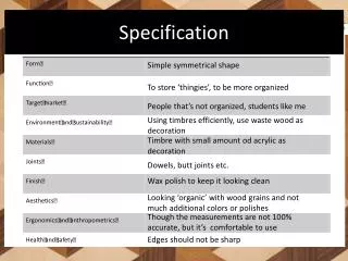
There are 3 images blended together; the mountains, dilapidated building and a desert. This tool that has been used is effective as it looks as though it is one image and not 3 separate images. The home colour applied is red and is consistent throughout the magazine cover. There is not much text on this cover other than the title and a list of north africas countries on the left hand side but the the font is in red italic
WHAT THE USER IS EXPECTING • From my graphic, the users are expecting a magazine cover on the tourism of Morocco that includes an insight to its culture and modern society. The cover is a blend of images with text all over various parts of the magazines cover. These texts differ by size and and colour in some areas and this allows it to attract the readers attention to more important information and more enticing information to be held within the magazine.