Download

1 / 14
140 likes | 295 Vues
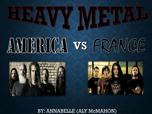
Foundation Production Planning By Annabelle Snelling. Screamo music.

E N D
Foundation Production Planning By Annabelle Snelling
Screamo music • ‘Screamo is a genre of music which predominantly evolved from hardcore punk, among other genres, in the early 1990s. The term "screamo" was initially applied to a more aggressive offshoot of emo that developed in San Diego in 1991, which used short, chaotically executed songs which grafted "spastic intensity to willfully experimental dissonance and dynamics. In the early 2000s, the genre name began to describe a different, slower and less dissonant style that borrowed from alternative rock. The term's application to the "second wave" is controversial among fans and practitioners of the earlier style. One musician alleged that the term "has been kind of tainted in a way, especially in the States“.’
Contents page draft layout This is my first idea for my layout of my contents page. I liked the way the ‘CONTENTS’ sign was shown, as though it is dropping down and pointing slightly in the direction of the next page, suggesting that there is much more to be seen within the magazine. I thought that it would be important for the Features and writing on the contents page to be clear and not hard to read and quick and easy to read for those searching for particular section of the magazine, not making it too long and complicated.
Front page draft layout I first decided that I would use a picture in the middle of my magazine, and a title at the top so that it was clear to my readers that this was an ordinary magazine you may find in a shop as this is the usual way a magazine is set out. The stories and features would be placed at the side, not overlapping the picture so that the front cover was not messy and too full. I decided that I would use a caption ‘Rawwwr!’ as a simple phrase for my magazine. This would help to stand out due it’s catchy phrases. I decided that I would tilt my headings slightly to the side so that my magazine did not go against the normal magazine conventions. This is because I wanted magazine to stand out as different from the others, but to also make it clear that I was a magazine. Due to my research most magazines have a straight title, which is bold and in capitals to help in stand out. Due to the success and popularity of these magazines I decided that my magazine would have bold capital letters to help it sell as well as these.
Double page spread draft layout I thought that a simple layout would be the way to go, to make the reading clear and simple toward to the audience. But I did not want to waste space. I decided that a large picture of the band in the middle we be most eye capturing to the audience letting them know that this article is about. The writing would be spaced around it, as though all writing is based upon the band in the middle. I liked the idea of the blue and red colours as they were clear, bright and contrasted well together.
Draft layouts This layout is more clear than the second as the is less information and more emphasis on the picture. This layout is more interested as there is much more information and less free space.
Names for Magazine • S*T*F –Scream till forever • Past Sundown • Scream your heart out • Torn at the screams • Rawwwr! • Scream Scene I went with the name ‘Scream Scene’ because my magazine is going to be based upon ‘Screamo’ music, and this particular type of music is most popular within the teens labelled as ‘Scene Kids’ therefore I mixed the two together coming up with Scream Scene. This title lets the audience know the type of music and the type of people who may be interested in buying this magazine.
My Music Magazine Proposal Genre – Rock/Indie/Screamo I feel I can relate to this type of music most as I am interested in and listen to Rock music very often. I have read many rock magazines and have a good idea of what readers will expect the magazine to include and what they are mostly interested in. Similar Bands – • The Used • Enter Shikari • The Blackout • Bring me the Horizon • Slipknot • You me at six • Avenged sevenfold • Hawnthorn heights • A thorn for every heart
Scene kids Target Audience 13 – 18 year olds emo/scene kids This is because music magazines are mostly popular with the younger generation. I want my music to be relatable to ages such as myself because I know what interests me most. A 'scene kid' is a person who conforms to the current trends promoted by the punk/goth/emo/hardcore music genres .Someone who is expressing themselves through the music they listen to and make and the clothes they wear. ‘Kids who know the music scene, sure they dress alike, but who doesn't these days? most chavs wear sports clothing, most Goths wear black, but whose to say that wearing skinny-jeans and eyeliner is a bad thing? everybody's different, different people belong to different cliques, different cliques follow different fashions... ‘
I want my magazine to appear colourful, bright and fun as this will make the magazine attractive and eye capturing. I also want my magazine to appear more serious and edgy, with darker colours to attract my target audience. I will mix these two ideas to give the magazine a theme of mixture, mixing positive with negative and bright with dark, creating contrast with every aspect of the magazine to convey many different meaning to my audience.
I decided to manipulate this photograph to convey a darker, rebellious meaning. I used a bright blue neon colour to create a ‘club’ effect which represents young teenage life. I decided to make the edges off this photo brighten to give off the effect that they are in a darker place. I used the colour tool making the picture darker by using black and grey colours. this gave off a dark, deathly and more emo effect to the picture. Showing the bands style.
WHO WOULD MAKE THE MAGAZINE? WHO WOULD SELL IT? My magazine would be a weekly magazine, sold in major supermarkets such as Tesco, Asda etc, newsagents, record shops e.g. banquet records. I think this because it is similar to other rock magazines such as KERRANG and NME. Therefore would hopefully sell well with the same sorts of people who buy this magazine as they be interested in a new magazine, similar to the ones they are currently reading as they may want a change. Or a different intake on rock/screamo/metal music.