Looking at Data - Distributions Displaying Distributions with Graphs
300 likes | 656 Vues
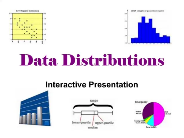
Looking at Data - Distributions Displaying Distributions with Graphs. Chapter 1.1. Objectives (Chapter 1.1). Displaying distributions with graphs Variables Types of variables Graphs for categorical variables Bar graphs Pie charts Graphs for quantitative variables Histograms Stemplots

Looking at Data - Distributions Displaying Distributions with Graphs
E N D
Presentation Transcript
Looking at Data - DistributionsDisplaying Distributions with Graphs Chapter 1.1
Objectives (Chapter 1.1) Displaying distributions with graphs • Variables • Types of variables • Graphs for categorical variables • Bar graphs • Pie charts • Graphs for quantitative variables • Histograms • Stemplots • Stemplots versus histograms • Interpreting histograms
Variables In a study, we collect information—data—from individuals. Individuals can be people, animals, plants, or any object of interest. A variable is any characteristic of an individual. A variable varies among individuals. Example: age, height, blood pressure, ethnicity, leaf length, first language The distribution of a variable tells us what values the variable takes and how often it takes these values.
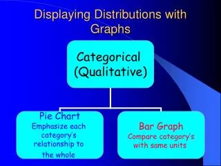
Two types of variables • Variables can be either quantitative… • Something that takes numerical values for which arithmetic operations, such as adding and averaging, make sense. • Example: How tall you are, your age, your blood cholesterol level, the number of credit cards you own. • … or categorical. • Something that falls into one of several categories. What can be counted is the count or proportion of individuals in each category. • Example: Your blood type (A, B, AB, O), your hair color, your ethnicity, whether you paid income tax last tax year or not.
Ways to chart categorical data Because the variable is categorical, the data in the graph can be ordered any way we want (alphabetical, by increasing value, by year, by personal preference, etc.) • Bar graphsEach category isrepresented by a bar. • Pie chartsThe slices must represent the parts of one whole.
The number of individuals who died of an accident in 2001 is approximately 100,000. Bar graphs Each category is represented by one bar. The bar’s height shows the count (or sometimes the percentage) for that particular category. Top 10 causes of deaths in the United States 2001
Pie charts Each slice represents a piece of one whole. The size of a slice depends on what percent of the whole this category represents. Percent of people dying from top 10 causes of death in the United States in 2000
Ways to chart quantitative data • Histograms and stemplots These are summary graphs for a single variable. They are very useful to understand the pattern of variability in the data. • Line graphs: time plots Use when there is a meaningful sequence, like time. The line connecting the points helps emphasize any change over time.
Histograms The range of values that a variable can take is divided into equal size intervals. The histogram shows the number of individual data points that fall in each interval. The first column represents all states with a Hispanic percent in their population between 0% and 4.99%. The height of the column shows how many states (27) have a percent in this range. The last column represents all states with a Hispanic percent in their population between 40% and 44.99%. There is only one such state: New Mexico, at 42.1% Hispanics.
Stem plots How to make a stemplot: • Separate each observation into a stem, consisting of all but the final (rightmost) digit, and a leaf, which is that remaining final digit. Stems may have as many digits as needed, but each leaf contains only a single digit. • Write the stems in a vertical column with the smallest value at the top, and draw a vertical line at the right of this column. • Write each leaf in the row to the right of its stem, in increasing order out from the stem. STEM LEAVES
Interpreting histograms When describing the distribution of a quantitative variable, we look for the overall pattern and for striking deviations from that pattern. We can describe the overall pattern of a histogram by its shape, center, and spread. Histogram with a line connecting each column too detailed Histogram with a smoothed curve highlighting the overall pattern of the distribution
Symmetric distribution • A distribution is skewed to the rightif the right side of the histogram (side with larger values) extends much farther out than the left side. It is skewed to the leftif the left side of the histogram extends much farther out than the right side. Skewed distribution Complex, multimodal distribution • Not all distributions have a simple overall shape, especially when there are few observations. Most common distribution shapes • A distribution is symmetricif the right and left sides of the histogram are approximately mirror images of each other.
Looking at Data - DistributionsDescribing distributions with numbers Chapter 1.2
Objectives (Chapter 1.2) Describing distributions with numbers • Measures of center: mean, median • Mean versus median • Measures of spread: quartiles, standard deviation • Five-number summary and boxplot
Measure of center: the mean The mean or arithmetic average To calculate the average, or mean,add all values, then divide by the number of individuals. It is the “center of mass.” Sum of heights is 1598.3 divided by 25 women = 63.9 inches
w o ma n h ei gh t w o ma n h ei gh t ( i ) ( x ) ( i ) ( x ) i = 1 x = 5 8 . 2 i = 14 x = 6 4 . 0 1 14 i = 2 x = 5 9 . 5 i = 15 x = 6 4 . 5 2 15 i = 3 x = 6 0 . 7 i = 16 x = 6 4 . 1 3 16 i = 4 x = 6 0 . 9 i = 17 x = 6 4 . 8 4 17 i = 5 x = 6 1 . 9 i = 18 x = 6 5 . 2 5 18 i = 6 x = 6 1 . 9 i = 19 x = 6 5 . 7 6 19 i = 7 x = 6 2 . 2 i = 20 x = 6 6 . 2 7 20 i = 8 x = 6 2 . 2 i = 21 x = 6 6 . 7 8 21 i = 9 x = 6 2 . 4 i = 22 x = 6 7 . 1 9 22 i = 10 x = 6 2 . 9 i = 23 x = 6 7 . 8 10 23 i = 11 x = 6 3 . 9 i = 24 x = 6 8 . 9 11 24 i = 12 x = 6 3 . 1 i = 25 x = 6 9 12 25 . 6 S = 1 5 9 8 . 3 n = 2 5 i = 13 x = 6 3 . 9 13 Mathematical notation: Learn right away how to get the mean using your calculators.
2.a. If n is odd, the median is observation (n+1)/2 down the list n = 25 (n+1)/2 = 26/2 = 13 Median = 3.4 2.b. If n is even, the median is the mean of the two middle observations. n = 24 n/2 = 12 Median = (3.3+3.4) /2 = 3.35 Measure of center: the median The median is the midpoint of a distribution—the number such that half of the observations are smaller and half are larger. 1. Sort observations by size. n = number of observations ______________________________
Measure of spread: the quartiles The first quartile, Q1, is the value in the sample that has 25% of the data at or below it ( it is the median of the lower half of the sorted data, excluding M). The third quartile, Q3, is the value in the sample that has 75% of the data at or below it ( it is the median of the upper half of the sorted data, excluding M). Q1= first quartile = 2.2 M = median = 3.4 Q3= third quartile = 4.35
Five-number summary and boxplot Largest = max = 6.1 BOXPLOT Q3= third quartile = 4.35 M = median = 3.4 Q1= first quartile = 2.2 Five-number summary: min Q1M Q3 max Smallest = min = 0.6
Suspected outliers Outliers are troublesome data points, and it is important to be able to identify them. One way to raise the flag for a suspected outlier is to compare the distance from the suspicious data point to the nearest quartile (Q1 or Q3). We then compare this distance to the interquartile range (distance between Q1 and Q3). We call an observation a suspected outlier if it falls more than 1.5 times the size of the interquartile range (IQR) above the first quartile or below the third quartile. This is called the “1.5 * IQR rule for outliers.”
8 Distance to Q3 7.9 − 4.35 = 3.55 Q3 = 4.35 Interquartile range Q3 – Q1 4.35 − 2.2 = 2.15 Q1 = 2.2 Individual #25 has a value of 7.9 years, which is 3.55 years above the third quartile. This is more than 3.225 years, 1.5 * IQR. Thus, individual #25 is a suspected outlier.
1. First calculate the variance s2. 2. Then take the square root to get the standard deviation s. Measure of spread: the standard deviation The standard deviation “s” is used to describe the variation around the mean. Like the mean, it is not resistant to skew or outliers. Mean ± 1 s.d.
Calculations … Women height (inches) We’ll never calculate these by hand, so make sure to know how to get the standard deviation using your calculator or software. Mean = 63.4 Sum of squared deviations from mean = 85.2 Degrees freedom (df) = (n − 1) = 13 s2 = variance = 85.2/13 = 6.55 inches squared s = standard deviation = √6.55 = 2.56 inches
Looking at Data - DistributionsDensity Curves and Normal Distributions Chapter 1.3
Objectives (Chapter 1.3) Density curves and Normal distributions • Normal distributions • The 68-95-99.7 rule • Standardizing observations • Using the standard Normal Table
Normal distributions Normal – or Gaussian – distributions are a family of symmetrical, bell-shaped density curves defined by a mean m (mu) and a standard deviation s (sigma) : N(m,s). x x e = 2.71828… The base of the natural logarithm π = pi = 3.14159…
The 68-95-99.7% Rule for Normal Distributions • About 68% of all observations are within 1 standard deviation (s) of the mean (m). • About 95% of all observations are within 2 s of the mean m. • Almost all (99.7%) observations are within 3 s of the mean. Inflection point mean µ = 64.5 standard deviation s = 2.5 N(µ, s) = N(64.5, 2.5) Reminder: µ (mu) is the mean of the idealized curve, while x¯ is the mean of a sample. s (sigma) is the standard deviation of the idealized curve, while s is the s.d. of a sample.
N(64.5, 2.5) N(0,1) => Standardized height (no units) The standard Normal distribution Because all Normal distributions share the same properties, we can standardize our data to transform any Normal curve N(m,s) into the standard Normal curve N(0,1). For each x we calculate a new value, z (called a z-score).
When x is 1 standard deviation larger than the mean, then z = 1. When x is 2 standard deviations larger than the mean, then z = 2. Standardizing: calculating z-scores A z-scoremeasures the number of standard deviations that a data value x is from the mean m. When x is larger than the mean, z is positive. When x is smaller than the mean, z is negative.
.0082 is the area under N(0,1) left of z = -2.40 0.0069 is the area under N(0,1) left of z = -2.46 .0080 is the area under N(0,1) left of z = -2.41 Using the standard Normal table Table A gives the area under the standard Normal curve to the left of any z value. (…)