
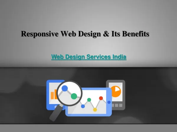
Comprehensive Guide to Responsive Design and Development Techniques
Responsive design is crucial for crafting websites that provide optimal viewing across various devices. This guide covers key elements such as fluid grids, media queries, flexible images, and responsive menus. It also discusses responsive frameworks like Bootstrap and Zurb Foundation and introduces helpful plugins for enhancing responsiveness. We’ll explore practical examples, breakpoints for different devices, and methods to ensure your typography is fluid and adaptable. Learn how to create visually appealing and user-friendly interfaces that cater to the growing range of screen sizes today.


Comprehensive Guide to Responsive Design and Development Techniques
E N D
Presentation Transcript
Approaches to Responsive Design & Development January 21, 2013
What is Responsive Design? • An approach to web design in which a site is crafted to provide an optimal viewing experience – easy reading and navigation with a minimum of resizing, panning, and scrolling – across a wide range of devices (Wikipedia) • Ethan Marcotte, A List Apart, Responsive Web Design (May 25, 2010) • No longer a ‘luxury’
Elements of Responsive Design • Fluid Grids & Fluid Layouts • Media Queries • Flexible Images/Media • Responsive Menus • Flexible type
Fluid Layouts • Benefits vs. fixed-width layout; drawbacks • Target / Context = Result Fixed-Width (based on pixels) Fluid Layout (based on %’s)
Fluid Grids • Typically 12 or 16 columns with column width and gutters based on %’s • Example:
Using Fluid Grids • 1140gs – cssgrid.net (PSD template included) • Foundation by Zurb (framework) • Twitter Bootstrap (framework) • Use 12/16 column PSD template when creating mockup
Media Queries • Placed in stylesheet (can also use Javascript detection) • Looks at the capability of the device and checks for: • Width & Height of browser window • Orientation • Resolution • http://css-tricks.com/snippets/css/media-queries-for-standard-devices/ • http://nmsdvid.com/snippets/
Media Query Example @media only screen and (min-device-width : 320px) and (max-device-width : 480px) { #primary-nav {display:none;} #responsive-nav {display:block;} } • Example: RoomTemp • Concept of ‘breakpoints’
Media Query Breakpoints • Browser widths that have a media query declaration to change the layout once the browser is within the declared range • 320 px — Mobile portrait • 480 px — Mobile landscape • 600 px — Small tablet • 768 px — Tablet portrait • 1024 px — Tablet landscape/Netbook • 1280 px & greater — Desktop
Flexible Images & Media img, embed, iframe { Max-width:100%; Height:auto; } • http://css-tricks.com/video-source-by-screen-size/ - Different videos depending on screen size and device • http://retinajs.com/ - Retina Images
Responsive Menus • Full Horizontal • Select Box (ex. RoomTemp) • Custom Dropdown (ex. Daystar) • Off Canvas • http://css-tricks.com/responsive-menu-concepts/
Flexible Typography • Set body to font-size:100% / 1em (16px) • Base all fonts relative to the base font size, so a 32px H1 would be 2em (32 / 16 = 2) • This makes it easy to adjust all typography with a single media query, changing the body font-size up or down • PxtoEm.com • CSS3 rems (based off HTML element, no nesting)
Responsive Frameworks • Based around a fluid grid (except Skeleton); some contain user interface elements and additional features • Skeleton • Twitter Bootstrap • Zurb Foundation • 1140 CSS Grid
Advantages of Frameworks • Basic media queries & responsiveness done for you • Cross-browser tested • Rapid protoyping; grid template provided for designing • Drawbacks: learning curve, lots of markup, can be tough to create highly custom designs
Helpful Plugins • CSS3-Mediaqueries.js (support for media queries on IE8 and below) • Retina.js (serve up high res images) • Fittext.js (scalable headlines) • FlexSlider (responsive slider) • FitVids.js (fluid video embeds)
Hacking Responsive Wordpress Themes • Inspect the behavior of the site • Look at the media queries • Determine if they are using a framework…learn how to incorporate that • Example: Teamate.us


