ITEC 715
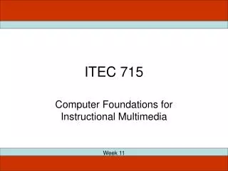
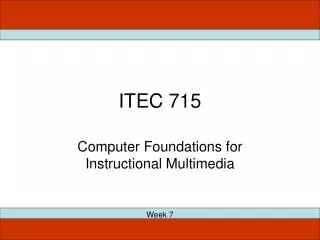
ITEC 715. Computer Foundations for Instructional Multimedia. Week 4. Making a Comic Strip. ITEC 715. Photoshop Image Setup. ITEC 715. Image Mode RGB Resolution for screen 72 dpi Image formats: PSD for your layered, editable source 24-bit PNG for delivery in your course

ITEC 715
E N D
Presentation Transcript
ITEC 715 Computer Foundations for Instructional Multimedia Week 4
Making a Comic Strip ITEC 715
Photoshop Image Setup ITEC 715 • Image Mode RGB • Resolution for screen 72 dpi • Image formats: • PSD for your layered, editable source • 24-bit PNG for delivery in your course • Photoshop tool palettes: • Marquee tool select, move (with arrows), select inverse, crop, fill • Layers new layer, select layer, delete layer, merge layers, layer effects
This week: More Photoshop! (But first, a few words about proper critiquing etiquette…)
In-class Critiques ITEC 715 • Focus on the work, not the person • Try to be specific and constructive: • If something’s not working, clearly identify the problem • If you have a suggestion for improvement, offer it • It’s useful to know what is working too, so point out the good as well as the bad • If a problem covers a broad category – e.g., overuse of passive voice – you can state the category of the problem and cite an example or two if necessary to clarify. It’s not necessary to itemize each infraction! • Ask questions to lead the designer to think about things he or she might not have considered
Bad Screen Design #1 What’s Wrong With This Screen? Source: http://www.ecfapa.com/
Bad Screen Design #1 What’s Wrong With This Screen? • Wasted space at top • Distracting background image • Insufficient contrast between yellow text and white background • What’s clickable? • What’s primary content? • Where is my eye supposed to start? How is it supposed to traverse this screen? • Etc… Source: http://www.ecfapa.com/
Bad Screen Design #2 What’s Wrong With This Screen? Source: http://www.myspace.com/redbloodclub
Bad Screen Design #2 What’s Wrong With This Screen? • Busy—too many links • Text-heavy—poor use of images/lack of images • Insufficient contrast between red text and black background • What’s primary content? • Etc… Source: http://www.myspace.com/redbloodclub
Multimedia Design Example Is This Design Good or Bad? Why? Source: http://www.clarktraining.com/mtest
Multimedia Design Example Is This Design Good or Bad? Why? • Music and voice compete for attention • The “Did You Know?” box and the yellow text box compete for attention with the main spreadsheet screen and the voice and music! • With so many things to focus on simultaneously, the learner is likely to retain none of it due to cognitive overload Source: http://www.clarktraining.com/mtest
Better Screen Design #1 What’s Working Here? Source: http://www.geneed.com/g2/individual/demo.php
Better Screen Design #1 What’s Working Here? • Navigation (“Lessons”) links listed clearly in left column • Primary content is clear • Forward/Back buttons grouped together • Current location listed at top • Additional, less-often-used controls at the lower left • Clean look with good contrast between text and background Source: http://www.geneed.com/g2/individual/demo.php
Better Screen Design #2 What’s Working Here?
Better Screen Design #2 What’s Working Here? • Navigation recallable from “Menu” button at top; leaves more screen area available for content • Reasonable eye-path: Start at upper left. Read directions, then move to lower left to perform actions, then look to upper right for results • Forward/Back buttons grouped together • Current location listed at top
Better Screen Design #3 What’s Working Here? Source: http://www.asklearning.com/web/defaultflash.cfm. E-Learning Portfolio The New Standard Deal
Better Screen Design #3 What’s Working Here? • Navigation recallable from “Show Index” button at lower left; leaves more screen area available for content • Eye is drawn directly to primary content • Forward/Back buttons grouped together • Current location listed at top • Progress indicator at lower left • Graphics support “story” context Source: http://www.asklearning.com/web/defaultflash.cfm. E-Learning Portfolio The New Standard Deal
Better Screen Design #4 What’s Working Here?
Better Screen Design #4 What’s Working Here? • Navigation recallable from “Menu” button at lower center; leaves more screen area available for content • Primary content is clear • Buttons grouped together • Current location listed at top • Syringe is progress indicator • Control graphics are thematically appropriate (a syringe and pills)
Screen Design Principles Layout Principles • “CRAP”—Contrast, Repetition, Alignment, Proximity. See http://www.thinkvitamin.com/features/design/how-crap-is-your-site-design • Colors—If you’re not sure what colors go with each other, hunt down some online visual art, screen capture it, then use Photoshop’s Eye-dropper tool to select some colors from the artist’s pallete. Or, visit a paint store and get some color combination cards. Or, visit the Color Combos website for more ideas: http://www.colorcombos.com/combolibrary.html Navigation Principles • Learner should have a good idea of what will happen when clicking any button or link. • Learner should be able to easily move around in the course—at least forward/back one page and to the start of any topic. • Group like controls together. • Place navigation controls in the same place on every screen; don’t let forward/back or other navigation buttons “jump” around from screen to screen.
Screen Design Resources ITEC 715 • Good Design list:http://www.urlsinternetcafe.com/classroom/features/featuresgood.html • Bad Design list:http://www.urlsinternetcafe.com/classroom/features/featuresbad.html • CRAP (Contrast, Repetition, Alignment, Proximity): http://www.thinkvitamin.com/features/design/how-crap-is-your-site-design
More Photoshop: Resize Canvas, Crop, Emboss, Texture, Gradient Effects, and Layer Opacity
For Next Week ITEC 715 • Mockup three variations of the frame and navigation layout you will use for your final e-learning project. You will present these designs to your classmates and they will recommend which they prefer and why. • Download and read the ITEC715-Week05.ppt slides and come to class ready to discuss. • Next week: Creating a prototype!