WORKING
WORKING. with. TYPOGRAPHY. The art of skillfully arranging and presenting type to gain attention. Types of Fonts. Thick Transition. Thin Transition. Slanted Serifs. Oldstyle (example Times New Roman) Often used for body copy It has slanted serifs on the edge of the letters

WORKING
E N D
Presentation Transcript
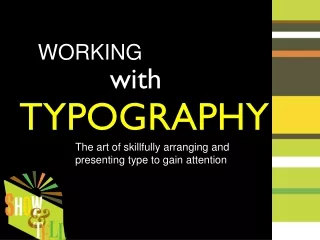
WORKING with TYPOGRAPHY The art of skillfully arranging and presenting type to gain attention
Types of Fonts Thick Transition Thin Transition Slanted Serifs Oldstyle(example Times New Roman) • Often used for body copy • It has slanted serifs on the edge of the letters • The letters have thick and thin transitions
Types of Fonts Oldstyle(examples) Body Copy
Types of Fonts No Transitions No serifs on the letters Sans Serif(example Arial) • “Sans” means without • There are no slants on the ends of the letters • This type is monoweight - meaning that it has no thick and thin transitions.
Types of Fonts Sans Serif(examples)
Types of Fonts No Transitions Serifs look like blocks Slab Serif(example Rockwell) • The serifs look like horizontal blocks on the edge of the letters • This type is monoweight - meaning that it has no thick and thin transitions.
Types of Fonts Slab Serif(examples)
Types of Fonts Thick Transition Serifs are thin horizontal lines Thin Transition Modern(example Modern No. 20) • The serifs are thin horizontal lines on the edge of the letters • This type has radically thick and thin transitions.
Types of Fonts Modern(examples)
Types of Fonts Decorative(example Curlz MT) • These fonts are fun, but need to be used sparingly • Often used for headlines, but not for body copy
Types of Fonts Decorative(examples)
Types of Fonts Script(example Classic Regular) • These fonts are used for a formal look • They look like handwriting • Often used for headlines, but not for body copy (it is too hard to read)
Types of Fonts Script(examples)
When and how to use fonts • Be selective when using fonts. Pick one or two font families that have many options. Such as a serif font family and a sans serif font family that has a light weight, medium weight, bold and italics version of that font.
When and how to use fonts Serif Sans Serif Examples of Font Families
When and how to use fonts Use fonts to add contrast • Size - vary the size of the type to show hierarchy and to draw attention (i.e. headlines will be larger than body copy)
When and how to use fonts Use fonts to add contrast • Color - use colors within your color scheme to make type stand out
When and how to use fonts Use fonts to add contrast • Weight - use varying weights of a specific font or make the font bold to have it stand out
When and how to use fonts Use fonts to add contrast • Italics - use a script or italics to emphasize certain words or to draw attention to others
When and how to use fonts Use fonts to add contrast • Direction - type text diagonally or vertically to add dimension to your page
When and how to use fonts Use fonts to add contrast • ALL CAPS vs. lowercase - using all caps in a title will set it apart from the rest of the type
When and how to use fonts Type Treatments • Drop caps - the first letter of a paragraph is dropped several lines • Raised caps - the first letter of a paragraph is raised above several lines
When and how to use fonts Type Treatments • Text Wrap - a block of text is wrapped around an object. The object could be a picture, graphic or a cobb.
When and how to use fonts Type Treatments • Transparency - varying the opacity of type to put behind other type or on top of a picture
When and how to use fonts Type Treatments • More Transparency examples
When and how to use fonts Type Treatments • Matching type with content - use filters on type to create a look to match the content of the page or find a font that matches the content
When and how to use fonts Type Treatments • Matching type with content - more examples
When and how to use fonts Type Alignments • Left Align - the left edge of the type is straight and the right edge is uneven Left edge is aligned, right edge is not Left edge is aligned, right edge is not
When and how to use fonts Type Alignments • Right Align - the right edge of the type is straight and the left edge is uneven Right edge is aligned Right edge is aligned
When and how to use fonts Type Alignments • Justified - the right and left edge of the type is straight Both sides are aligned Both sides are aligned
When and how to use fonts Type Alignments • Center Alignment - both the right edge and the left edge are uneven. The type is aligned in the center. Type is aligned in the center Type is aligned in the center

