Introduction to Graphical Presentation
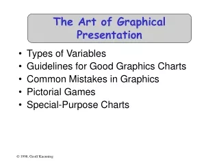
Introduction to Graphical Presentation. Andy Wang CIS 5930-03 Computer Systems Performance Analysis. The Art of Graphical Presentation. Reference Works Types of Variables Guidelines for Good Graphics Charts Common Mistakes in Graphics Pictorial Games Special-Purpose Charts.

Introduction to Graphical Presentation
E N D
Presentation Transcript
Introduction toGraphical Presentation Andy Wang CIS 5930-03 Computer Systems Performance Analysis
The Art of Graphical Presentation • Reference Works • Types of Variables • Guidelines for Good Graphics Charts • Common Mistakes in Graphics • Pictorial Games • Special-Purpose Charts
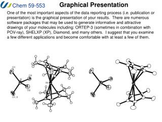
Useful Reference Works • Edward R. Tufte, The Visual Display of Quantitative Information, Graphics Press, Cheshire, Connecticut, 1983. • Edward R. Tufte, Envisioning Information, Graphics Press, Cheshire, Connecticut, 1990. • Edward R. Tufte, Visual Explanations, Graphics Press, Cheshire, Connecticut, 1997. • Darrell Huff, How to Lie With Statistics, W.W. Norton & Co., New York, 1954
Types of Variables • Qualitative • Ordered (e.g., modem, Ethernet, satellite) • Unordered (e.g., CS, math, literature) • Quantitative • Discrete (e.g., number of terminals) • Continuous (e.g., time)
Charting Basedon Variable Types • Qualitative variables usually work best with bar charts or Kiviat graphs • If ordered, use bar charts to show order • Quantitative variables work well in X-Y graphs • Use points if discrete, lines if continuous • Bar charts sometimes work well for discrete
Guidelines for Good Graphics Charts • Principles of graphical excellence • Principles of good graphics • Specific hints for specific situations • Aesthetics • Friendliness
Principlesof Graphical Excellence • Graphical excellence is the well-designed presentation of interesting data: • Substance • Statistics • Design
Graphical Excellence (2) • Complex ideas get communicated with: • Clarity • Precision • Efficiency
Graphical Excellence (3) • Viewer gets: • Greatest number of ideas • In the shortest time • With the least ink • In the smallest space
Graphical Excellence (4) • Is nearly always multivariate • Requires telling truth about data
Principles of Good Graphics • Above all else show the data • Maximize the data-ink ratio • Erase non-data ink • Erase redundant data ink • Revise and edit
Erase Non-Data Ink North West East
Erase Redundant Data Ink North West East
Erase Redundant Data Ink North West East
Specific Things to Do • Give information the reader needs • Limit complexity and confusion • Have a point • Show statistics graphically • Don’t always use graphics • Discuss it in the text
Give Informationthe Reader Needs • Show informative axes • Use axes to indicate range • Label things fully and intelligently • Highlight important points on the graph
Limit Complexityand Confusion • Not too many curves • Single scale for all curves • No “extra” curves • No pointless decoration (“ducks”)
Have a Point • Graphs should add information not otherwise available to reader • Don’t plot data just because you collected it • Know what you’re trying to show, and make sure the graph shows it
Having a Point • Sales were up 15% this quarter:
Show Statistics Graphically • Put bars in a reasonable order • Geographical • Best to worst • Even alphabetic • Make bar widths reflect interval widths • Hard to do with most graphing software • Show confidence intervals on the graph • Examples will be shown later
Don’t AlwaysUse Graphics • Tables are best for small sets of numbers • Tufte says 20 or fewer • Also best for certain arrangements of data • E.g., 10 graphs of 3 points each • Sometimes a simple sentence will do • Always ask whether the chart is the best way to present the information • And whether it brings out your message
Discuss It in the Text • Figures should be self-explanatory • Many people scan papers, just look at graphs • Good graphs build interest, “hook” readers • But text should highlight and aid figures • Tell readers when to look at figures • Point out what figure is telling them • Expand on what figure has to say
Aesthetics • Not everyone is an artist • But figures should be visually pleasing • Elegance is found in • Simplicity of design • Complexity of data
Principles of Aesthetics • Use appropriate format and design • Use words, numbers, drawings together • Reflect balance, proportion, relevant scale • Keep detail and complexity accessible • Have story about the data (narrative quality) • Do professional job of drawing • Avoid decoration and chartjunk
Use AppropriateFormat and Design • Don’t automatically draw a graph • Mentioned before • Choose graphical format carefully • Sometimes “text graphic” works best • Use text placement to communicate numbers • Very close to being a table
CEA: +4.7 WEF: 6.8 DR: +4.5 CB: 6.7 NABE: +4.5 NABE: 6.7 WEF: +4.5 IBM: 6.6 CBO: +4.4 DR: 6.5 CB: +4.2 NABE: +6.2 CBO: 6.3 IBM: +4.1 IBM: +5.9 WEF: +21 CEA: 6.3 GNP: +3.8 IPG: +5.8 CPI: +7.7 Profits: +13.3 Unempl: 6.0 CE: +2.9 CB: +5.5 IBM: +6.6 DR: +10.5 DR: +5.2 NABE: +6.5 IBM: +10.4 WEF: +4.8 CB: +6.2 CE: +6.5 Using Text as a Graphic About a year ago, eight forecasters were asked for their predictions on some key economic indicators. Here’s how the forecasts stack up against the probable 1978 results (shown in the black panel). (New York Times, Jan. 2, 1979)
The Stem-and-Leaf Plot • From Tukey, via Tufte, heights of volcanoes in feet:0|98766562 1|97719630 2|99987766544422211009850 3|876655412099551426 4|9998844331929433361107 5|97666666554422210097731 6|898665441077761065 7|98855431100652108073 8|653322122937
Choosinga Graphical Format • Many options, more being invented all the time • Examples will be given later • See Jain for some commonly useful ones • Tufte shows ways to get creative • Choose a format that reflects your data • Or that helps you analyze it yourself
Use Words, Numbers, Drawings Together • Put graphics near or in text that discusses them • Even if you have to murder your word processor • Integrate text into graphics • Tufte: “Data graphics are paragraphs about data and should be treated as such”
Reflect Balance, Proportion, Relevant Scale • Much of this boils down to “artistic sense” • Make sure things are big enough to read • Tiny type is OK only for young people! • Keep lines thin • But use heavier lines to indicate important information • Keep horizontal larger than vertical • About 50% larger works well