Distributions & Graphs
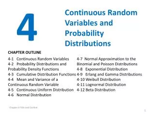
Distributions & Graphs. Variable Types. Discrete (nominal) Sex, race, football numbers Continuous (interval, ratio) Temperature, Test score, Reaction time. Frequency Distributions. Graphic representation of data Easier to understand than raw numbers Helps communicate to others


Distributions & Graphs
E N D
Presentation Transcript
Variable Types • Discrete (nominal) • Sex, race, football numbers • Continuous (interval, ratio) • Temperature, Test score, Reaction time
Frequency Distributions • Graphic representation of data • Easier to understand than raw numbers • Helps communicate to others • Basic kinds of frequency distributions • Ungrouped – simple tally • Grouped – used to simplify • Uses • Relative and cumulative frequency • Shape
Common of Graphs • Bar Chart (discrete) • Histogram (continuous) • Scatterplot (2 variables)
Distribution Shapes • Normal • Center • Spread • Shoulders • Skew There will be numerical ways to describe all these, but for now, just consider the shape visually.
Variability (spread) Central tendency and Variability
Skew The tail!
Modern Stat Graphs • Box plot • Stem-leaf
Boxplot Same distribution as a (sort of) histogram Boxplot for a normal distribution
Stem-leaf diagram • Frequency Stem & Leaf • 1.00 2 . 0 • 2.00 3 . 00 • 3.00 4 . 000 • 4.00 5 . 0000 • 3.00 6 . 000 • 2.00 7 . 00 • 1.00 8 . 0 • Stem width: 1.00 • Each leaf: 1 case(s) (Approximately) Normal distribution
Stem-leaf of volcano heights • Frequency Stem & Leaf • 8.00 0 . 25666789 • 8.00 1 . 01367799 • 23.00 2 . 00011222444556667788999 • 21.00 3 . 011224445555566677899 • 21.00 4 . 011123333344678899999 • 24.00 5 . 001122234455666666677799 • 18.00 6 . 001144556666777889 • 26.00 7 . 00000011112233455556678889 • 12.00 8 . 122223335679 • 14.00 9 . 00012334455679 • 13.00 10 . 0112233445689 • 10.00 11 . 0112334669 • 9.00 12 . 111234456 • 5.00 13 . 03478 • 2.00 14 . 00 • 3.00 15 . 667 • 2.00 16 . 25 • 2.00 17 . 29 • 6.00 Extremes (>=18500) • Stem width: 1000.00 • Each leaf: 1 case(s)
Final Grade Pct Sp 08 • TotPct08 Stem-and-Leaf Plot • Frequency Stem & Leaf • 12.00 Extremes (=<.48) • 3.00 5 . 669 • 12.00 6 . 011333344444 • 18.00 6 . 555566677777889999 • 28.00 7 . 0000111122222223333333444444 • 34.00 7 . 5555555566666667777777888888889999 • 29.00 8 . 00000111111112222223333344444 • 13.00 8 . 5555566667788 • 16.00 9 . 0000011111123344 • 3.00 9 . 566 • Stem width: .10 • Each leaf: 1 case(s) Note that SPSS has the boxplot with larger numbers at the top, but the stem-leaf shows larger numbers at the BOTTOM, so one is backwards from the other.
Definition • Political party is an example of what kind of variable? • 1 continuous • 2 discrete • 3 intensity • 4 objective
Definition • A distribution with a long tail to the right (high) end is called ________ • 1 leptokurtic • 2 negatively skewed • 3 platykurtic • 4 positively skewed
Graphs • Which boxplot shows a skewed distribution? 4 2 3 1
Discussion Question • When might you prefer a graph to a table of numbers for presenting a result? • Name a variable you think would be interesting for college students to see as a graph. What kind of data would you put in the graph? Why would it be of interest?