Mastering Color Basics: Physics, Physiology, and Perception
"Understand how to create realistic images by grasping the fundamentals of color elements, including physics, physiology of vision, and perception. Explore topics like cones, retina, metamers, and color spaces. Discover the complexity of color perception and dynamic ranges. Learn about the CIE color space, LAB space, device color gamuts, and HSV color space. Unveil the intricacies of color wheels, primary, secondary, intermediate, and neutral colors in the fascinating world of color theory."

Mastering Color Basics: Physics, Physiology, and Perception
E N D
Presentation Transcript
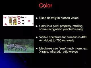
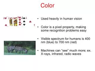
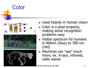
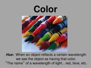
Color • To understand how to make realistic images, we need a basic understanding of the physics and physiology of vision.
Basics Of Color • Elements of color:
Basics of Color • Physics: • Illumination • Electromagnetic spectra • Reflection • Material properties • Surface geometry and microgeometry (i.e., polished versus matte versus brushed) • Perception • Physiology and neurophysiology • Perceptual psychology
Physiology of Vision • The eye: • The retina • Rods • Cones • Color!
Physiology of Vision • The center of the retina is a densely packed region called the fovea. • Cones much denser here than the periphery
Physiology of Vision: Cones • Three types of cones: • L or R, most sensitive to red light (610 nm) • M or G, most sensitive to green light (560 nm) • S or B, most sensitive to blue light (430 nm) • Color blindness results from missing cone type(s)
Physiology of Vision: The Retina • Strangely, rods and cones are at the back of the retina, behind a mostly-transparent neural structure that collects their response. • http://www.trueorigin.org/retina.asp
Perception: Metamers • A given perceptual sensation of color derives from the stimulus of all three cone types • Identical perceptions of color can thus be caused by very different spectra
Perception: Other Gotchas • Color perception is also difficult because: • It varies from person to person • It is affected by adaptation (stare at a light bulb… don’t) • It is affected by surrounding color:
Perception: Relative Intensity We are not good at judging absolute intensity • Let’s illuminate pixels with white light on scale of 0 - 1.0 • Intensity difference of neighboring colored rectangles with intensities: • 0.10 -> 0.11 (10% change) • 0.50 -> 0.55 (10% change) will look the same • We perceive relative intensities, not absolute
Dynamic Ranges Dynamic Range Max # of Display (max / min illum) Perceived Intensities (r=1.01) • CRT: 50-200 400-530 • Photo (print) 100 465 • Photo (slide) 1000 700 • B/W printout 100 465 • Color printout 50 400 • Newspaper 10 234
How well do we see color? • What color do we see the best? • Yellow-green at 550 nm • What color do we see the worst? • Blue at 440 nm • Can perceive color differences of 10 nm at extremes (violet and red) and 2 nm between blue and yellow
How well do we see color? • 128 fully saturated hues can be distinguished • Cannot perceive hue differences with less saturated light. • Sensitivity to changes in saturation for a fixed hue and brightness ranges from 16 to 23 depending on hue.
Combining Colors Additive (RGB) Subtractive (CMYK)
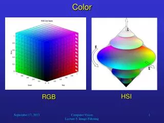
Color Spaces • Three types of cones suggests color is a 3D quantity. How to define 3D color space? • Idea: shine given wavelength () on a screen, and mix three other wavelengths (R,G,B) on same screen. Have user adjust intensity of RGB until colors are identical:
CIE Color Space • The CIE(Commission Internationale d’Eclairage) came up with three hypothetical lights X, Y, and Z with these spectra: • Idea: any wavelength can be matched perceptually by positivecombinations of X,Y,Z • Note that: • X ~ R • Y ~ G • Z ~ B
CIE Color Space • The gamut of all colors perceivable is thus a three-dimensional shape in X,Y,Z • Color = X’X + Y’Y + Z’Z
CIE Chromaticity Diagram (1931) • For simplicity, we often project to the 2D plane X’+Y’+Z’=1 • X’ = X’ / (X’+Y’+Z’) • Y’ = Y’ / (X’+Y’+Z’) • Z’ = 1 – X’ – Y’
Device Color Gamuts • Since X, Y, and Z are hypothetical light sources, no real device can produce the entire gamut of perceivable color • Example: CRT monitor
RGB Color Space • Define colors with (r, g, b) amounts of red, green, and blue
Device Color Gamuts • The RGB color cube sits within CIE color space something like this:
Device Color Gamuts • We can use the CIE chromaticity diagram to compare the gamuts of various devices: • Note, for example, that a color printercannot reproduceall shades availableon a color monitor
HSV Color Space Value • A more intuitive color space • H = Hue • S = Saturation • V = Value (or brightness) Saturation Hue
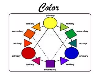
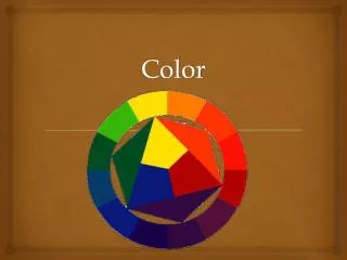
The color wheel fits together like a puzzle - each color in a specific place. The Color Wheel
Primary Colors Primary colors are not mixed from other elements and they generate all other colors. • Red • Yellow • Blue
Secondary Colors By mixing two primary colors, a secondary color is created. • Red + Yellow = Orange • Yellow+ Blue = Green • Blue+ Red = Purple
Intermediate Colors Intermediate, or Tertiary, colors are created by mixing a primary and a secondary. • blue-green • blue-purple • red-purple • red-orange • yellow-orange • yellow-green
Neutral Colors The principles of color mixing let us describe a variety of colors, but there are still many colors to explore. The neutral colors contain equal parts of each of the three primary colors. Black, white, gray and sometimes brown are considered "neutral”.
Color Values Color values are the lights and darks of a color you create by using black and white (‘neutrals”) with a color. This makes hundreds of more colors from the basic 12 colors of the wheel. • white + color = tint • color + black = shade
Tints Tints are lightened colors. Always begin with white and add a bit of color to the white until the desired tint is obtained. This is an example of a value scale for the tints of blue.
Shades Shades are darkened colors. Always begin with the color and add just a bit of black at a time to get the desired shade of a color. This is an example of a value scale for the shades of blue.
Color Schemes Color Schemes are a systematic way of using the color wheel to put colors together… in your art work, putting together the clothes you wear, deciding what colors to paint your room….. monochromatic, complementary, analogous, warm and cool.
Monochromatic “Mono” means “one”, “chroma” means “color”… monochromatic color schemes have only one color and its values. The following slide shows a painting done in a monochromatic color scheme.
This non-objective painting has a monochromatic color scheme - blue and the values (tints and shades) of blue.
Complementary Complementary colors are opposite on the color wheel provided a high contrast - if you want to be noticed wear complementary colors!
This painting has complementary colors and their values - blues and oranges.
Analogous The analogous color scheme is 3-5 colors adjacent to each other on the color wheel. This combination of colors provides very little contrast.
Analogous colors are illustrated here: yellow, yellow-green, green and blue-green.
Warm Warm colors are found on the right side of the color wheel. They are colors found in fire and the sun. Warm colors make objects look closer in a painting or drawing.
This is an illustration of the use of warm colors - reds, oranges and yellows.
Cool Cool colors are found on the left side of the color wheel. They are the colors found in snow and ice and tend to recede in a composition.
Note the cool color scheme in this painting (greens, purples and blues).