Enhancing Reader Engagement Through Effective Newspaper Design
300 likes | 408 Vues
In this insightful discussion presented by Michael T. Shepard, Assistant News Editor at The Washington Post, the importance of design in newspaper publishing is explored. Design is shown not as a cure-all, but as a vital tool that enhances the accessibility of quality content, enabling readers to absorb information more effectively and fostering a strong connection with them. The challenges of designing newspapers in a chaotic newsroom environment are addressed, along with methods to maximize communication effectiveness and the impact of visual elements on reader engagement.

Enhancing Reader Engagement Through Effective Newspaper Design
E N D
Presentation Transcript
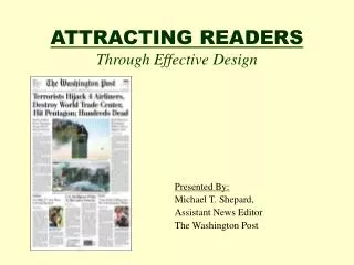
ATTRACTING READERSThrough Effective Design Presented By: Michael T. Shepard, Assistant News Editor The Washington Post
HOW CAN DESIGN HELP? • Design is not a cure-all. It cannot improve weak content • BUT it can help you make good content more accessible • Good design can help readers absorb information more easily • Good design can help forge a lasting bond with readers
THINKING ABOUT DESIGN • Design is all around us. • Furniture, buildings, art, music —even cave paintings — are the fruit of design. And, yes, newspapers, are too. • Every creative human endeavor has an element of design. Design is the act of giving form to an idea. Design is the human process of bringing order out of chaos. Cave Painting from Lascaux, France
DESIGN FOR NEWSPAPERS • As it turns out, “order out of chaos” is an appropriate way of looking at newspaper design. After all, chaos is a word well-suited for describing most newsrooms! • Design is not simply the end result on the printed page. • It is the process of organizing and synthesizing many disparate informational elements. • Design gives a newspaper its personality: Design can make a newspaper a consistent and familiar product to readers.
SPECIAL CHALLENGES • Dimensions: We live in a three-dimensional world, but must collapse our information into a two-dimensional medium. • Time: We have to meet strict production deadlines so the newspaper can publish on time. • Uncertainty: Breaking news often happens in the middle of our production cycle, forcing us to change our carefully laid-out pages. Detroit Free Press, Nov. 8, 2000. The unresolved presidential election combined with regular deadline pressures to make for an extraordinarily difficult, not to mention historic, evening.
SPECIAL CHALLENGES • Standards: We adhere to commonly recognized standards of accuracy and fairness. We cannot simply publish whatever we want, however we want. • Space: The news hole is limited. Text, photos, headlines and informational graphics compete with each other for space, which is limited by economic considerations. • Reproduction quality: It’s difficult to reproduce strong colors on newsprint of often imperfect quality, especially when there’s little time to make adjustments on the presses. • Learning how to work with the above limitations
GOAL OF NEWSPAPER DESIGN Maximize effective communication to readers of relevant and newsworthy information. How do we achieve this? • Organize news hierarchically: Put the most important news in the most visible positions. • Organize news categorically: Separate the news into related sections. • Set a value, through presentation, on the relative importance of news stories. Detroit Free Press edition of September 12, 2002.
HOW THE READER LOOKS AT THE PAGE • A landmark study published in 1991 by the Poynter Institute for Media Studies gave new insights about how readers “process” – or look at – information on a newspaper page. • The study relied on “Eye-Trac” devices, worn by volunteers as they read sample newspapers. The devices measured the reader’s eye movement. Copies of “Eyes on the News”, by Dr. Mario Garcia and Dr. Pegie Stark, can be purchased through Poynter: http://poynter.org/pub/ eyenews.htm The cost is $5.00
HOW THE READER LOOKS AT THE PAGE 2 • Readers process photographs 75 percent of the time • Readers process headlines 56 percent of the time. • Text is processed only 25 percent of the time. • Larger photos attract more readers – pictures 3 columns or wider are processed 92 percent of the time. • Mug shots are processed less than half of the time. • Informational graphics are read 73 percent of the time. ** Statistics from “Eyes on the News”, by Dr. Mario Garcia and Dr. Pegie Stark, Poynter Institute for Media Studies.
WHAT KIND OF INFORMATION? • Different kinds of information communicate on different levels with readers. • They require different visual approaches to achieve the most effective communication with the reader. Let’s look at the typical newspaper page to see how different elements on a page communicate different messages to readers:
WHAT KIND OF INFORMATION?Text Tip: Edit stories to be as lean as possible. For example, if quantitative information will also be published in a graphic, consider dropping the figures from the story. • The most basic element of a newspaper is the story. (Without stories, the newspaper would feel empty!) • The story tells the news of an event. • Text can present the news completely and with all the relevant nuances and caveats. • It provides the so-called “first-draft” of history.
WHAT KIND OF INFORMATION?Photographs • Photos add emotional depth that is difficult to reproduce in text. • They provide documentary, or visual proof, for the reader that an event happened. • They can help to explain a complicated subject. BY YONI BROOK – THE WASHINGTON POST The World Trade Center site on the morning of Sept. 12, 2001.
WHAT KIND OF INFORMATION?Photographs 2 • Photos are a quick visual read. • For readers, good photos can make a newspaper page more inviting and accessible. • They can humanize an otherwise drab subject. BY BILL O’LEARY—THE WASHINGTON POST Kenneth Foster puts flowers on the grave of his wife, Sandra N. Foster, who was killed in the September 11 attack on the Pentagon.
WHAT KIND OF INFORMATION?Photographs 3 Tips on Photos: • Go for news-driven images – it adds urgency to your front page. • Pursue a variety of images – don’t just run pictures of the president! • Shoot people’s faces – especially on local photo assignments. Readers like to see people like themselves in the paper. • Strive for images with strong emotional content. • Shoot from interesting angles – within reason • Crop images for maximum impact.
WHAT KIND OF INFORMATION?Photographs 4 More Tips: • Ask for permission before photographing someone. • Never stage a photo – readers can figure out when a scene has been faked. • Don’t emboss type onto photos. • Don’t overlap pictures in a layout. • Don’t alter images electronically, other than to improve toning for reproductive quality. If you do alter an image, label it as a “photo illustration” to alert the reader that the photo’s original content has been altered.
WHAT KIND OF INFORMATION?Headlines • Provide a quick summary of a story or event. • Call attention on a page to a particular story. • Set the tone of how a reader should approach a story. • Say what’s new about a story. • Through their size, headlines indicate the story’s importance. • Give information in layers. The New York Times on Sept. 12, 2001.
WHAT KIND OF INFORMATION?Informational Graphics • Help to explain a complex subject. • Show how things work. • Add visual impact to stories. • Through use of tables and charts, financial and other quantitative information can be more clearly presented
WHAT KIND OF INFORMATION?Informational Graphics2 The graphic at right was published with a long story explaining the unfolding Enron scandal.
WHAT KIND OF INFORMATION? Informational Graphics2 The graphic at right was published with a story explaining the effort to rebuild the damaged portions of the Pentagon.
WHAT KIND OF INFORMATION?Informational Graphics3 The graphic at right was published with a story explaining the connections between the 9/11 hijackers.
WHAT KIND OF INFORMATION?Informational Graphics 4 Tips: • Research graphics thoroughly. They require as much – sometimes more – reporting than a story. • Send graphic artists to the scenes of breaking news events. When artists can’t go, ask reporters to make quick sketches of what they see. • Train graphic artists on the latest software available in your newsroom. Keep it updated whenever possible.
BRINGING IT ALL TOGETHER • Stories, photos, headlines and informational graphics – compete with each other for space. • The trick is to use everything in proper measure, based on your news judgment. • Be consistent in your treatment and play of stories. Don’t overplay a story simply because the art is unusually good. • Strive for simplicity, clarity and cleanliness in presentation. The Washington Post, “One Year” special section cover, Sept. 8, 2002.
DESIGN TRAPS • Design that calls attention to itself, taking attention away from the man point of a news story. • Design that tries too hard. Artistically, the presentation may be thoughtful, even poignant, but it might not work in a newspaper. You run the risk of sending a confusing message to readers, or no message at all. • Design that overpowers other important stories on a page. Detroit Free Press, edition of September 11, 2002.
MAKING DESIGN WORK FOR YOU • Make good design a mission of your newsroom – teach reporters and other editors that better presentation can get more readers for their stories. • Treat designers as journalists. Expect them to be understand current events and history. They should be able to grasp complex running stories. • Don’t abandon your news judgment for the sake of the newspaper’s visual appearance. • Know your readers. Think carefully about the best ways to reach it. • Make your work easier by: setting procedures for managing space, deciding the front page and establishing deadline. • Write a “stylebook” establishing your organization’s design rules.
REDESIGN ISSUES • There are many good reasons to redesign. But think carefully before starting – you don’t want to make the product less appealing than it was before. • If you decide to change the look of your paper, plan it out. Pull staffers from their regular assignments to work on it. • Test the redesign on sample groups of readers. • When you’re ready to start publishing with the new design, explain to readers what you’re doing. Give your readers a chance to comment.
CONCLUSION • Remember: How your newspaper looks doescount with readers. • Good design is like an English butler, who subtly anticipates your needs before you even know you have them. A well-designed newspaper puts before the reader all the answers to the most salient questions regarding a news story – each in its most accessible form. • Proceed carefully and intelligently, as your credibility is at is at stake.
Internet Resources http://www.poynter.org The Poynter Institute for Media Studies specializes in teaching journalists, aspiring journalists and journalism educators. Its faculty includes several world-renowned specialists in news design. http://www.poynter.org/Visual/index.htm Poynter’s reference file on news design. It includes useful information on newspaper and online design issues. http://www.snd.org The Society for News Design, an international organization of professionals specializing in news design. http://www.newspagedesigner.com A Web-based forum for news designers to trade ideas and critique each other’s work. http://americanpressinstitute.org The American Press Institute focuses on training and professional development and hosts various annual sessions on newspaper editing and design. http://www.asne.org/kiosk/editor/00.april/toc.htm ASNE published a 32-page special report on design in April 2000. This document is posted as a PDF file. http://www.snd.org/graphics/war/newspapersa.html The link to SND’s posting of September 11 front pages. http://www.poynter.org/Terrorism/gallery/Extra1.htm The link to Poynter’s posting of September 11 front pages. BIBLIOGRAPHY
BIBLIOGRAPHY 2 Books(By Author) • Adam, Pegie Stark. Color, Contrast, and Dimension in News Design. Poynter Paper: No. 6, St. Petersburg: Poynter Institute, 1995. • American Press Institute. Design 2020: Visions of the Newspaper of the Future. Reston, VA: API, 1999. • Ames, Steven E. Elements of Newspaper Design. New York: Praeger, 1989. • Ang, Tom. Picture Editing. Oxford: Focal Press, 2000. • Barnhurst, Kevin G. and John C. Nerone. The Form of News. New York: Guilford Press, 2001. • Bounford, Trevor and Alastair Campbell. Digital Diagrams: How to Design and Present Statistical Information Effectively. New York: Watson-Guptill, 2000. • Evans, Poppy. Graphic Designer's Guide to Faster, Better, Easier Design and Production. Cincinnati, OH: North Light Books, 1993. • Garcia, Mario R. Contemporary Newspaper Design. Englewood Cliffs, NJ: Prentice-Hall, 1993. • ----. Newspaper Evolutions. St. Petersburg, FL: Poynter Institute, 1996. • ----. Redesigning Print for the Web. Indianapolis, IN: Hayden Books, 1997. • Garcia, Mario R. and Pegie Stark. Eyes on the News. St. Petersburg, FL: Poynter Institute, 1991.
BIBLIOGRAPHY 3 Books (ByAuthor) • Giles, Vic and F.W. Hodgson. Creative Newspaper Design.Boston: Focal Press, 1996. • Harris, Robert L. Information Graphics .New York: Oxford University Press, 2000. • Harrower, Tim. The Newspaper Designer's Handbook. Boston: McGraw-Hill, 2001. • Holland, D.K. Design Issues: How Graphic Design Informs Society. New York: Allworth Press, 2001. • Hurlbut, Allen. Layout: Design of the Printed Page.New York, NY. Watson-Guptill Publications, 1977. • ---. The Design Concept: A Guide to Effective Graphic Comunication. New York, NY. Watson-Guptill Publications, 1977. • ---. The Grid: A Modular System for the Design and Production of Newspapers, Magazines and Books. New York, NY, 1978. • Newton, Julianne H. The Burden of Visual Truth: The Role of Photojournalism in Mediating Reality. Hillsdale, NJ: Lawrence Erlbaum, 2001. • Tufte, Edward R. Visual Display of Quantitative Information. Cheshire, CT: Graphics Press, 2001. • ---. Envisioning Information. Cheshire, CT: Graphics Press 1999 • ---. Visual Explanations: Images and Quantities, Evidence and Numbers. Cheshire, CT. Graphics Press,
Michael T. ShepardAssistant News Editor, The Washington Post Mailing Address: The Washington Post 1150 15th Street, NW Washington, DC 20071 Tel: 001-202-334-7495 Email: shepardm@washpost.com Biography: Mike Shepard has spent most of his professional life working as an editor on the news desk. He entered the newspaper business in November 1988, when he was hired by The Post as a copy aide. By May 1990, he was promoted to full-time assistant news editor on the news desk. His assignments on the news desk now range from the planning and design of A1 to the layout of the national, foreign and metro sections, as well as the design of special projects and major breaking news events. He has twice attended American Press Institute seminars, the first in September 1992 for news editors and copy desk chiefs, the other in January 1995 for newspaper design and graphics. He is a member of the Newspaper Guild. Mike was born in 1967 in New York City, and raised in Florham Park, NJ. He graduated in May 1988 from Georgetown University with a degree in economics and history. In May 1994, after three years of part-time study, he received a master's degree in journalism from American University.In 1997, Mike took a leave of absence from the Post to teach journalism in Brazil on a Fulbright scholarship. He was assigned to the University of Brasília, a federal school located in the Brazilian capital. While living in Brasília, he had the good fortune to meet his future wife, Sonia de Assis.
