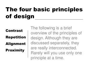
The Four Basic Principles
The Four Basic Principles. C ontrast R epetition A lignment P roximity. Proximity. Items relating to each other should be grouped close together. When several items are in close proximity to each other, they become one visual unit rather than several separate units.

The Four Basic Principles
E N D
Presentation Transcript
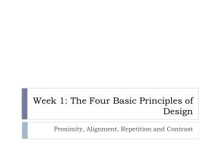
The Four Basic Principles • Contrast • Repetition • Alignment • Proximity
Proximity • Items relating to each other should be grouped close together. • When several items are in close proximity to each other, they become one visual unit rather than several separate units. • This helps organize information and reduces clutter.
Proximity • Items that are not related to each other should not be in close proximity. • The closeness or lack of closeness indicates the relationship. • Elements that are intellectually connected should be visually connected.
Alignment • Nothing should be placed on the page arbitrarily. • Every element should have some visual connection with another element on the page. • This creates a clean, sophisticated look.
Contrast • Avoid elements on the page that are merely similar. • If the elements (type, color, size, line thickness, shape, space, etc.) are not the same, then make them very different. Contrast is often the most important visual element on the page.
AVOID ALL CAPS • ALL CAPS ARE HARD FOR PEOPLE TO READ B/C THERE’S NO SHAPE TO THEM • Mixed-case sentences have redundant shape coding that make them easier to read.
AVOID ALL CAPS • ALL CAPS HAVE NO SHAPE CODING • Mixed-case sentences have redundant shape coding Ascenders Descenders
AVOID ALL CAPS • ALL CAPS TAKES UP MORE SPACE, FORCING YOU TO USE A SMALLER FONT TO PUT THE SAME AMOUNT OF INFORMATION • (If you don’t believe me, this sentence has just the same number of letters as the previous one.)
Repetition • Repeat visual elements of the design throughout the piece. You can repeat color, shape, texture, spatial relationships, line thicknesses, sizes, etc. • This helps develop the organization and strengthens the unity.