Download
1 / 19
240 likes | 1.56k Vues
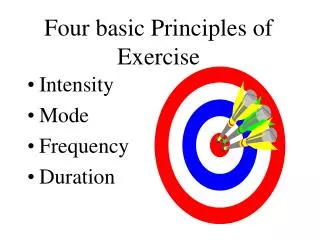
The four basic principles of design. The following is a brief overview of the principles of design. Although they are discussed separately, they are really interconnected. Rarely will you use only one principle at a time. Contrast Repetition Alignment Proximity. Contrast.

E N D
The four basic principles of design The following is a brief overview of the principles of design. Although they are discussed separately, they are really interconnected. Rarely will you use only one principle at a time. Contrast Repetition Alignment Proximity
Contrast The idea behind contrast is to avoid elements that are merely similar. If the elements (type, color, size, line thickness, space, shape) are not the same, then make them very different. Contrast is often the most important visual attraction on the page.
Contrast How has the designer increased the contrast in the text elements from version to version? In the colors? In the size of elements? The graphics? In the spatial relationships? Contrast on the page draws our eye to it; our eyes like contrast. If you are putting two elements on the page that are not the same, such as two typefaces or two line widths or two colors, they cannot be similar. For contrast to be effective, make them very different.
QuestionTo which design elements has the designer added contrast from the first version to the second? Think about type, line thickness, dark and light areas, shapes, sizes, proportion, etc.
Repetition Repeat visual elements of the design throughout the piece. You can repeat color, shape, texture, spatial relationships, line thickness, size, and type. This helps develop the organization and strengthens unity visually.
Repetition Which elements are repeated throughout this design? How does your eye move around the design--what’s the compositional scheme? Which elements are your eyes drawn to? Repetition of visual elements throughout the design unifies and strengthens it by tying together otherwise separate parts. Repetition is very useful on one-page pieces, and is critical in multi-page documents, where we often just call it being consistent. Don’t underestimate the the value of the visual interest you can achieve through repetition--if a piece looks interesting, it is more likely to be read.
Repetition Which elements are repeated throughout this design? How has the designer pushed consistency to turn it into part of the conscious graphic design? Avoid repeating an element so much that it becomes overwhelming or annoying. Be conscious of the value of contrast
Repetition Which elements are repeated throughout this design? How has the designer pushed consistency to turn it into part of the conscious graphic design?
Repetition of visual elements from page to page within your site is also critical to avoiding confusion on the user’s part about where they are, where they can find information, and how they can return to where they were. Note the repetition within each page as well.
Alignment Nothing should be placed on the page arbitrarily. Every element should have some consciously designed visual connection with another element on the page. This creates a clean, fresh, and intentional look.
AlignmentThe web site’s pages are arrayed along a curved alignment. How does your eye move through them? How about the centered alignment of the red links below?
AlignmentThe main pages of the Art Institute’s site are contained in frames with a centered alignment. Is it easy to scan the list? How might the navigability be improved through the use of a stronger alignment?
Alignment Find two (or more) elements that are aligned on the design. How does the alignment of the elements create a sense of organization in the design? Unity is an important concept in design. To make all of the elements on the page appear to be unified, interconnected and interrelated, there needs to be some visual tie between the separate elements. Even if they are far apart on the page, they can appear connected or related simply by their placement on the page.
Alignment Describe the sense of organization achieved through unity in this page. How can you relate the feel of the piece to the alignment scheme? Be conscious of where you place elements. Always find something else on the page to align with, even if the two objects are physically far away from each other. Avoid using more then one text alignment on the page. That is, don’t center some text and right align other text, unless you have a good reason for doing so.
Proximity Items relating to each other should be grouped close together. When several items are in close proximity to each other, they become one visual unit, rather than several separate units. This helps organize the information and reduces visual clutter.
Proximity Squint your eyes slightly and count the number of visual elements by counting the number of times your eye stops. If there are more than 3-5 items, can some be grouped in closer proximity to become one visual unit? When several objects are in close proximity to each other, they became one visual unit rather than several separate units. Items relating to each other should be grouped together. Be conscious of where your eye is going. Where do you start looking? What path do you follow? Where do you end up; after you’ve read it, where does your eye go next? You should be able to follow a logical progression through the piece, from a definite beginning to a definite end.
Proximity Squint and count again. If there are more than 3-5 items, can some be grouped in closer proximity to become one visual unit?
Proximity What could the designer do to make the navigation bar easier to scan?
Proximity What elements are grouped together in close proximity? How does the proximity of the elements help organize the information? If information is logically organized, it will be less likely to create confusion, and will be read. Avoid too many separate elements on the page. Don’t stick things in the corners and in the middle. Avoid using equal amounts of white space between elements unless each group is a part of the subset. Don’t create relationships with elements that don’t belong together. If they’re not related, move them very far apart.