Basic Design Principles
Basic Design Principles. Gaining Attention and Delivering a Message by Mr. Tim Hixson Computer Applications. What a mess!. Four Elements of Good Design. Good color contrast to allow the message to be seen Readable fonts to communicate the message clearly Use Pictures to enhance the message

Basic Design Principles
E N D
Presentation Transcript
Basic Design Principles Gaining Attention and Delivering a Message by Mr. Tim Hixson Computer Applications
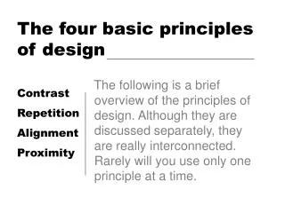
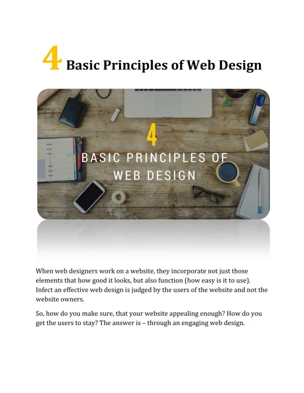
Four Elements of Good Design • Good color contrast to allow the message to be seen • Readable fonts to communicate the message clearly • Use Pictures to enhance the message • Arranging contents to draw more attention to the message
Color Contrast • Contrast is the effect of having colors that are different enough to stand out against each other. • In the example, the black text on the dark blue background is harder to read
Color Contrast • Bad contrast • Good contrast Can you read this? You can read this!
Font Selection • Consider the appropriate size font • Use Sans-Serif fonts for better readability • Limit yourself to two different fonts to avoid distractions and clutter (maybe three on a larger work) Hello Hello serifs sans-serif
Use of Pictures • Use pictures that directly relate to the message • Avoid using too many pictures • Use pictures that have a similar style and coloring
Content Placement Look at the box. When I show the numbers, which one do you notice first? 3 5 This is commonly called the Rule of Thirds. 2 8 6 1 4 7 9
Good Example – Poster Melissa Logies – Class of 2010
Good Example – Poster Caleb Venman – Class of 2010
Good Example – Scrap Book Cheryl Ginsburg – Class of 2009
Good Examples – Business Cards Amy Hart – Class of 2010 Becky Yager – Class of 2009 John Wiser – Class of 2009 Chris Stathopoulos– Class of 2010
Basic Design Principles Gaining Attention and Delivering a Message by Mr. Tim Hixson Computer Applications