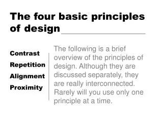
4 Basic Principles of Design
4 Basic Principles of Design. Proximity. Summary of Proximity. When several items are in close proximity to each other, they become one visual unit rather than several separate units. Items relating to each other should be grouped together.

4 Basic Principles of Design
E N D
Presentation Transcript
Proximity Summary of Proximity • When several items are in close proximity to each other, they become one visual unit rather than several separate units. • Items relating to each other should be grouped together. • You should be able to follow a logical progression through a piece, from a definite beginning to a definite end.
Proximity Basic Purpose • The basic purpose of proximity is to organize. • If the information is organized, it is more likely to be read and more likely to be remembered. • You create a more appealing white space. Learn to Dance! StreetRhythm Smooth Hip Hop Cha Cha Waltz Krump Rumba Tango Funk Bolero Foxtrot Clown Mamba Quickstep Example:
Proximity How to Get it • Squint your eyes slightly and count the number of visual elements on the page by counting the number of times your eyes stops. • If there are more than three to five items on the page, see which of the separate elements can be grouped together into closer proximity to become one visual unit.
Proximity What to Avoid • Don’t stick things in the corners or in the middle just because the space is empty. • Avoid too many separate elements on a page. • Avoid leaving equal amounts of white space between elements unless each group is part of a subset. • Avoid even a slit second of confusion over whether a headline, subhead, caption, graphic, etc., belongs with its related material. Create a relationship among elements with close proximity. • Don’t create relationships with elements that don’t belong together! If they are not related, more them apart from each other.
Alignment Summary of Alignment • Nothing should be placed on a page arbitrarily. Even elements should have some visual connection with other elements on the page. • Unity is an important concept in design. To make all the elements on the page appear to be unified, connected, & interrelated, there needs to be some visual tie between separate elements. • Even if the separate elements are not physically close on the page, they can appear connected with the other information simply by their placement.
Alignment Basic Purpose • The basic purpose of alignment is to unify & organize the page. • It is often a strong alignment that creates a the look you want. Example: Mermaid Tavern Ralph Roister Doister 1027 Bread Street London, NM (715) 555-1212
Alignment How to Get it • Be conscious of where you place elements. • Always find something else on the page to align with, even if the two objects are physically far away from each other.
Alignment What to Avoid • Avoid using more than one text alignment on the page. • Break away from centered alignment unless you are consciously trying to create a more formal, sedate presentation. • Choose a centered alignment consciously, not by default.
Repetition Summary of Repetition • A repetition of visual elements throughout the design unifies & strengthens a piece. • Repetition is very useful on one-page pieces, & is critical in multi-page documents.
Repetition Basic Purpose • The purpose of repetition is to unify & to add visual interest. • Terence English • Objective • To make money • Education • Stratford Grammar School • Employment • Actor • Play broker • Favorite Activities • Suing people for small sums • Chasing women Example:
Repetition How to Get it • Think of repetition as being consistent. • Look at the possibility of adding elements whose sole purpose is to create a repetition. • Push the existing consistencies a little further.
Repetition What to Avoid • Avoid repeating the elements so much that it becomes annoying or overwhelming. • Be conscious of the value of contrast.
Contrast Summary of Contrast • Contrast on a page draws our eyes to it; our eyes like contrast. • If you are putting two elements on the page that are not the same, they cannot be similar- for contrast to be effective, the two elements must be very different.
Contrast Basic Purpose • Contrast has two purposes- • 1) Is to create an interest on the page. • 2) The other is to aid in the organization of the information. The Rules of Life Your attitude is your life Maximize your options Don’t let the seeds stop you from enjoyin’ the watermelon. Be nice. Example:
Contrast How to Get it • Add contrast through you typeface choices, line thickness, colors, shapes, sizes, spaces, etc. • Remember to be strong.
Contrast What to Avoid • Don’t be a wimp. If you’re going to contrast, do it with strength. • Avoid contrasting a sort-of-heavy line with a sort-of-heavier line. • Avoid contrasting brown text with black headlines. • Avoid using two or more typefaces that are similar.