Download
1 / 8
80 likes | 282 Vues
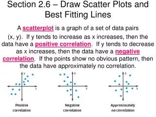
Section 2.6 – Draw Scatter Plots and Best Fitting Lines. A scatterplot is a graph of a set of data pairs

E N D
Section 2.6 – Draw Scatter Plots and Best Fitting Lines A scatterplot is a graph of a set of data pairs (x, y). If y tends to increase as x increases, then the data have a positive correlation. If y tends to decrease as x increases, then the data have a negative correlation. If the points show no obvious pattern, then the data have approximately no correlation.
Section 2.6 – Draw Scatter Plots and Best Fitting Lines Example 1:
Section 2.6 – Draw Scatter Plots and Best Fitting Lines A correlation coefficient, denoted r, is a number from -1 to 1 that measures how well a line fits a set of data pairs (x,y). If r is near 1, the points lie close to a line with positive slope. If r is near -1, the points lie close to a line with negative slope. If r is near 0, the points do not lie close to any line.
Section 2.6 – Draw Scatter Plots and Best Fitting Lines Example 2:
Section 2.6 – Draw Scatter Plots and Best Fitting Lines If the correlation coefficient for a set of data is near positive or negative 1, the data can be reasonably modeled by a line. The best fitting line is the line that lies as close as possible to all the data points. You can approximate a best-fitting line by graphing.
Section 2.6 – Draw Scatter Plots and Best Fitting Lines Example 3: Use the equation of the line of fit from above to predict the number of alternative-fueled vehicles in use in the US in 2010.
Section 2.6 – Draw Scatter Plots and Best Fitting Lines Example 4: Use the linear regression feature on a graphing calculator to find an equation of the best-fitting line for the data in Example 3.