Download
1 / 8
80 likes | 210 Vues
Graphs and plots in R offer a powerful way to visualize data, revealing insights that numerical summaries often miss. To effectively communicate data features, it's essential to follow general guidelines: present the data clearly without distortion, minimize unnecessary chart elements (or "chart junk"), and enable meaningful comparisons. Edward Tufte's principles emphasize showing the data, encouraging thoughtful analysis, and revealing information at varying detail levels. As you create visualizations, be mindful of avoiding pie charts if possible, as they can misrepresent data. Aim for clarity and purpose in your visual representations.

E N D
Graphs • Graphs capture much more detail than numerical summaries, so very useful for learning about data and communicating its features. • At the same time, graphical interpretation isn’t standard in the way that numerical summaries are, and our eyes can fool us.
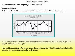
Some General Rules • Insights from Edward Tufte (2001) • show the data • Induce the reader to think about the data being presented • Avoid distorting the data http://www.npr.org/2011/07/03/137536111/by-the-numbers-todays-military
More Insights from Tufte • Present many numbers with minimum ink • Try to make large data sets coherent • Encourage the reader to compare different pieces of data • “Reveal” Data at different levels of detail • The visualization should serve a reasonably clear purpose http://xkcd.com/1064/
Things to Avoid Whenever Possible: • Avoid distractions, chart junk, and distorting data. Phillips (1991)
Why Pie Charts are Usually Terrible. http://xkcd.com/688/
Pie Charts in the Wild http://www.engadget.com/2008/01/15/live-from-macworld-2008-steve-jobs-keynote/ http://www.jgc.org/blog/uploaded_images/FeaturesByVersion-777059.png
Why Pie Charts are Usually Terrible. (Source: Wikipedia user Schutz)