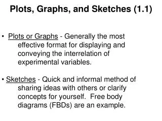
Plots, Graphs, and Pictures
210 likes | 340 Vues
This comprehensive guide examines the importance of clarity in data visualization. It addresses common pitfalls like misleading plots and graphs while presenting practical advice for effectively illustrating relationships in data. Concepts such as two- and three-dimensional charts are explored, including their benefits in conveying complex information simply. The case study of the Challenger Shuttle disaster highlights the critical outcomes of poor data representation. Learn how to use modern data analysis tools to enhance your understanding and presentation of key metrics like GDP and population.

Plots, Graphs, and Pictures
E N D
Presentation Transcript
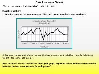
Plots, Graphs, and Pictures “Out of the clutter, find simplicity” – Albert Einstein Thought Questions 1. Here is a plot that has some problems. Give two reasons why this is not a good plot. 2. Suppose you had a set of data representing two measurement variables—namely, height and weight—for each of 100 people. How could you put that information into a plot, graph, or picture that illustrated the relationship between the two measurements for each person?
Plots, Graphs, and Pictures Two and three dimensional charts
Plots, Graphs, and Pictures Two and three dimensional charts Why is this a better graphical representation?
Plots, Graphs, and Pictures Nightingale Graph preventable diseases (in blue), the results of wounds (in red), due to other causes (in black).
Plots, Graphs, and Pictures Two and three dimensional charts
Plots, Graphs, and Pictures Energy Data
Plots, Graphs, and Pictures Energy Data
Plots, Graphs, and Pictures Area Judgments Population of Cities at the end of the Eighteen Century
Plots, Graphs, and Pictures Population of Cities at the end of the Eighteen Century
Plots, Graphs, and Pictures Area Judgments
Plots, Graphs, and Pictures Line Judgments
Plots, Graphs, and Pictures Line Graphs Used Car Price Mountain Height Data
Plots, Graphs, and Pictures Misleading Line Graphs Carbon Dioxide by Year Carbon Dioxide by Year: Aspect Ratio Changed
Plots, Graphs, and Pictures Misleading Bar Graphs
Plots, Graphs, and Pictures Misleading Bar Graphs
Plots, Graphs, and Pictures Challenger Shuttle Disaster The morning of 27 January 1986 was particularly cold in the USA. Several engineers raised concerns over the low temperature at Kennedy Space Center and what effect it would have on the space shuttle, particularly the rubber O-rings in the Solid Rocket Boosters (SRBs). No one had tested the O-rings at such low temperatures. However management needed to get the mission underway, as soon as possible. The night before, the decision was made to go ahead with the launch. As the SRBs ignited, the hot gases inside immediately caused the O-rings to expand in the casing joints to prevent flame leaking out sideways. Because the rings were frozen, during this launch they took a fraction of a second longer to expand. One set of O-rings on the right hand SRB immediately burnt away, releasing a puff of black smoke immediately after lift-off.
Plots, Graphs, and Pictures Challenger disaster
Plots, Graphs, and Pictures Data Visualization Tool This application uses FBI world data on GDP, Population, Infant Mortality etc. To get started, click the Viewers Manager on the left and select "Data analysis" from the 2x2 saved layouts. Then from the active manager dropdown menu, choose "Full Pane" for tab navigation through the different ways the data is presented. You can apply filters in the graphs view of the data (click button to left of question mark button in the graph view). You can drag a slide rule to filter countries by GDP, Population, Infant Mortality.